as Architect & Technical Job Captain @ ONCUOGLU+ACP Architecture
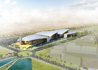
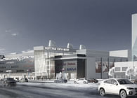
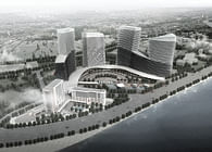
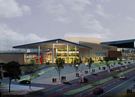
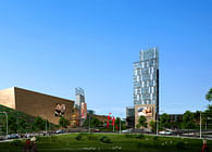
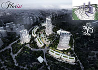
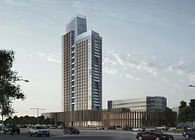
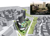
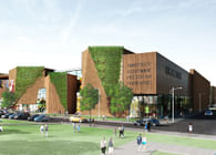
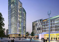
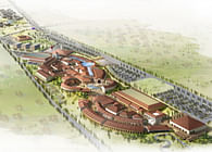
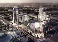
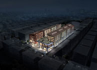
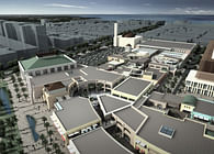
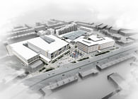
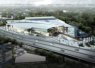
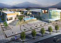
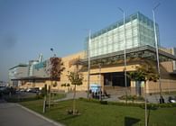
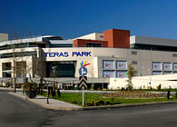
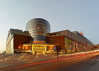
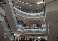
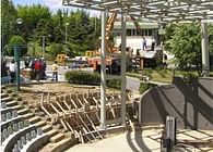
That very large life style center breaks the usual introverted shopping mall typology defined as “retail box” and is inspired and designed by a theme `urban` as the word `kent` refers to. The main feature of the project is the “interior street” connecting the main road to a buffer zone between the shopping center and residences which is comprised of a recreational area and a small lake. Thus, the main rotunda is designed as “Urban Square”, the main artery as “Street”, the market place as “Bazaar” and the open-air area at the rear as “Terrace.”
In way finding and signages inside the center, those main areas are shown as directions. Materials used in signage systems are: green color glass referring to patinated copper green by simply attaching to columns; or by supports of bronze aluminium referring to the facade material. Fonts and symbols are designed and organised in a minimalistic manner considering the ease of perception in graphical design. In principle the main indicator like floor indicator such as Z for ground floor or I for information is marked in a big size in italic on aluminium mat sheets.
For the restrooms, which are reached via long corridors are directioned by wall information graphics.
On parking areas, the directioning is provided by hanging aluminium panels in a similar design language.
Status: Built
Location: Ankara, TR
My Role: Schematical planning, conceptual modeling in Archicad and preliminary project development & Signage and way finding design and detailings
Additional Credits: ONCUOGLU+ACP Architecture
