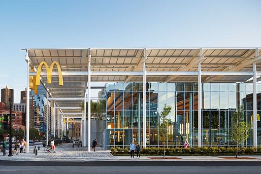

Goodbye bright colors and unusual shapes. Today, the design is minimal and sleek. Most fast-food restaurants are built to maximize efficiency, not catch motorists’ attention. One critic has called this trend “faux five-star restaurants” intended to make customers forget they are eating greasy fries and burgers.
The chains now sport nearly identical looks. Call it the gentrification of fast-food design.
— CNN
The psychologically manipulative color schemes may remain, but fast food’s once-iconic Googie and mid-century modern designs are quickly being swapped out for more monolith structures. Changes caused by the pandemic and technology are the largest factors, along with the rise in popularity of drive-thru-only chains.
If it goes on unabated, the America your children grow up in could become one vast dystopic warren of bland 5-over-1s, converted strip malls, Amazon fulfillment centers, these unhealthy slat facade Wendy’s stores, and the occasional mass timber luxury tower attainable exclusively to the very rich and well-connected.
7 Comments
Awe, what a tragedy…
Oh no, fast food design is improving!
Not everything has to be hysterical and apocalyptic.
"improving" is a subjective statement.
Fast junk food. Fast junk writing. The McD's Chicago flagship is nothing more than a flagship to green-washing.
The flagship is surprisingly underwhelming when seen in person.
I’m not sad to see it go
Who cares...
Block this user
Are you sure you want to block this user and hide all related comments throughout the site?
Archinect
This is your first comment on Archinect. Your comment will be visible once approved.