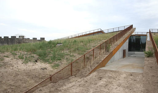
Due to the surrender of German forces in WWII, the Tirpitz Bunker's construction was never completed leaving the dugout as a dark presence on the sandy coast of Denmark. The 3.5 meter thick concrete fortification is the country's largest bunker and was intended to be part of Hitler's Atlantic Wall defenses. Due to its strategic position near the coast, the bunker would've helped protect the sea route to the Port of Esbjerg, a major intermodal hub for the Nordic region. While the Allies blew up many of the bunkers in the region, the Tirpitz was saved. The site has been used as a small museum since 1991 and has previously held concerts and art shows within the moss-covered bunker walls. In 2012 as part of a 7,500-square foot development, it was decided to expand the museum.

Today, hidden under the dunes, the new Tirpitz Museum, designed by Bjarke Ingels, has finally been transformed with four distinct galleries alongside the original bunker. The museum will explore both the lighter and darker chapters of the region's history and the first round of programming, designed by Tinker Imagineers, will feature an exhibit on WWII called "A Wall of Concrete," as well as one on the West Coast landscape and one on amber, a special treasure of the area.
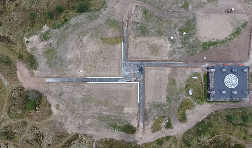
The design, itself, maintains the continuity of the landscape and embeds the majority of the building beneath the dunes, making the exhibition itself, a dugout of sorts. Four open-air troughs connect the spaces and meet at a central courtyard nestled under the sand—a questionable design choice considering the aerial view resembles a certain Nazi symbol.

The public will enter the complex through the trail cuts that link to a footpath looping around the complex. The Danish architect has described the concept as "at once critical and respectful of the existing bunkers" and that "as a vacuum rather than a volume, and symbolising transparency rather than gravity, it represents the new architecture of a light and easy antithesis of bunker architecture."
but it's not a swastika. It has a square at the center.
Isnt there enough in the world for us to be outraged at, without dreaming up more?
its essentially a miesian pinwheel plan. It may not be a swastika, but the similarity is obvious and when designing a building with ww2 connections the architect should realize the impact of symbolisms and how the public will interpret thm
All 16 Comments
Looks more like an ICBM launch facility
While I like this emerging trend of "void" projects from BIG, I'm trying to imagine Bjarke pitching the "incomplete swastika" parti. Speaking of hot potatoes...
Everything is an incomplete swastika except maybe swastikas.
And for a ww2.....lol...I can't stop laughing
BI: "Its not a swastika its a potato"
Q: "where you eating potatos with nazis?"
It's a very insensitive design and think BIG is full of bull ****
I think that their is no compassion but just " BIG EGO's
10 years from now, we won't want to see firm - BIG is just media darling - all talk and no real substance
I would never want to visit this place
I wonder had a of BiG''s Jewish developers would react to his design and accepting the offer to. Ud the project
I don't think the Jewish legacy of survivors would be very happy with the design
I am very upset and shocked
Terrible moment for Jewish history and the future wit this kind of reckless design
I wonder if BiG''s Jewish developers in NYC would react so kindly to his design and accepting the offer to build this project.
I don't think the Jewish immunity or Holocaust survivors would be very happy with the design
I am very upset and shocked
Terrible moment for Jewish history and the future with this kind of reckless design.
it is completely "reckless". Anyone with half a brain would have noticed that as Im sure they did. they obvioisly didnt care enough to change it.
but it's not a swastika. It has a square at the center.
Isnt there enough in the world for us to be outraged at, without dreaming up more?
BIG sucks, but to call that piece of junk project a swastika is a total stretch.
Not a swastika, but if the photos are to be believed it's not a very good building either. BIG's projects never seem to achieve the promise of their presentations.
its essentially a miesian pinwheel plan. It may not be a swastika, but the similarity is obvious and when designing a building with ww2 connections the architect should realize the impact of symbolisms and how the public will interpret thm
I thought the pinwheel was pioneered by FLW?
Go BIG or go home. German fortifications on the occupied island of Jersey. A little hint of brutalism?
Very interesting process... you are slicing a potato and viola! a WW2 museum. Next project, a Civil War museum ... dinner tonight... spaghetti and meatballs. Damn architecture is easy!
That's not a swastika, it's actually a rather nice and modest building, wouldn't even say it's a BIG.
the dirt over the roofs is the worst, looks like they run out of budget for a decent landscape plan - and the railing, who knew you had to have a railing to stop people from falling into the slits?
There's no landscape plan, it seems to fit in naturally with the surrounding dunes, at least to me, or it will eventually. If it weren't for the cuts in the potato you wouldn't even know it's there. And I personally find it a pity that there are railings needed in this case, would have rather seen none, or I guess these weren't really up to cod:
Block this user
Are you sure you want to block this user and hide all related comments throughout the site?
Archinect
This is your first comment on Archinect. Your comment will be visible once approved.