
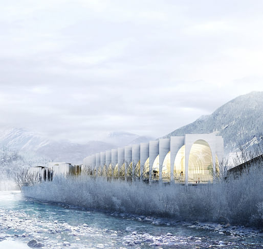
In hopes to bring tourism into the area, San Pellegrino will soon have a brand new flagship factory in San Pellegrino Terme, where the sparkling-water brand has resided since 1899. Bjarke Ingels Group had the winning proposal to design the new bottling factory in a competition against MVRDV, Snøhetta, and Architetto Michele De Lucchi.

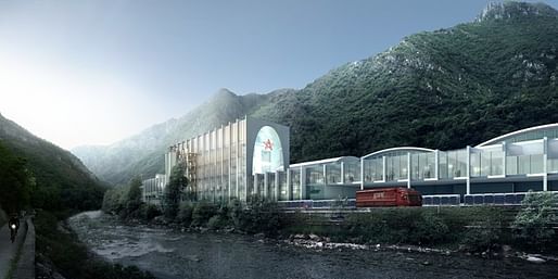
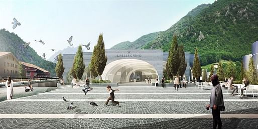
At 17,500 m2, the €90 million building pays tribute to its mountainous environment and San Pellegrino's heritage. “Rather than imposing a new identity on the existing complex, we propose to grow it out of the complex,” Bjarke Ingels said in a statement. “We propose to wash away the traditional segregation between front and back of house, and to create a seamless continuity between the environment of production and consumption, and preparation and enjoyment.“
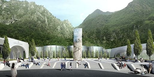
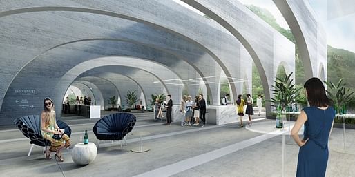
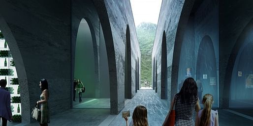
In addition to the production facility, the new building will include offices for San Pellegrino staff and public spaces open to visitors. BIG's design reinvents elements of classic Italian architecture — like the arcade, the viale, the piazza, and the portico — and features walkways shaped by rows of arcs that offer views of the surrounding landscape.
At the center of the campus, a core sample of the mountain displays the different strata of rock involved in the natural formation of the spring water, an interpretation of the 30-year journey of the water that travels from the snowy summits to the springs at the foot of the mountain.
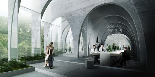
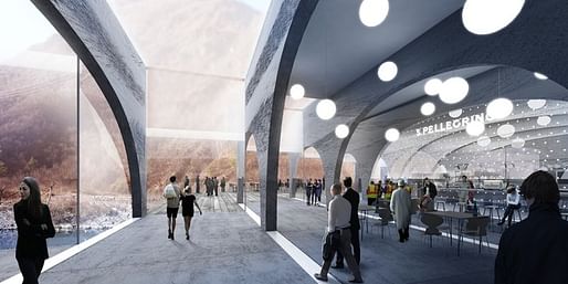
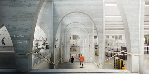
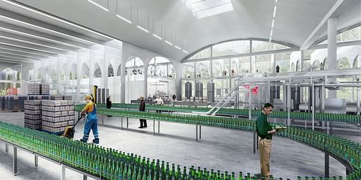
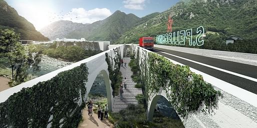

“We are confident that it will stimulate other initiatives that were started in recent years, but may have been put on hold in the aftermath of the economic crisis,” says San Pellegrino Terme mayor Vittorio Milesi.
Over the next four years, BIG will work on the project alongside San Pellegrino and local architects Studio Verticale. Once groundbreaking takes place in 2018, construction will begin for a bridge that connects the factory to Zogno and a parking structure for heavy vehicles. Starting in 2019, construction will focus on offices, the northern wing of the Factory, and the Experience Lab.
Find more project images in the gallery below.
4 Comments
Makes me uncomfortable. It's like you're never inside. Good way to monitor employees though.
Exactly like his project for the Serpentine Gallery with the glassfiber blocks. It looked downright awful in a sea of green, but it looks at home in Vancouver. There is a place for all buildings under the sun.
Congratulations!!! Excellent!
Not bad for a BIG project, not just a one liner. But we still seem to be living in a flimsy pop-up design age.
Block this user
Are you sure you want to block this user and hide all related comments throughout the site?
Archinect
This is your first comment on Archinect. Your comment will be visible once approved.