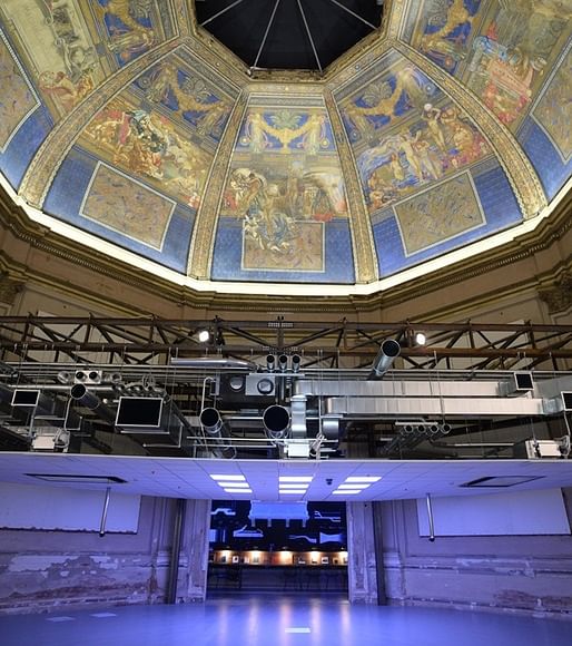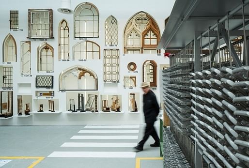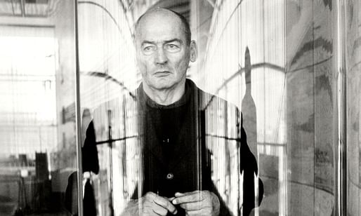
This year's Venice Biennale of Architecture, curated by Rem Koolhaas, officially opened on June 7, under the theme "Fundamentals". The deluge of criticism and reporting coming out of the Biennale will surely continue until it closes November 23, but so far reactions from the architectural journalism community seem pretty consistent. Critics seem at once relieved that the biennale is not given away to preening and doting upon architectural personalities, but instead focused on "architecture, not architects", as per Koolhaas' design. The flip-side of this could be seen as replacing objects of starchitectural value with a too-safe generalism, imbued with the self-importance of Koolhaas' cult of personality. Responses seem largely concerned with interpreting the man at the same time as his Biennale, rather than investigating the interplay of national pavilions' personalities under a unifying theme. But we've got many months to go, and this is only the beginning.
But with the sheer mass of reporting coming out of the Biennale, we've gathered a selection of meatier accounts, and broken them down for you. Be sure to check out Archinect's reporting on the biennale, courtesy of Terri Peters, as a primer.

Aaron Betsky waxes poetic about Rem's Biennale for Architect Magazine, comparing it to modernist poet T.S. Eliot's 1915 poem "The Love Song of J. Alfred Prufrock". You can interpret the subtext yourself and read Eliot's entire poem here, but the Cliffs Notes is that Betsky is comparing (favorably, it seems) Koolhaas' biennale to a middle-aged man grappling with life's grand questions.
The Architectural Review features two interviews with Koolhaas, one by Charles Jencks, Koolhaas' former architecture tutor, and another by Andrew Mackenzie. Jencks interview, entitled "The Flying Dutchman", pokes at Fundamentals' technical determinism, and Koolhaas' Dutch-ness. The two go way back.
Mackenzie engages Koolhaas on international translations of the modernist style -- in regards to client expectations, regionalisms or political biases. Koolhaas insists on separating theoretical writing, done for himself, and completed projects, which are collaborative exercises. It should not be assumed that they are reinforcements of one another, or that they should even agree. The Fundamentals theme is a nod to architecture's atavism in the midst of contemporary digital immediacy -- revisiting a past that's easy to take for granted in the present, oversaturated with imagery.

Reinhold Martin focuses his piece for Design Observer on issues of land rights and real estate, and argues that architecture's disputes can best be imagined through concepts of "ground" -- the fundamental missing from Koolhaas' indispensable 15. Like many other reviews, Martin's agrees that the focus on architecture over architects is for the best. Trying to represent modernity in architecture through individual architects' visions would only muddy the issue and create false conflations. But by regarding architecture as simply permutations of inalienable elements, we also aren't out of the woods: "There is in fact a distinct air of the fetish, and hence of the sacred and the magical, in the invocation of “architecture” itself as a timeless set of logical subsets."

In perhaps the most quotable piece I've encountered so far, Kieran Long writes for Dezeen: "Elements just makes you feel unutterably sad for [Koolhaas] and for what he thinks architecture is. That a director of the biennale, whose work and writing make him unarguably the leading architect of his generation, should make a show that proposes that architecture is, when stripped right back to 'fundamentals', the mere shuffling around of cladding, walls, doors, stairs, roofs and toilets. I may sound ingenuous, credulous. But how else are we supposed to feel?"
Long's piece is very concerned with what the Biennale means for Rem's oeuvre, and can come across as absolutely intoxicated on the Koolhaas Kult of Personality. Much of the criticism is built on questioning Koolhaas' intent, trying to figure out the man behind the exhibition rather than deconstructing the implications of Fundamentals for contemporary architecture, and architectural history. For example:
Rowan Moore's piece for The Guardian also makes a (perhaps unintentional) reference to "Prufrock", comparing the exhibition of Italy's deconstructed architectural elements (whose supremacy was ceded long ago) as a somewhat perverse arrangement, "like a body on a slab". He interprets Koolhaas' theme almost as a eulogy, "The show is partly a celebration of what built spaces can do, but there is also an underlying pessimism. Things Ain't What They Used to Be is one message, or We're All Doomed."
He seems similarly depressed by Fundamentals' reminder, that technological advancements are narrowing the architect's role by diminishing their necessity in certain building conditions: "If, for example, a fireplace was once an occasion for social gathering and ornamental embellishment, there are now sensors that can track an individual and provide heating specific to that one person. The provision of heat becomes a solitary, dematerialised and invisible affair."
He's not a total downer though, and is relieved that little time is spent doting attention on starchitects' personalities: "The Biennale is greatly enhanced by the fact that, unlike its predecessors, it does not pay tribute to the big beasts of contemporary architecture (Koolhaas excepted) and the absence of their honking and rutting adds greatly to its enjoyment."
Interview with Rem Koolhaas // VENICE BIENNALE 2014 by Uncube from BauNetz Media on Vimeo.
Uncube's treatment pays service to Koolhaas' Kult but remains critical, invoking his personality as an endearment to the biennale: "Though the overall show comes across as slightly over didactic, what also comes through is the sense of keen interest, excitement and underlying humour, that Koolhaas, however polemical, always seems to bring to bear, in his writing, exhibition-making... and even sometimes still to his architecture." But Koolhaas' charm notwithstanding, "This is a museum show and a museum of a show, and at times one can’t see the (architectural) wood for the trees. Indeed a recurring criticism has been that if architecture is a language, all that is given here is the vocab, not the grammar."

That's our round-up for now, with more from the 2014 Biennale to come. Stay tuned.
21 Comments
"things aint what they used to be"
and some will argue that ornamentation is a crime and that efficiency and comfort are paramount to experience and adventure...Its all bullshit really. This linear view of time. This idea of progress. Geologically speaking, the space between the ancient and the now is but a fart in time, and we are only one small comet away from being blown back to building with mud and twigs.
The critics are just as busy staking out psuedo-intellectual turf as Rem is.
Some more biters from Sarah Williams Goldhagen for Architectural Record:
T.S. Eliot began writing Prufrock in his 20's...every line in that compilation of poems has multiple upon multiple references ...I will smack any old guy who reads this poem in a history of architecture lecture to fill his lecture up as he goes through slides about Brunelleschi;'s work (undergrad) or some critic walking through the Biennale (see above)... you don't' get to subjectively interpret T.S. Eliot. The Michaelangelo bit, not very important, overly interpreted because its Michaelangelo....like Koolhaas.
I think a better correlation to T.S. Eliot would be Kieran Long's quote "...so deeply implicated in the phenomena he records, that it is no longer possible to tell the difference between what he advocates and what he criticizes."
based strictly on reading about this event and the spawn of Koolhaas I think the last stanza of "Conversation Galante" is more appropriate if we are going to make analogies between the science of poetry and the art of architecture - because the language of architecture isn't language we speak - we have to talk about it via other fields languages...
"You, madam, are the eternal humorist
The eternal enemy of the absolute,
Giving our vagrant moods the slightest twist
With your air indifferent and imperious
At a stroke our mad poetics to confute—"
And—"Are we then so serious?"
(this poem follows Hysteria in the Prufrock and other Observations)
I would love to see a photo of airconditioning and lighting integrated into a lovely ceiling, as was common before the modernists flattened the world! This show might have been less faux had it been held in Mestre, but who are we kidding, Venice is a beautiful place to talk about anything!
It is impossible to judge this Biennale by spending a day by hovering around some pavilions and guessing to have understood all the matter. Ii is since almost two weeks that I am spending much of my time analyzing every single pavilion of the Biennale, including the exhibition sections directly curated by Koolhaas and in my opinion this is probably one of the best Biennale of the last 20 years. Simply it is quite difficult to grasp it at first sight, it requires an in-depth study for every single exhibit. I discovered that what seemed to me superficial at a further look was actually much more profound than I expected. The question "what currently modernity is in the global world" posed by Koolhas is not suitable for a quick reply based on a hasty glimpse.
The problem I have with fundamentals is that it is comparing apples and oranges. There is nothing scientific about these observations and nothing original.
thayer, could you post a pic or two (or a link to pics or whatever) that would illustrate the pre-modern ductwork, lighting, associated conduit, etc., that maintains what you consider a lovely ceiling?
or would you consider the pantheon's oculus to be air conditioning and lighting?
modern "flat" ceilings?
or does it have to be a dome? because those are made by armstrong too
http://youtu.be/e2rKONJIzDQ
Hey I don't want that someone other says I am "spamming" (something that really offend and hurt me so deeply I don't want to add a single word about it) nevertheless I have been at the Biennale two days long and with my press account I had time to see all the stuff there including Elements. I have not prepared a "critic" article on all the matter but only reported what I found there as a simple witness. Hope it could hep you to get a more precise opinion on Koolhaas' Biennale.
(I do not link the URL, to avoid further stupid considerations by who doesn't appreciate my efforts, so I am sorry, but if you are interested you have to cut and paste the link below)
here it is my photo reportage;
http://www.inexhibit.com/case-studies/14th-venice-architecture-biennale-part-2/
Sorry, the forum platform is adding the direct linking by itself and I am not allowed to remove it. It was not my intention.....:(
More worthless shit that is not useful to 99% of the professionals, except for Phd students and teachers
actually, doc, this is probably the only biennale that is of use to 99% of the profession.
Riccardo I really enjoyed your collection of photos and descriptions! The more I learn about this Biennale the more I like it.
Thanks Donna, I much appreciate it! :)
What is most incoherent is how OMA both layers history in exhibitions and great architectural work, but claims that modernism has overshadowed and universalized form and context. Why is it then that New York City and Tokyo and São Paulo and San Francisco and Boise and Istanbul and Rotterdam look and feel completely different? And OMAs own work is constantly changing. Is it not a difference in culture, politics, history, geography, technology, innovation, etc? The pictures of individual buildings doesn't reflect the real experience.
I used to love the IIT Chicago, with its multilayered references to Mies, the L, drywall, colors, and a hyper rational built architecture path. It seems like an echo of the current curatorial and trend in architecture. It's stuck in reverse, which is fine for a historian, but fails to see architecture as constantly expanding from the structures of the past, not imprisoned by references. Mies reflected classical orders and proportions with modern materials, because it was the best way forward, not because he was stuck in the past.
It's also unfair that the drop ceiling is displayed as a fragment while the fresco ceiling is in context. Still, both are beautiful on their own terms, if viewed as particulars. It is also unequal contexts via their histories: one was built with extra care, another as utility. If you juxtapose the Villa Savoye with a Roman hut, the joke reverses.
Once you stop marveling at the beauty of every particular, and see it as some kind of brand ie "ceiling" you can't see architecture.
Darkman, good points. There is nothing scientific about this whatsoever. There is no control group. For a more accurate account he should have compared one typology through history. Library vs library. He's comparing apples and oranges. Had this been done as an anthropology thesis it would get a D-
As provocation and media it is A+, but D from a critical POV. But what matters most is users, the reason modernism was successful, as it offered a built solution, not a provocation. But the world is diverse not only modern, because users are diverse. The thing I get from this is how media and architecture both need to evolve past static imagery and the euro-curatorial trend of brand fetishism (replace modern or brutalist with Rem or Apple or Ceiling) and capitalism/media as end in itself rather than byproduct of innovation and built quality of the particular.
"greedy reductionism"
As declared in the Canada pavilion exhibition -modernity needs to be both innovative and adaptive to be really useful- (this was referred to the Nunavut region in northern Canada), and I guess that's as more true as more contexts are diverse and/or deviate from the average.
"modernity needs to be both innovative and adaptive to be really useful- "
Do you mean modernity as a style of architecture? My guess is anything that's both innovative and adaptive will probably be useful, regardless of when it was created. Then again, historic architecture has its uses also. See Venice bienalle.
It's always fun to see folks get bent about what they can and can't do and the reasons why.
Block this user
Are you sure you want to block this user and hide all related comments throughout the site?
Archinect
This is your first comment on Archinect. Your comment will be visible once approved.