yes. the switches were designed to be a three way switch. one at each end of the hall, and one in the middle near the entrance... but the contractor added two and one end of the hall, 4.5 feet from each other controlling the same lights...
so now it is a 4 way switch.... and he has yet to install the low-voltage dimmer on them..
it just seemed like a silly thing to add. the doors are opposite one another and no more than five feet apart... does each bedroom REALLY need it's own switch??? especially when the switch does the same thing???... and what makes it even worse is that these are leading into the guest bedrooms which will have occupants 2-3 times a year!!??
I just looked at my mother and said, "why did you do this?" and she just turned, walked away and said, "leave me alone."
I will always use this wall as an example to show clients why they shouldn't make arbitrary decisions on site without the architect.. so for this I can thank my parents..
I love construction. My love of architecture is mainly related to the construction side of it - I can nuerote over connection details for days but it's always due much more to a concern with constructibility issues than to philosophical ones.
Geoff posted this link to the ENR 2006 construction "Images of the Year" on BLDGBLOG that kept me totally captivated for a good 45 minutes. Yum, yum, yum.
two buildings constructed simultaneously, a school board administrative building and an 'alternative' school - basically a school for the students that haven't succeeded in mainstream classroom: suspensions, expulsions, other issues.
Contrary to popular belief, I do in fact do work...here is one of my projects under construction.
The project is a renovation / addition of a 1950's post and beam house in Beverly Hills. The house was origionally designed by the industrial designer Gretta Grossman; it was her own residence.
The one story hillside house was too small for today's living standards. We have designed a pool house underneath the existing house, with a pool underneath that.
Here are some pics from the jobsite...
Looking down towards new pool/poolhouse
Location of new pool..new casions
Same casions...damn bedrock
Bedrock + jackhammer...
Making rebar cages for casions
Looking out master bedroom window towards pool
View of living / dining area...notice the new steel column
nice stuff p2an; all of this is making me sad. I haven't been at work for 3 weeks now and just as long I've been off any of my job sites (aka babies). Liberty like you I do love the construction side of things, and found that i was good at resolving things quickly as the buildings arose...I find it fun to tell you the truth. The one part i don't like is getting stuck in the mud which invariably happens either my vehicle spinning tyres or my work boots sinking deep. Fun tho - I casually refer to it as an adults playground
Yeah, last week I wore a suit for a meeting, but also had a site visit (to the house for which I will post pictures momentarily) so I brought my knee-high wader boots and tromped around the mud checking the concrete formwork - a suit and waders, looks ridiculous but so fun!
It's been a long time, but I thought I would finally post the resolution of the grout misalignment issue. Seems the 4" glass tiles are Italian, and the white 8" field tile is American, and those numbers are both nominal, so there was no way to get the grout joints to align the entire length without cutting a sixteenth off of each glass tile...so I breathed a huge sigh of relief because the owner didn't have a problem with the installation in the first place.
For context, the view from the master bedroom looking into the bathroom space.
Its amazing how something as simple as a threshold and throw off your perception of space and height. It gives it this omnious appearance, I really am drawn to that space. Nice.
31JAN2007 progress report:
plaster and corrugated metal exterior in place.
we chose red plaster so tennis players would be able to see the ball (there are a bunch of courts to the left). the building that we added on to was yellow, and tennis players often complained that they would lose sight of the ball on with the yellow backdrop.
entrance/exit to lobby area. the corrugated projection above is a sitting area outside of the main fitness space.
also, the grey mass in the foreground of the bottom image is the locker rooms. on the red mass you can see where the downspouts will go, between each window bay. if you recall the earier construction images, the solid portions of the red facade are solid because there are eccentric/cross braces where windows would have gone...
View From across central, looking north. The Steel span covers a what will be an open plan street level corridor...should be nice in the summer and cold in the winter...but it should also be a great place for the school to have a venue to show large scale work.
AP, the building looks excellent. I love how tight it is, with the corrugated witting flush with the red plane. You say it's red "plaster" and I hate to even ask because it sounds like I'm being judgemental - I'm not - but... is it EIFS? Or stucco?
You didn't post what I think is the coolest picture:
I love the composition of the L-shaped stair (?) in front of the contracting red/yellow behind - with that little square window popped in.
Looks great. You'll have the typical post-project-depression no doubt after it's all done - make sure you schedule professional photography soon! Though actually fall is usually the best time for photos - lots of growth on trees, and blue blue skies if it's a clear day.
stucco, don't feel bad for asking. i prefer to call it plaster ;-)
and thanks for your kind words.
i like that image as well, but we've had difficulty with the old/new connection there (the yellow is the 'old'). we drew it one way, the contractor said it wouldn't work, we drew it another way, they said okay, but still did it a 3rd way. now we need them to make a few adjustments...once this is resolved i'll get some better shots of this elevation up...
that's awesome strawb... i'll have to put that in my files...
here's some fresh pix from this morning's jobsite meeting on the recreation center that i'm working on...
the gym girders waiting to be erected...
steel beams that will support the second floor spaces that overlook the gym and create a covered entry... the gym is to the left here...
closer detail of the steel at the covered entry... the steel will remain exposed and the second floor structure will be hollowcore planks...
inside the gym... these are the same steel members from the previous pictures... they cantilever out over the gym bleachers to create the second floor walkway... the flanges are the connection point for the walkway railing... again the steel will be left exposed...
they'll start erecting the second floor structure of precast hollowcore concrete planks late next week... i'm looking forward to spending some time on site watching the crane ballet!!!
I came across a drawing set a little while back where all the leaders were wavy curved lines. I was told 'so they don't confuse those lines with whats in the building'. I thought it looked ridiculous and was unnessary. I've since realized that one can never make drawings clear enough...
AP, the project looks great... as LB said the juxtaposition of the stucco and corrugated is quite nice... and stucco's just part of working in florida... there's no getting around it... at least it isn't EIFS...
i'm looking forward to the metal cladding that we'll be using for the second story volumes of the project pictured above... it's going to be zinc shingles... something along the lines of these copper ones...
i couldn't find a better pic of the product in zinc...
Strawbeary, I am speechless......how could that have happened?!? How could that possibly have happened?!?!? Has the concrete contractor never worked in a jurisdiction with building codes before? Was there a note on the drawings that said "Please smoke a bunch of dope and don't sleep the night before you build formwork for this stair"? There is no dimension for it, so they obviously scaled the drawing, did they think that was OK?!?
Oh my god. I mean I get frustrated sometimes when a contractor asks "Is this really how you want to build this?" but an example like that makes me thankful for every damn RFI I've ever received. Unbelievable. Unbelievable!!!!!!
But if the treads are only 5" high that's a code violation, and the handrail would need to align with the point where the nosing changes direction, so that would kinda ruin the look.
Jobsite Pic of The Day
sorry, more like 4.5' - 5' apart.
yes. the switches were designed to be a three way switch. one at each end of the hall, and one in the middle near the entrance... but the contractor added two and one end of the hall, 4.5 feet from each other controlling the same lights...
so now it is a 4 way switch.... and he has yet to install the low-voltage dimmer on them..
it just seemed like a silly thing to add. the doors are opposite one another and no more than five feet apart... does each bedroom REALLY need it's own switch??? especially when the switch does the same thing???... and what makes it even worse is that these are leading into the guest bedrooms which will have occupants 2-3 times a year!!??
I just looked at my mother and said, "why did you do this?" and she just turned, walked away and said, "leave me alone."
I will always use this wall as an example to show clients why they shouldn't make arbitrary decisions on site without the architect.. so for this I can thank my parents..
good one. maybe she could cut a small hole in one of her paintings to let the thermostat fit?
28DEC progress report:
 YMCA, Jacksonville, FL
full Flickr set of project's construction, from 18OCT-28DEC. Completion scheduled for April.
curtclay, your mother doesn't want to walk in 5 feet of darkness...
Snooker what's that you are building?
arch...no my buildings....just a place I visited day before Christmas...
retail on first floor and office space upstairs.
I love construction. My love of architecture is mainly related to the construction side of it - I can nuerote over connection details for days but it's always due much more to a concern with constructibility issues than to philosophical ones.
Geoff posted this link to the ENR 2006 construction "Images of the Year" on BLDGBLOG that kept me totally captivated for a good 45 minutes. Yum, yum, yum.
those were fun. my favorite, one of those projects you wish you could freeze right there and say 'it's finished! don't muck it up!':

I was captivated by that one too, Steven - saved it to my computer to perhaps use as my desktop background.
I think my next career will be in the construction side of things.
this one broke ground over christmas break:

flickr set: here
two buildings constructed simultaneously, a school board administrative building and an 'alternative' school - basically a school for the students that haven't succeeded in mainstream classroom: suspensions, expulsions, other issues.
Contrary to popular belief, I do in fact do work...here is one of my projects under construction.
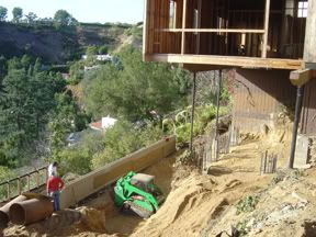
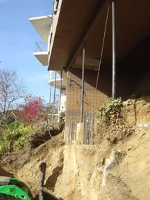
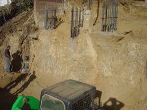
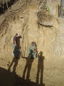
The project is a renovation / addition of a 1950's post and beam house in Beverly Hills. The house was origionally designed by the industrial designer Gretta Grossman; it was her own residence.
The one story hillside house was too small for today's living standards. We have designed a pool house underneath the existing house, with a pool underneath that.
Here are some pics from the jobsite...
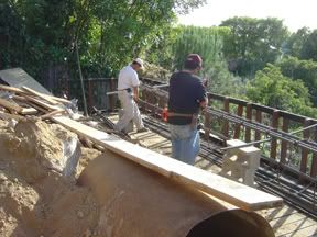
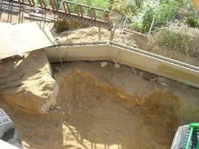
Looking down towards new pool/poolhouse
Location of new pool..new casions
Same casions...damn bedrock
Bedrock + jackhammer...
Making rebar cages for casions
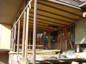
Looking out master bedroom window towards pool
View of living / dining area...notice the new steel column
03JAN2007 progress:


17JAN2007 progress:
corrugated metal panel cladding installed
YMCA, Jacksonville, FL
full Flickr set of project's construction, from 18OCT-17JAN. Completion scheduled for April.
a pic of our new office going up near amsterdam.

pre-cast concrete - no cladding.
6 floors when finished. one room per floor.
nice stuff p2an; all of this is making me sad. I haven't been at work for 3 weeks now and just as long I've been off any of my job sites (aka babies). Liberty like you I do love the construction side of things, and found that i was good at resolving things quickly as the buildings arose...I find it fun to tell you the truth. The one part i don't like is getting stuck in the mud which invariably happens either my vehicle spinning tyres or my work boots sinking deep. Fun tho - I casually refer to it as an adults playground
Yeah, last week I wore a suit for a meeting, but also had a site visit (to the house for which I will post pictures momentarily) so I brought my knee-high wader boots and tromped around the mud checking the concrete formwork - a suit and waders, looks ridiculous but so fun!
One minute, more pics...
It's been a long time, but I thought I would finally post the resolution of the grout misalignment issue. Seems the 4" glass tiles are Italian, and the white 8" field tile is American, and those numbers are both nominal, so there was no way to get the grout joints to align the entire length without cutting a sixteenth off of each glass tile...so I breathed a huge sigh of relief because the owner didn't have a problem with the installation in the first place.


For context, the view from the master bedroom looking into the bathroom space.
Its amazing how something as simple as a threshold and throw off your perception of space and height. It gives it this omnious appearance, I really am drawn to that space. Nice.
31JAN2007 progress report:


plaster and corrugated metal exterior in place.
we chose red plaster so tennis players would be able to see the ball (there are a bunch of courts to the left). the building that we added on to was yellow, and tennis players often complained that they would lose sight of the ball on with the yellow backdrop.
entrance/exit to lobby area. the corrugated projection above is a sitting area outside of the main fitness space.
YMCA, Jacksonville, FL
more from 31JAN on Flickr
it might not look like much, but it's the first built project that i had a hand in designing. completion in April...
also, the grey mass in the foreground of the bottom image is the locker rooms. on the red mass you can see where the downspouts will go, between each window bay. if you recall the earier construction images, the solid portions of the red facade are solid because there are eccentric/cross braces where windows would have gone...
better image of entrance/exit
this is the bldg's rear, so this exit is to the tennis courts and pool.
AP that's a very nice image with the contrast of colours reminds of me of this
very cool...what is it?
A community college I did in Montserrat. Its as you come up the stair well.
Here is some of the recent work on the new UNM Architecture School


Pair of trusses in place.
Truss being attached to crane.
View From across central, looking north. The Steel span covers a what will be an open plan street level corridor...should be nice in the summer and cold in the winter...but it should also be a great place for the school to have a venue to show large scale work.

Form brace detail

see more here:
http://flickr.com/photos/thepeculiarform/sets/72157594507814220/
thanks for the pics jason, especially the frontier shot!!!
i had a cinnamon roll today.
AP, the building looks excellent. I love how tight it is, with the corrugated witting flush with the red plane. You say it's red "plaster" and I hate to even ask because it sounds like I'm being judgemental - I'm not - but... is it EIFS? Or stucco?

You didn't post what I think is the coolest picture:
I love the composition of the L-shaped stair (?) in front of the contracting red/yellow behind - with that little square window popped in.
Looks great. You'll have the typical post-project-depression no doubt after it's all done - make sure you schedule professional photography soon! Though actually fall is usually the best time for photos - lots of growth on trees, and blue blue skies if it's a clear day.
stucco, don't feel bad for asking. i prefer to call it plaster ;-)
and thanks for your kind words.
i like that image as well, but we've had difficulty with the old/new connection there (the yellow is the 'old'). we drew it one way, the contractor said it wouldn't work, we drew it another way, they said okay, but still did it a 3rd way. now we need them to make a few adjustments...once this is resolved i'll get some better shots of this elevation up...
that really is a sexy composition with the colour & textures
^ stair tread built from detail leader.
Classic.
Quite similar to 7'-3".... "why do you dimension 7 feet minus 3 inches?"
that's hilarious.
yeah, note the added riser, making each riser like 5" tall.
priceless. i've passed this on to my co-workers.
thank you for sharing.
Was this on one of your jobs Strawbeary?
one of my co-worker's jobs. picture was taken this morning.
that's awesome strawb... i'll have to put that in my files...


here's some fresh pix from this morning's jobsite meeting on the recreation center that i'm working on...
the gym girders waiting to be erected...
steel beams that will support the second floor spaces that overlook the gym and create a covered entry... the gym is to the left here...
closer detail of the steel at the covered entry... the steel will remain exposed and the second floor structure will be hollowcore planks...
inside the gym... these are the same steel members from the previous pictures... they cantilever out over the gym bleachers to create the second floor walkway... the flanges are the connection point for the walkway railing... again the steel will be left exposed...
they'll start erecting the second floor structure of precast hollowcore concrete planks late next week... i'm looking forward to spending some time on site watching the crane ballet!!!
thats hilarious...
I came across a drawing set a little while back where all the leaders were wavy curved lines. I was told 'so they don't confuse those lines with whats in the building'. I thought it looked ridiculous and was unnessary. I've since realized that one can never make drawings clear enough...
oh yeah... a few more things that i forgot...

AP, the project looks great... as LB said the juxtaposition of the stucco and corrugated is quite nice... and stucco's just part of working in florida... there's no getting around it... at least it isn't EIFS...
i'm looking forward to the metal cladding that we'll be using for the second story volumes of the project pictured above... it's going to be zinc shingles... something along the lines of these copper ones...
i couldn't find a better pic of the product in zinc...
Strawbeary, I am speechless......how could that have happened?!? How could that possibly have happened?!?!? Has the concrete contractor never worked in a jurisdiction with building codes before? Was there a note on the drawings that said "Please smoke a bunch of dope and don't sleep the night before you build formwork for this stair"? There is no dimension for it, so they obviously scaled the drawing, did they think that was OK?!?
Oh my god. I mean I get frustrated sometimes when a contractor asks "Is this really how you want to build this?" but an example like that makes me thankful for every damn RFI I've ever received. Unbelievable. Unbelievable!!!!!!
I like the stair tread. It may not work in the context, I can't tell, but it has a sort of Scarpa feel to it. I'd leave it if I were the client.
Whoops, jumped pages. I am referring to Stawberry's Stair Tread Picture.
Yeah, I agree, Sarah, it looks cool.
But if the treads are only 5" high that's a code violation, and the handrail would need to align with the point where the nosing changes direction, so that would kinda ruin the look.
Damned codes.
I still cannot believe that happened.
Block this user
Are you sure you want to block this user and hide all related comments throughout the site?
Archinect
This is your first comment on Archinect. Your comment will be visible once approved.