London, GB
Opplyst, a new permanent exhibition designed by Nissen Richards Studio, has opened at The National Library of Norway (Norway’s Nasjonalbiblioteket). All branding and graphics within the exhibition are also by the London-based studio, for whom this is a second project for the same client. The first, a temporary exhibition on Norwegian book history, came to a close in January.
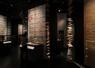
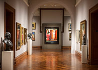
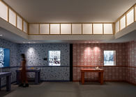
Opplyst, meaning ‘Enlightened’, refers to the new exhibition’s central concept: the display of thirty highly-significant objects from the country’s history – fragments that helped shape the nation. The objects are now on display together for the first time in the Library’s central Oslo premises, with every surface and aspect bespoke-designed by Nissen Richards Studio to create this dramatic and intense immersion into Norway’s fascinating history.
‘Our initial concept was for the chosen objects to be floating, with the showcases rendered almost invisible. Whilst light and darkness were metaphors for the exhibition, including the concept of knowledge arising like light out of the darkness, they also became structuring devices’ Pippa Nissen, Director of Nissen Richards Studio explained, adding that ‘we also set out to make something of lasting quality, with a materiality that spoke clearly of the ideas surrounding the project. We want visitors to step over the threshold and discover a magical new space.’
A second source of design inspiration came from the location of the Library’s full object collection. This archive, effectively a catalogue of Norwegian culture, is stored in the belly of a mountain in the country and accessed via a fully-mechanised system, whereby a robot brings objects out on demand.
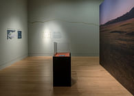
‘Discovering more about this fascinating archive further directed our design thinking’, Pippa Nissen added. ‘The back wall of the new space is effectively an abstracted version of the drawers that hold the full set of historical objects, designed with timber blocks to form a surface of varying 3D depth. We liked the idea of creating a room that gradually shifts over time – a darkness that the objects sit within that is an ‘active darkness’, full of content and textures.’
The objects selected for Opplyst tell of great breakthroughs, creative masterpieces and crucial events that shaped the country’s capacity for expression and sense of nationhood. They range from a 12th-century psalter and Magnus Lagabotes Landslov, the Norwegian equivalent of the Magna Carta, to an early example of a chain letter, known as a ‘letter from heaven’, a Grieg piano concerto and a letter from the South Pole by explorer Roald Amundsen, along with censored fragments from one of the earliest Norwegian silent movies made in Norway. Reminders of darker moments in the country’s history are included too, including a photo negative documenting the deportation of Norwegian Jews to Auschwitz in 1942. The library did all its own object-sourcing from its vast archive, with Nissen Richards Studio involved in the final consultation stages of the process, as well as in locating of the objects within the space.
‘Unusually, the client wanted all the objects to be of equal standing and without hierarchy or chronology. The pacing of the room therefore was all about visitors finding their own paths through’ Pippa Nissen explained. ‘This also ensured flexibility for the longer-term. Adjacencies were considered at length, with some objects offering maximum contrast for added drama and interest, whilst others form subtle pairings. Discovering connective threads is therefore entirely dependent on the mindset and path of the individual visitor.’
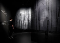
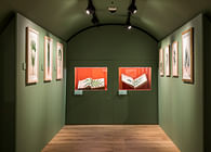
Timber forms a major part of Opplyst’s carefully-crafted materials palette. As well as the rear feature wall, the floor, for example, is made up of block-end larch, which has been sanded, oiled and stained with black and white pigments and built by hand, creating the effect of subtly-different charcoal-grey tones, through which the grain is still visible. The new raised floor is also highly functional and hides all the services, with cabling running up the legs of the showcases. The use of wood throughout came from the idea of integrating a sense of the natural world, particularly the forests that cover so much Norwegian terrain, with the movement of the wind inspiring the design treatment of the two side walls, which feature grooved etchings, the result of much experimentation using a precision-cutting CMC process, with the final diagonally-patterned textural finish applied to pigmented Valcromat. A further sense of movement has been created by an incredibly slow lightwash through the space, created by lighting designers Studio ZNA. This moves from cool to warm and adds a gentle dynamism to the display.
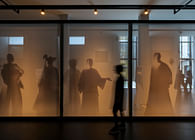
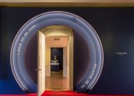
There are lightboxes to either side of the exhibition entrance as visitors arrive, followed by a portal of light and a gentle ramp up to the raised floor. This threshold moment prepares visitors for transformation. The visitor’s first impression on entering Opplyst is of a single room, made up of light, shadow and a feeling of infinite darkness, with the thirty chosen objects seeming to float in space, although they are in fact set into table, box, shelf or recessed wall-mounted showcases, with a family of five different showcase types used – with subtly-individualised adaptations - created out of black, powder-coated metal, with thin-profile legs. Each showcase has been placed so that the object is visible at eye height from two sides. Some showcases house interactive elements, such as music tracks and drawers for further interpretation elements. The inner linings of the cases include conservation-grade fabrics in deep and rich colours, so that colour is added to the room, whilst at the same time not detracting from the room’s dominant simplicity and calm.
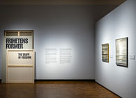
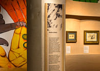
Nissen Richards Studio also undertook all the project’s graphics, including interpretation panels and layouts. The interpretation is present but hidden, so that visitors can choose exactly how deeply they wish to delve into an object’s history, including backlit image panels within drawers. Moving images are always on the horizontal plane, so as not to attract too much attention from a distance. The exhibition’s identity centres on the idea of light, with the ‘O’ of Opplyst taking the form of an illuminated halo.
Status: Built
Location: Oslo, NO
Firm Role: Exhibition and graphic designer
Additional Credits: Client: The National Library of Norway
Exhibition & graphic design: Nissen Richards Studio
Lighting Designer: Studio ZNA
Main contractor: Petter Halvorsen
Specialist wall finish contractor: Factory Settings
Showcase contractor: Meyvaert
AV specialist: Sysco Productions
Graphics production: Displayways
Photography: Gareth Gardner


