London, GB
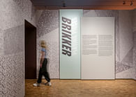
London-based architects and designers Nissen Richards Studio have completed their fourth exhibition for The National Library of Norway in Oslo. The exhibition deals with one of the most intriguing subjects the studio has dealt with to date – the musical phenomenon of Norwegian Black Metal, a cultural world-within-a-world described by the curators as a ‘primeval forest of emotions’.
‘This has been a particularly thrilling and theatrical subject to investigate and work with’, Nissen Richards Studio Director Pippa Nissen commented. ‘Our team has responded with great enthusiasm and creativity to the curatorial brief ‘to inspire the audience to search within their own feelings and reactions’ and has considered analogue, natural, religious and literary sources, as well as plenty of sonic input, in order to create an environment that challenges those not familiar with black metal’s core themes. The design creates a series of atmospheres that feel more like scenography and it was really enjoyable to work with subject matter that enabled this.’
The Brief
The brief from the curatorial team at The National Library of Norway was one of the most poetic the Studio remembers receiving…
‘Black metal in its most primitive form is raw music, unpolished, direct. Feeling far exceeds form. Which means black metal diverts from many other subgenres within heavy metal where skill must be heard in the songs. For many, this impenetrable and chaotic, uncomfortable, cold, and dark sound can have a repellent effect. However, for others it acts like a kind of medicine. If we dare approach the dark and uncomfortable sides of ourselves and the world through this music, there could be something to be gained for all of us. But you have to do the work yourself….’
The Approach
The curators asked that the exhibition shouldn’t be a typical, exhaustive historical-chronological presentation, but one that went much closer to the heart of the matter in relation to a musical form many find alienating, even ‘evil’, especially in relation to the events of the early 1990s, when the scene became associated in Norway with a criminal wave of brutal murders and churches burnt to the ground. At the same time, this seemingly-impenetrable scene allowed fans to belong to something exciting and communal within a world that itself can be chaotic and difficult. What is it about black metal therefore, the exhibition asks, that makes this music so important to so many around the world?
The Concept
The exhibition is located within a new, dedicated temporary exhibition space on the first floor of the National Library, featuring inbuilt flexible pivot walls and new lighting rigs. The space is rectilinear and includes built-in lightboxes as part of its kit of parts.
‘We maximised the creative use of darkness in our conceptual approach’, Kate Coghlan, Associate at Nissen Richards Studio explained. ‘This of course also made our use of light particularly impactful and theatrical, with the darkness creating a shifting environment when used along with high impact graphics.’
The Studio’s graphic approach, led by designers Dario Pianesi and Jessie Gardiner, plays on shades and textures of black, together with the incorporation of a large number of analogue items, from posters and record covers to magazines, fanzines and old typewriters, whilst the exhibition’s environmental graphics pull on everything from TV static to tattoo-like borders around a wall of 2D artefacts.
The Themes
Spatially, the exhibition has six separate thematic sections:
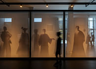
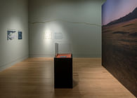
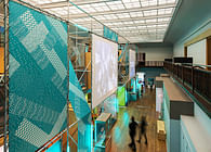
The entrance area uses the idea of the forest, in the form of full-height gauze walls backlit with a black-and-white forest print and introductory text on monochrome panels, to create an immersive, moody and atmospheric portal into the exhibition, communicating a feeling of calm but with a certain sense of lurking menace at the same time. The section draws inspiration from Norwegian nature and the role of its ancient forests in the country’s myths and legends – and also acknowledges the strength of black metal’s mainly rural, rather than urban, fanbase.
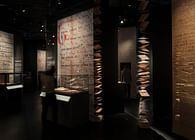
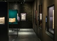
Visitors weave through the forest area and into the Black Music Box, where the walls are clad, floor-to-ceiling, with charcoal-hued spiked foam panels of the type used to provide acoustic insulation in recording studios. There’s an immediate shift in emphasis here to the music itself, with an invitation to ‘unprejudiced listening’ on the part of the visitor. Showcases with black, textured monochrome lining display album sleeves and related cultural ephemera, whilst listening stations invite a potentially first exposure to the music itself, with an accent on the beginnings of the scene, as well as showing videos of and interviews with key exponents.
3. Inspiration
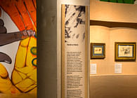
This area examines the link between the iconography of black metal and the expression and symbolism of religious and fantasy-genre texts and illustration, from the illustrations of Gustave Doré in old versions of the bible, re-appropriated for album covers by bands such as Emperor, to pentagrams, old and new Satanism, fantasies about the realm of the dead, blood, spirituality, negativity, the underworld, anti-religion, Nietzsche, the horror genre, Tolkien and Norse mythology.
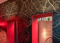
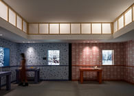
Large-scale prints of illustrations by Gustave Doré and Theodor Kittelsen line the walls here as wallpaper, whilst a room inset features an old, graffiti-covered door from a notorious record shop called ‘Helvete’, meaning ‘Hell’, making this the ‘door to hell’, which immediately communicates both the fear and the thrill of cultural transgression that forms part of the scene’s love of extremes. The expressive graphic treatment uses dibond for an etched feel, catching the light, so that the darkness is always countered with lighter or reflective elements.
4. International Community of Outsiders
Musical ‘tribes’ are a great way to meet others who feel just like you. This area looks at the way people come together with a similar outlook on life, often from their bedrooms, including a bedroom set-up showing a typical teenage black metal fan’s personal space with desk, chair, wall and shelf, full of books, magazines, posters and artefacts, plus a band-name-covered jacket slung casually over the chair.
Additional walls are in dark-stained OSB (oriented strand board), expressing a deliberately rough-and-ready aesthetic, and serving as a backdrop to objects of interest, whilst another features a wall-to-ceiling graphic of individual flyers and articles with a tattoo-like edge, designed by the Nissen Richards Studio graphics team, displaying journalist articles, letters and illustrating the home-made fanzine culture, xerox aesthetics and the friendships that arose out of tape-trading and the sharing of musical influences.
The influence of ‘Slayer’ magazine is highlighted via a wall of magazine spreads, whilst its magazine’s founder, Jon ‘Metalion’ Kristiansen, talks of the history of Slayer mag and his role in early Norwegian black metal.
5. Listening Station
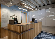
This interactive area is all about sound recording and looks at the classics of Norwegian black metal. Here, the visitor becomes the producer, able to enhance or decrease the sound levels of drums, bass, guitars and vocals via a studio-style mixing desk. The section’s aesthetic pays homage to the real-life Grieghallen Studio in Bergen through its floor-to-ceiling timber panelling, with a huge-scale photo of the actual recording studio, where many classics of the genre were recorded.
6. Satanic Panic
This minimal and sombre space reflects on the terrible events of 1992-94, when the sub-cult of black metal went overground in the most sinister of ways, with church burnings and a number of murders and deaths, including that of a fireman trying to put out a church fire at the Methodist Church in Sarpsborg.
Visitors can look back at TV segments and news clippings of the time that try and say something about what happened and its consequences in the most sober and reflective way possible. It was important that the design of this section was also more restrained in order to let people think and assess what happened in their own space and time. Two very simple, but highly-effective right-angled walls here mimic TV static via a bespoke graphic wallpaper that suggests the shock of this turn of events as it happened.
‘Norwegian Black Metal is a music genre and cultural phenomenon associated with a distinct style and aesthetic’ Marte-Kine Sandengen, Head of Exhibitions at The National Library of Norway commented. ‘Nissen Richards Studio excelled at the opportunity to investigate and interpret such an aesthetically-strong means of expression. Their design for ‘Bad Vibes’, with its many nuances of black, the dramatic use of images and exciting material variations is, I must say, as strong and impactful as the genre itself. I can’t imagine any other studio taking on a project with greater creative eagerness and with such a keen eye for staying within the genre’s own dos and don’ts.’
Status: Built
Location: Oslo, NO
Firm Role: Exhibition Designer / Graphic Designer
Additional Credits: Photography Gareth Gardner
Lighting Design Light Bureau


