London, GB
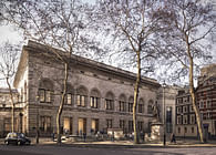
Architects and exhibition designers Nissen Richards Studio have completed a dynamic, colourful and historically-significant project for the Wallace Collection. Forgotten Masters: Indian Painting for the East India Company, guest-curated by renowned writer and historian William Dalrymple, is the first UK exhibition of works by Indian master painters that were originally commissioned by officials from the East India Company in the late eighteenth and nineteenth centuries. The exhibition represents an unprecedented opportunity to see these vivid and highly original paintings together for the first time, recognising them as among the greatest masterpieces of Indian painting.
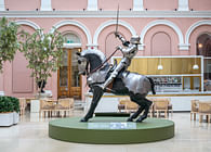
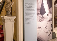
Nissen Richards Studio undertook both the exhibition and the graphic design for the show, along with the script-editing. The graphics remit included interpretive information, as well as posters, banners and other marketing collateral. This is the studio’s fourth project for the leading London gallery, following the graphic design on an exhibition on Sir Richard Wallace; the 3D and graphic design of Helmet Heads, featuring Henry Moore’s celebrated series of helmet head sculptures, and the London Design Awards 2019 gold-winning project, An Enquiring Mind: Manolo Blahnik at the Wallace Collection.
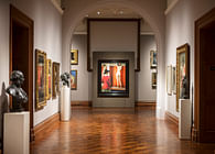
The artists behind the stunning natural studies of flora and fauna in Forgotten Masters were never credited at the time of commission and the exhibition sets out to right that wrong by restoring proper authorship in almost all cases. The artists whose works are on show include Shaikh Zain ud-Din, Bhawani Das, Shaikh Mohammad Amir of Karriah, Sita Ram and Ghulam Ali Khan. An important aspect of Nissen Richards Studio’s interpretive approach was the way in which the works are introduced to visitors, ensuring that for the first time, the artists come first, with artist portraits featuring in the very first vista of the exhibition.
The array of dazzling and often surprising artworks, which reflect both the beauty of the natural world and the social reality of the time, offer a rare glimpse of the cultural fusion between British and Indian artistic styles during the period. The artists hired by East India Company often created artwork albums, such as the famous Impey album, commissioned by Lady Mary Impey, and were heirs to an artistic tradition of precise observation whose roots lay in medieval Iraq and Iran. The miniaturist art style was brought to India by the Mughal Empire and the training it involved enabled artists to adapt to the later requirements of the science-obsessed English aristocrats and officials of the East India Company, using the modern paper insisted on by the commissioners, whilst still being presented in the Mughal album tradition. Other paintings in the exhibition focus on people, from soldiers to beggars, as well as on buildings, from the grandeur of the Taj Mahal to everyday village life.
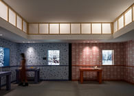
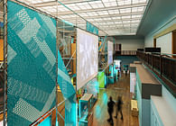
‘Our approach to the exhibition design for this very special project’, Nissen Richards Studio Director Pippa Nissen commented, ‘was to explore different ways of siting the artworks against a bright colour on long colourful vistas, picking up on the colours within the artworks and enabling them to resonate further. We also created dynamic physical thresholds between sections through new wall structures and the use of colour to indicate a change in focus or period.’
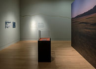
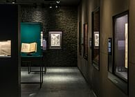
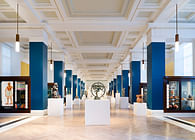
The exhibition layout creates a very different feel for this space than that of previous exhibitions so that it feels notably fresh for visitors. The long central space has been subdivided into room-sets to create five thematic showcase areas, using single-coloured walls that relate to and complement the paintings in order to create instinctive step-changes for visitors, as well as new, sub-dividing wall structures that stand proud of the perimeter and create the feel of a series of rooms. The internal surface of the linking threshold doorways has been painted a cool white to create a theatrical break between themes and underline a sense of transition. When visitors look down the whole space, these flashes of white create an accent between the brighter colours. The existing light-mid toned timber flooring also ensures an overall sense of balance with the saturated intensity of the coloured walls.
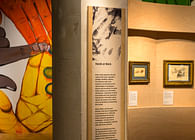
The sections of the exhibition are: The Master Artists of Lucknow; Sheikh Muhammed Amir of Karriya and Yellopah of Vallore; The Natural World; The Master Artists of the Impey Album; The Late Mughal Master Artists of Delhi and Agra; Sita Ram and the Hastings album. The interiors of the showcases that punctuate the space have been lined in a fabric that suggests the natural textures of silk dupion in bright colours that contrast with the walls. Information on individual artists and artworks is presented via a simple and subtle graphics approach that references the symmetry of the botanicals within the artworks on display. Information on each of the five showcase sections has been applied directly onto the walls in black or white and set within decorative borders directly inspired by the paintings. A similar decorative motif has also been used for the map locations in the entrance area.
Status: Built
Location: London, GB
Firm Role: Exhibition and graphic designers
Additional Credits: Photography by Gareth Gardner


