London, GB
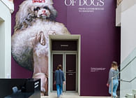
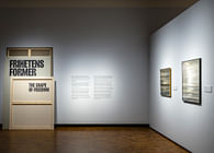
Nissen Richards Studio has once again worked with client Historic Royal Palaces - this time on a new, temporary exhibition at London’s Kensington Palace. Life Through a Royal Lens explores the Royal Family through photography and brings together in one place some of the most iconic images of the Royal Family ever taken. The new exhibition is now open and runs until 30 October in Kensington Palace’s Pigott Galleries.
The commission to Nissen Richards Studio follows a successful collaboration between the cultural-specialist architects and exhibition designers with Historic Royal Palaces on Victoria: Woman and Crown, an exhibition which went on to win the 2021 Eastern Eye ‘Editor’s Special Award’ for its portrayal of the relationship between Queen Victoria, the British Empire and the Indian subcontinent.
Life Through a Royal Lens brings together more than 100 photographs charting the relationship between the monarchy and photography from the technology’s fledgling beginnings in the 1840s up to the present day. It explores the ways in which the British monarchy has used the medium to shape its public image and how Queen Victoria and Prince Albert’s enthusiastic patronage of photography in its infancy helped this new invention receive greater scientific and public attention.
The photography in the exhibition ranges from commissions by some of the greatest names in portrait photography, from Cecil Beaton and Lord Snowdon to Annie Liebowitz and Rankin, alongside images taken by Royal Family members themselves and snaps taken by and for worldwide contemporary media.
‘The exhibition parallels the lives and representation of the Royal Family alongside changing technologies in the field of photography’, Nissen Richards Studio Director Pippa Nissen commented. ‘In terms of a design treatment for the exhibition, this joint subject matter pointed away from a strictly chronological treatment towards thematic areas instead, which allow visitors to examine the context and purpose of each photography typology.’
The exhibition is therefore made up of five sections, each with a dominant theme:
1 - Innovators and Patrons 2 - Ceremonial Occasions 3 - Portrait Commissions 4 - Family and Home 5 - Monarchy and the Media
Design Treatment
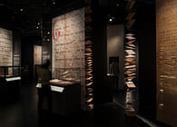
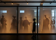
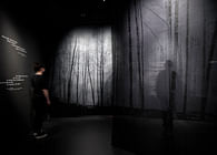
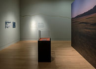
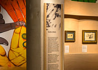
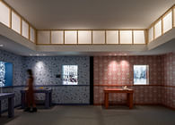
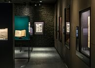
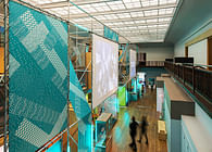
‘The design language is all about framing, layering and transparency’ Kate Coghlan, Nissen Richards Studio Associate explained, ‘with solid frameworks representing formality and backlit gauze layers of semi-transparency representing informality, whilst also demonstrating how you are always seeing layers of information. The materiality of the exhibition contrasts sharp and hard lines with softer lines and textures to express this, whilst at the same time the exhibition also runs thematically from formality to informality. Staging, the use of scale and the cleverly-adjudged use of light are key elements of the design, underlining the fact that the photographs on show are themselves choreographed.’
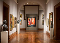
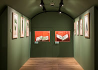
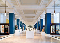
The wall colours of the five thematic spaces move from blue to red and through pink, beige and white, with all shades taken from colours with royal associations, with particular inspiration taken from a single portrait shot of Her Majesty the Queen with her two eldest children when they were young – and includes royal blue for formality and deep red to represent ceremony. Pink is used for the studio photography portraiture section, whilst beige evokes a domestic feel for the family album area, with the spectrum ending on stark white for the media room.
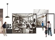
The exhibition’s graphic language is also entirely drawn from motifs from the world of photography, ranging from information cards with missing corners to denote photographic albums and tall, thin graphic panels that resemble negative strips. The concept of semi-transparency is inspired by negative strips.
Design Walk-through
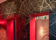
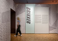
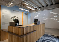
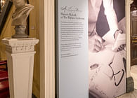
The exhibition begins with a dramatic ‘portal’, in the form of a 3D camera lens surrounding the entrance door, so that visitors feel to enter the world of photography as they pass through the lens surround. The introduction space, which follows, features a large intro panel and a huge lightbox to the right, based on the idea of a 35mm slide and made up of layered images, immediately demonstrating and underlining the language of photography.
The images on show vary in scale, from original ‘cartes de visite’ to larger-scale prints. Formats range from black and white to colour prints and from holograms to digital books. Finely-adjudged lighting highlights tiny works such a jewellery lockets and individual pages from photo albums.
The ‘Innovators and Patrons’ area shows how quickly the Royal Family adapted to and saw the potential of photography, particularly in the case of Queen Victoria, who is believed to have said ‘I have to be seen to be believed.’
The Ceremonial Occasions section explores the photographic record of official royal events as Jubilees, State openings of Parliament, Royal Investitures, Coronations & the Delhi Durbar, Order of the Garter ceremonies and Trooping the Colour - examining the importance of ceremonial dress in the portrayal of pageantry and prestige.
The Portrait Commissions area sees the evolution of collaborative image-making by photographers such as Cecil Beaton – one of the great shapers of royal image in the twentieth century - showing how he redefined modern royal portraiture. Stunning images of Her Majesty the Queen and Queen Elizabeth the Queen Mother, among Beaton’s most faithful sitters, demonstrate how his work influenced public perceptions of the royals.
The Family and Home area uses motifs of the home to suggest domesticity, including images hung as if on living room walls to unveil a secret-yet-relatable off-duty world. A second dramatic entrance portal precedes the final Monarchy and the Media section, where a wall of photographers is depicted as if lined up to snap visitors as they enter. This final room is bright and white, inspired by flashlight light, to evoke a world of magazines and the internet.
As a fun rejoinder to the exhibition, an installation is included on the way out, based on the ‘carte de visite’ idea, where visitors can have their own photograph taken.
Status: Built
Location: London, GB
Firm Role: Exhibition designer, graphic designer
Additional Credits: All images by Gareth Gardner


