London, GB
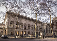
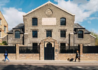
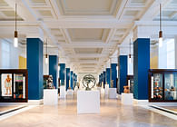
The Courtauld Gallery has re-opened after the biggest redevelopment since it first moved to its magnificent 18th century home, Grade I-listed Somerset House in the Strand, in 1989. Cultural-sector specialist architects and designers Nissen Richards Studio were charged with the interpretation of the new visitor experience for the project, considering the entirety of the visitor journey from arrival, through all three levels of gallery space, culminating in the extraordinary LMVH Great Room. The remit included the scheme’s gallery and exhibition design – including a brand-new interior colour scheme; bespoke visitor furniture and artwork showcase design, as well as the project’s wayfinding and signage. The design team also worked closely with Studio ZNA on the new lighting design.
‘Our overall approach was to introduce elements that worked with the Grade I-listed building in a subtle yet contemporary way’ Pippa Nissen, Director of Nissen Richards Studio commented. ‘We used materials that would complement and highlight the beauty and character of the building. Our gallery designs sought above all to showcase The Courtauld Gallery’s superlative collection, as well as the classical architecture and sheer scale of the rooms at Somerset House, whilst at the same time ensuring visitors enjoyed a sense of intimacy with the works.’
Nissen Richards Studio’s approach began with a consideration of the physical aspects of the environment, including the complexity of spaces and the way visitors experience and flow through them. Computer modelling was used to map visitor flow forensically, from street level into the entrance hall and then through the thirteen individual gallery spaces.
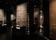
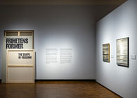
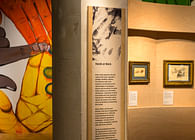
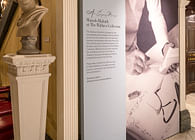
‘The wayfinding and interpretation for the redesign was created in layers’, Pippa Nissen explained. ‘We used an artisan process to create beautiful and bespoke etched panels that deliver the text in a way that feels seamless with the building and the atmosphere of the rooms.’
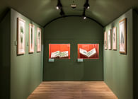
Another element of the scheme’s new signage family is the paper-based artwork signage, using Canson paper – which has a long association with the world of art - slotted into patinated brass holders.
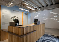
The design of the new arrival area centred on uncluttered, simple volumes with full accessibility, including a new matt Corian reception desk with concealed storage and a stepped design. A new display wall to the right of reception for exhibition catalogues uses lipped-detail timber. A queue divider furniture element on casters breaks up the space and is a subtle way to help direct arriving visitors. A feature floating light above is one of several major new feature lights in the scheme, deliberately contrasting with the minimal track lighting in the galleries.
Other new bespoke furniture includes benches throughout the galleries and at key rest points, such as by the lifts. The benches are in oak, specially matched to the gallery’s floorboards, with a butterfly profile and wide, generous feel. The metal frames supporting the benches make them heavy enough to be stable, whilst light enough to be easily re-positioned.
Bespoke showcases were developed throughout by Nissen Richards Studio and manufactured by Florea d.sign, with a ‘family’ of cases for each gallery, made up of plinths in cool white Corian, on nonreflective glass cases and shelves, depending on the art being displayed.
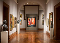
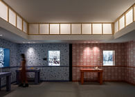
Nissen Richards Studio also created the new paintwork colour scheme throughout the interior spaces, taking inspiration from the artworks themselves. These range from the domestic-inspired warm colours of the Bloomsbury Room to the lighter pinks and blues of the Blavatnik Fine Rooms, working in each case with the proportions of the galleries, the ceiling height, the nature and colourways of the artworks and the North- or South-facing light. A calming off-white dado level throughout provides a clear linking element, with the walls themselves holding the colour to work at their best with the art in each of the key areas – the Medieval Room, Blavatnik Fine Rooms, Bloomsbury Room and the LMVH Great Room. For the hang of the paintings themselves, stainless steel wires were used, which stand proud of the galleries’ historic walls and were spray-painted to blend in seamlessly.
The practice also worked closely with lighting designers Studio ZNA on the project, with lighting acting as a guiding tool to help direct visitors, as well as to optimise the display of the Institute’s world-renowned collection. A new track layout has replaced the individual lights previously attached to artwork frames and was carefully integrated – with on-site testing undertaken to ascertain optimum distances - within the decorated heritage ceilings to allow visitors to appreciate longer and more unobstructed vistas.
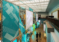
The LMVH Great Room, on the top floor, forms the final crescendo to the new visitor experience. Nissen Richards Studio played an integral role in realising the bold new vision for this room, developing freestanding divisions and opening the room up after years of being partitioned into smaller, more cellular spaces.
‘Until 1837, the Great Room hosted the annual summer exhibitions of the Royal Academy of Arts, so it has an incredible history’ Marie-Lise Oulmont, Associate Architect at Nissen Richards Studio explained. ‘Then, since 2002, the room had temporary walls splitting the room to facilitate the hanging of artworks, but this feature inevitably also concealed the true volume and grandeur of the space. We were delighted therefore to be given the challenge of creating the new display scheme, which provides a dynamic and exciting setting for Samuel Courtauld’s famous collection of Impressionist and Post-Impressionist paintings within this historic room setting, been restored once again to its original proportions.’
The new configuration takes the form of a series of continuing spaces, which control flow and allow for a more intimate experience of the artworks, whilst retaining the experience for visitors of a single volume. Four new walls create a dynamic final setting within a layout that breaks up the conventional gallery perimeter wall hang and is completely visible from the point of arrival. This ensures a sense of discovery for visitors, allowing the collection to be viewed in defined groupings, each with equal prominence.
‘Working closely with the project team and curators, we have created an engaging environment with elegant displays, enhanced within the historic setting’ Pippa Nissen concluded. ‘Everything supports the Gallery’s ethos of enabling unhurried and personal enjoyment of great masterpieces within a distinctive environment, whilst encouraging the public to foster deep encounters with the breadth of the collection and the history of Somerset House. We very much look forward to seeing visitors enjoy the galleries and the artworks for themselves.’
Status: Built
Location: London, GB
Firm Role: Gallery designer, Interior designer, Wayfinding and Signage designer
Additional Credits: Exhibition design and bespoke showcases: Nissen Richards Studio
Signage and wayfinding: Nissen Richards Studio
Base-build architects: Witherford Watson Mann
Lighting design: Studio ZNA
Fitout and signage contractor: Factory Settings
Graphics contractor: Displayways
Showcase manufacture: Florea d.sign
Bespoke paint colours: Developed with Little Greene
Photography Gareth Gardner


