London, GB
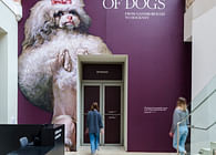
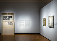
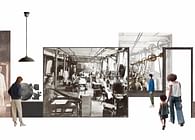
Cultural specialist architects and designers Nissen Richards Studio have completed a stunning exhibition for two different clients in two different venues: MUNCH in Oslo and KODE in Bergen. Playing Pieces is a collaborative exhibition, sponsored by and featuring the extensive art collection of philanthropic organisation Sparebankstiftelsen DNB - who also played a curatorial role in the project, together with the teams from MUNCH and KODE. Nissen Richards Studio was asked to create a single concept exhibition that would be recognisably the same for both venues, whilst also uniquely suited to the different spaces and the graphic identity of each institution. Playing Pieces has now opened at Oslo’s MUNCH and will transfer after its late August completion to KODE in Bergen, where the exhibition will run from 22 November 2022 to 26 February 2023.
The brief asked for ‘an exhibition experience that creates engagement, reflection and inclusion for a wide audience’ and which looked ‘to show a diverse world-class art collection and ask critical questions about the stories we tell each other through art and the institutions that characterise cultural life in Norway.’
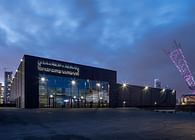
The proposed concept for the 167-artwork show had to work well within the new-build confines of the new MUNCH museum building, designed by architects Estudio Herreros and which opened in October 2021 as the world’s number one destination for experiencing Edvard Munch’s art, as well as a diverse range of modern and contemporary art. Secondly, the concept had to work equally well within its subsequent host venue of KODE in Bergen. KODE Art Museums and Composer Homes is one of the largest museums for art, craft, design and music in the Nordic countries, occupying four buildings in Bergen city centre.
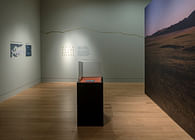
The specific location for the first show is the entire third floor of MUNCH, comprised a 1,100 sq m of rectilinear, L-shaped floor space, divided into a large hall (810 sqm) and a small hall (290 sqm). The KODE exhibition location, also on the third floor of the museum, is comprised of three rooms and is formed of a central atrium space with two adjoining wings, as well as a ground floor introductory space.
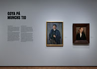
‘The key to this unique challenge’, Pippa Nissen of Nissen Richards Studio commented on the Studio’s approach, ‘was to design a spatially-simple approach that could work in both spaces, with a clear exhibition identity created by bold use of a series of colours and texture, which are individual to the particular artist or group of artists that forms the focus of each main segment of the exhibition. We underwent a long and careful process of collaboration with both clients in order to ensure equal ownership over the direction and the appropriateness of the results for both. Another key difference was the availability of MUNCH’s brand-new adaptable wall system for display, whilst at KODE we purpose-built new display walls. Finally, the graphics treatment needed to differ for each exhibition to reflect the graphic identity of the host museum.’
Playing Pieces - Curatorial & Design Concept
The concept behind the shows was the presentation and thematicisation of Sparebankstiftelsen's art collection, shedding light on the organisation’s activities as an art collector and on its role in Norwegian art life, as well as the cultural relevance of each section’s artworks. The priority areas of that collection – embracing paintings, graphic works, photography and sculpture - formed the eight thematic sections of the exhibition, which are as follows:
The eight themes are identical to both exhibitions, though the KODE display sees a swap in the order of the Kurt Schwitters and Friends / American Street Photography sections in order to suit the given space, whilst the Pioneering Women area will feature on the ground floor at KODE, where it will form part of the exhibition’s introduction. All smaller elements of the display, from plinths, benches, tables to physical interactives and digital installations, will travel with the artworks from MUNCH to KODE.
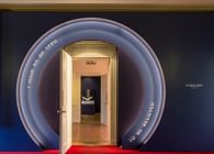
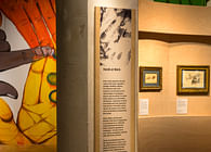
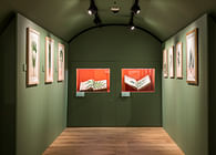
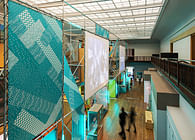
The design concept was to create a paced journey with a binding thread and moments to reflect to vary the pace and allow full absorption of the incredible artworks on display here. While colour and texture separate each of the eight main themes, there are also four ‘interval’ installations in the Nikolai Astrup, Pioneering Women, Kurt Schwitters and Friends and American Street Photography sections, to draw the audience in further. Nissen Richards Studio also sought to create visual interest through connections and thresholds, taking into account views beyond the immediate at all times, whilst contextual material on the artworks is shown in a clean and composed way on the fronts or outsides of each wall or room.
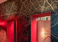
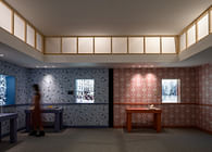
“We really enjoyed using colours that resonated with the themes and the shift across the gallery spaces” Pippa Nissen added. “We wanted the colours to engage audiences emotionally, so that they bind the content of each section together. The configuration of the walls and spaces then reinforces these thematic shifts. We enjoyed too the creation of patterns and textures that speak about each section, creating a subtle underlayer to the interpretation. These pieces of the puzzle then appear as a collage in the intro and outro sections.”
Design Walk-through
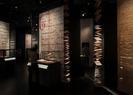
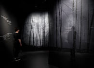
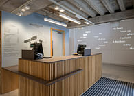
A textured introductory space is followed by the first Nikolai Astrup area. Here, the works are backed by sub-narratives about the art and its themes and processes, whilst a reflections area tells of the artist’s ‘local to global’ story through text panels with an integrated collage of press headlines. A digital interactive area creates an interval, in the form of an immersive multimedia installation in which fragments of Astrup’s art are integrated into dynamically-shifting natural environments. Nissen Richards Studio worked closely with the project’s AV specialists, Yoke, a digital design company from Denmark, on the sound accompanying this immersive piece, which seeks to conjure a sense of places as Astrup himself did in his work.
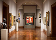
The spatial approach to each theme shifts slightly as the exhibition proceeds to accentuate the content. From angular views to the use of texture and open space, each area is gently reflective of its content, whilst taking care to ensure the build is always subservient to the art. German Expressionism – with a geometric emphasis, including angular walls with lighting accentuating the angular drama – and then Putting Munch in Context with a graphic feel - then follow and are differentiated by different choices of colour. Moments for pause are also provided by benches, with tops printed using a special textured design, created by the Nissen Richards Studio graphics team.
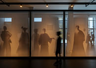
The Pioneering Women section comes next, with the artworks here large-scale, whether paintings or sculptures, with sound points an additional part of this section. This is followed by the green-painted Kurt Schwitters and Friends section, which also includes a large-scale fun interactive in the form of a ‘make your own collage’ wall, using a photo as a backdrop and using coloured shapes and pin board. The Warhol After Munch section is a shock of bright colour, whilst American Street Photography is a rich dark blue, with images arranged in a salon hang and a further immersive multimedia installation sitting alongside. Here, photographs from the exhibition are projected onto the wall at large scale and mobilised through sound and visuals in order to convey the art of picture-taking in American urban spaces as both an embodied and lived experience.
“The pause spaces are opportunities for visitors to engage and reflect on what they’re seeing in a different way” explained Pippa Nissen, “looking again and being encouraged to dream and imagine around the content they are seeing.”
The final ‘New Playing Pieces’ themed area features five artworks, with the whole exhibition finishing on the first painting of a brand-new collection for the Sparebankstiftelsen DNB – exemplifying the idea that collecting never ends and is forever beginning again. A final interactive wall and table asks visitors about the art of collecting – ‘What do you think should be collected and preserved?’
Nikita Mathias, Senior Concept Developer at MUNCH, commented on the exhibition’s design: “Nissen Richards Studio have created a beautiful, engaging and accessible exhibition. It both gives centre stage to the art and caters to a broad and diverse group of visitors and their specific needs. Through the strategic use of colour, texture, text, seating, spatial variety, as well as participatory and immersive elements, the exhibition has become a space in which everybody feels invited to see, learn, play and partake. This is also the result of the studio’s ability to facilitate a smooth, productive and inspiring interdisciplinary development process which brings out the best in everybody in the team.”
Status: Built
Location: Oslo, NO
Firm Role: Exhibition designer, graphic designer
Additional Credits: Photography Gareth Gardner
Digital Design Yoke
Main Contractor Spekta


