
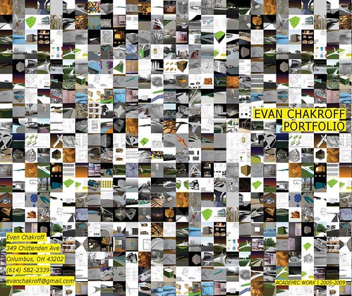
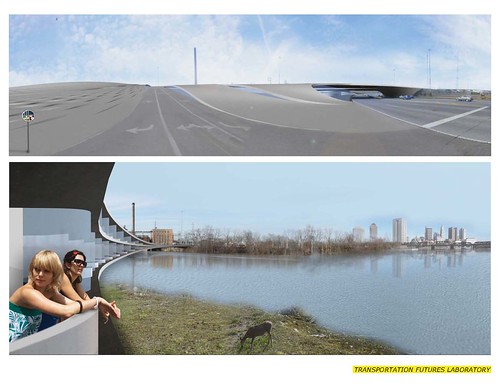
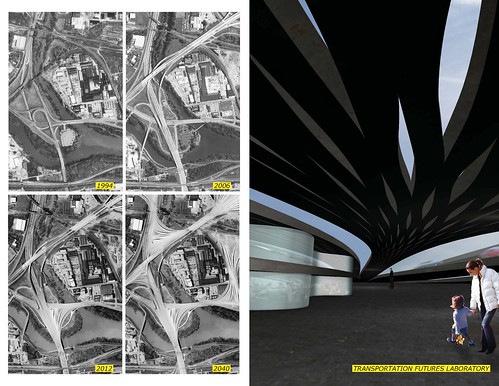
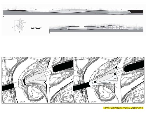
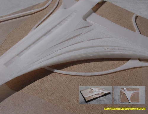
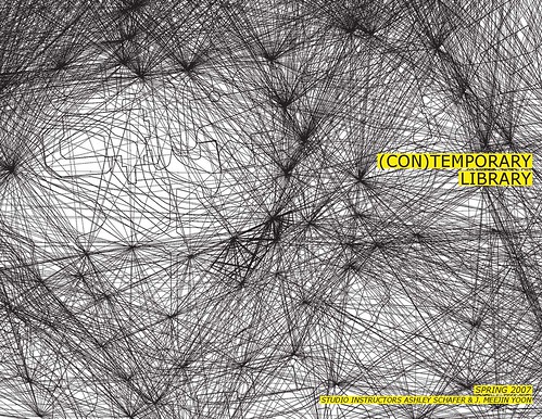
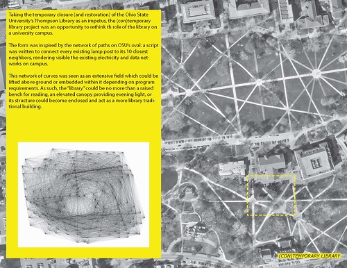
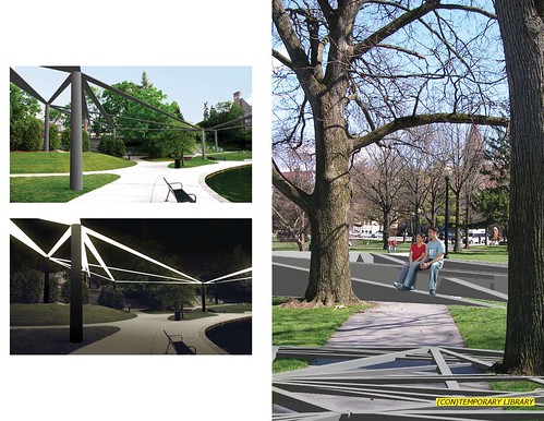
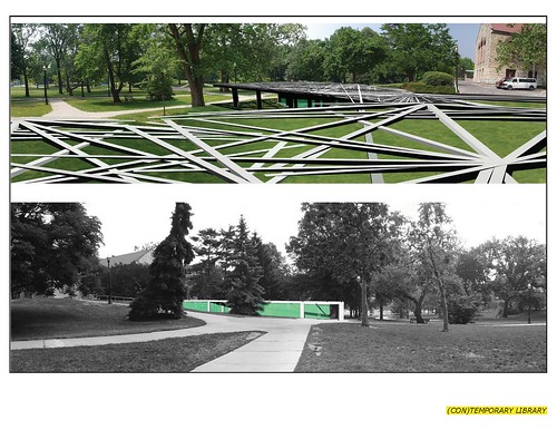
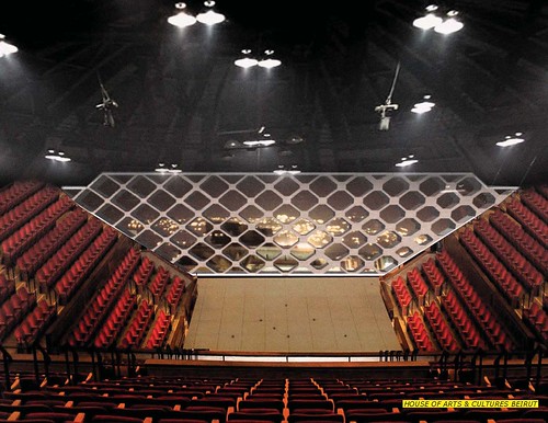
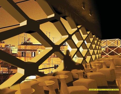
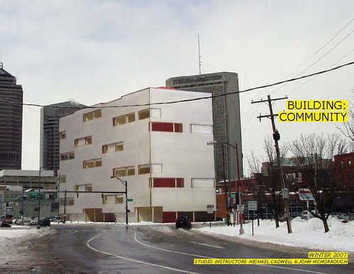
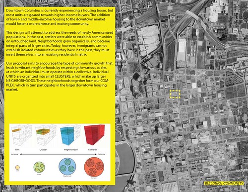
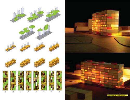
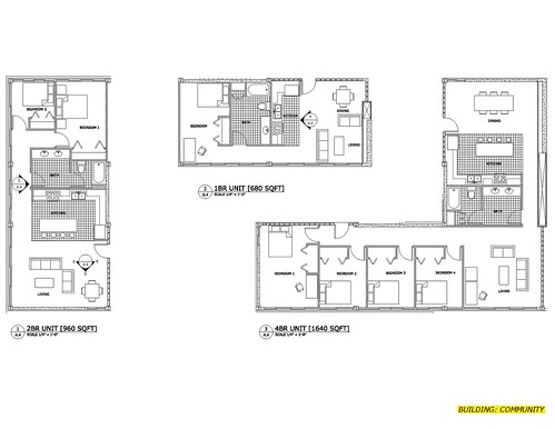
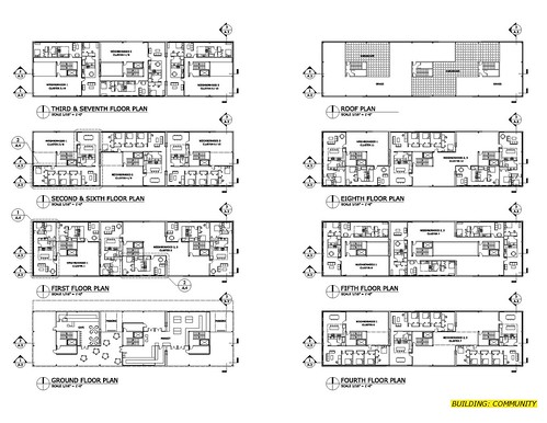
So, it's spring break here at OSU, meaning I've finally got some time to catch up on GA work and to start laying out my portfolio.
This is draft #2, following the general layout of my work samples pamphlet i put together quickly for the KSA career fair (and didn't show to anyone...)
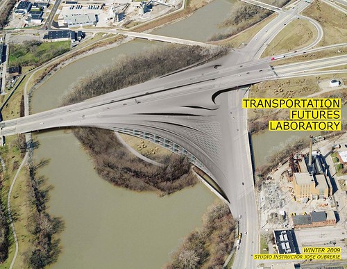
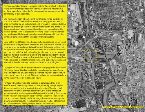
I'm not sure yet how i feel about the overall design, especially compared to my last portfolio, which looks pretty clean & uncluttered by comparison.... i'm debating including some more of the older projects, but i don't want this to get too expansive....
anyway i'm curious what you all think, especially if you've been following my work this year. brutal criticism is, of course, encouraged.
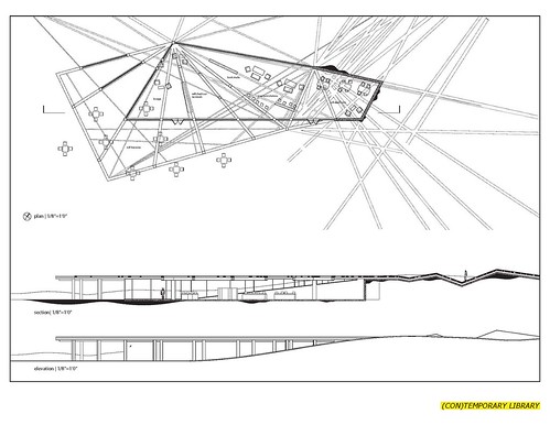
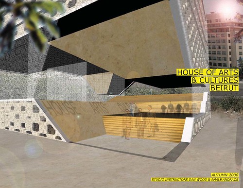
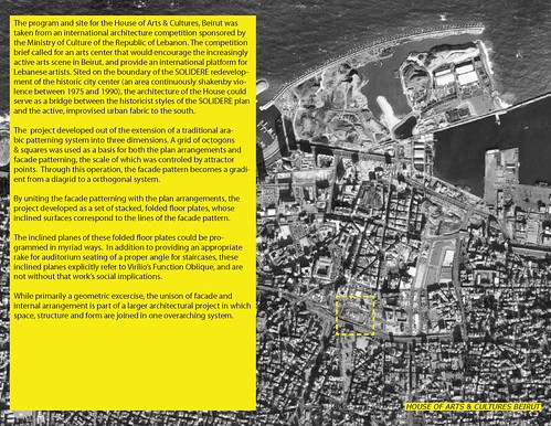
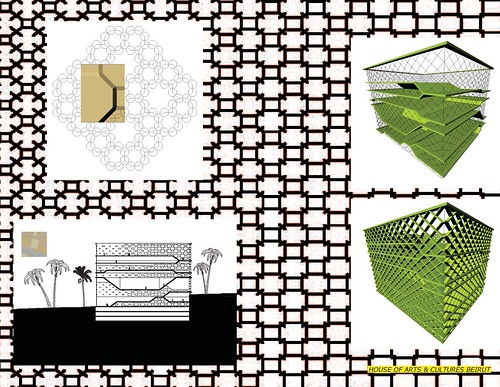
(full set, high res, on flickr)
-------
Thoughts on the M.Arch I program at the Ohio State University, 2005-2009, plus additional work with OSU as a critic and lecturer.


2 Comments
looks slick. The images (renderings) are very nice...something I wish we produced a bit more of here. We're a bit too diagram + photomontage heavy, especially in grad school.
I'm typically one for clean portfolios...but I think you've maximized well.
It's odd for me, being a columbusite, to see cool work sited in a city with which I'm actually familiar. I always enjoy your blog for that.
thanks jacob. i'm a little worried its too heavy on the photoshop work, and lacking in diagrams.... but then it's representative of what i've been doing here.....
since then i've edited the layout a bit and bound it. you can see it in my next blog post.
Block this user
Are you sure you want to block this user and hide all related comments throughout the site?
Archinect
This is your first comment on Archinect. Your comment will be visible once approved.