
Ah yes: summer school. Once regarded as the dreaded nadir of the pit of despair (at least for me while trudging through grade school), summer school took an enticing twist this year. CCA's Studio 333 (three critics, three weeks, three times the fun...) was a great way to cram your brain into an atom- smasher. We were given a single primary material, industrial plastic film, to explore, test, destroy, and distill the beauty of. Our findings were to be expressed in a large scale installation in CCA's hallowed halls. Our critics were excellent, with each bringing a distinct critical precision to the table:
Nadar Tehrani
Office dA
Raveevarn Choksombatchai
LOOM Studio
Stephen Cassell
ARO
My team mates (Misha Packer, Patrick Flynn, Paul Taylor, and Donnie Gonzales) and I received excellent challenges and proposals from each instructor, enabling us refine our work into a statement unlike what any of us could have come up with on our own. A very solid team work experience to be sure.
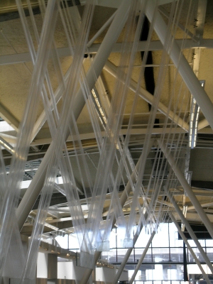
The pix below are of the entire class's installations, with my team's project being represented first.
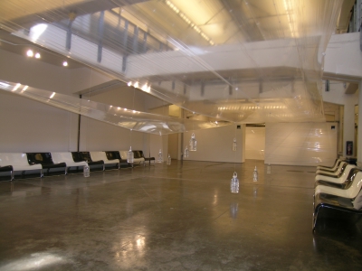
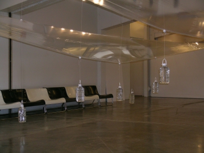
Our scheme flows over the Alpha Void, a double height space achieved through a slab penetration yet divided by a large beam and expansion joint. The plastic film ribbons are stretched across the long dimension with adjacent ribbons overlapping each other, creating a continuous surface. Small, white spheres form dependable mounting points in the plane, from which weighted pendula are either suspended from below, or pull from above through the use of UniStrut mounted eyelets.
The suspended weights form a field beneath the upper skin, which reacts according to the inputs of visitors who pass through. As the weights are moved laterally and pulled vertically, the plastic film plane responds enthusiastically, much like water. Some points will pull the plane downward, while others pull up creating a morphological effect of constant flux.
The second skin floats between the upper film and the lower field of pendula. A key concept is a mechanical scheme that allows the interstitial skin the move in a counterintuitive manner in comparison to the direct relationship between the upper skin and pendula. For example, pulling a certain weight down will result in the lower skin stretching upward to almost meet the upper skin, whereas a different weight causes the opposite response from the skins.
The resultant spatial experience is one of discovery and ephemera. Visitors affect the forms both actively and passively, enjoying three layers of response to their inputs. Oblique views through the layers continually treat the inhabitant to a variety of juxtapositions of material, assemblage, airflow, and diffused light.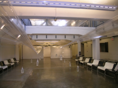


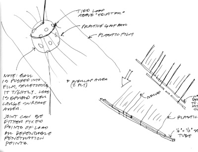
Some sketches of our details from my sketchbook: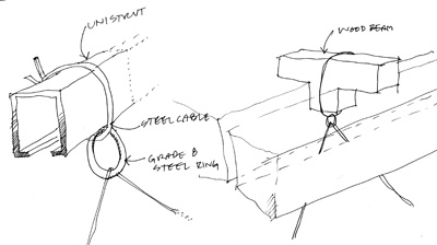
my studiomates' projects are as follows:
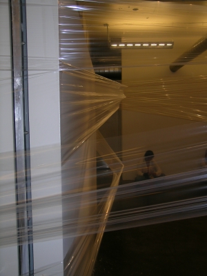
Redline: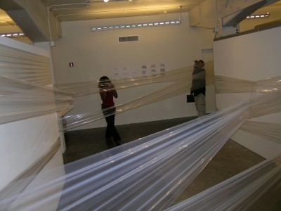
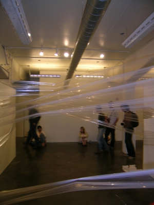
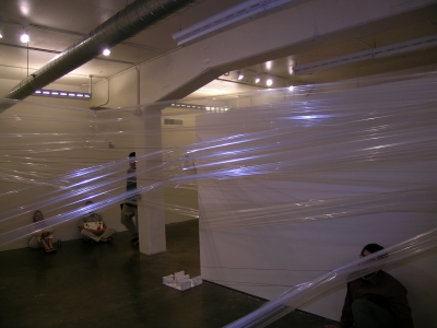
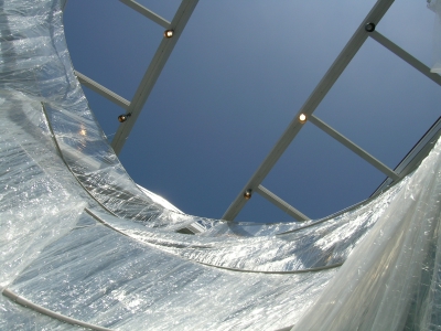
Conical Oculus: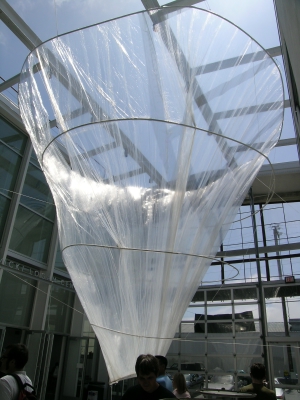
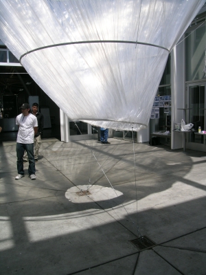
The V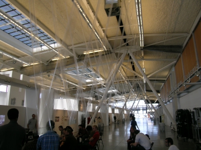


6 Comments
a few years ago some grad students at UF did something similar (with "industrial plastic film") as an independent study/seminar. Every few weeks a new installation would appear somewhere in the vicinity of the School of Architecture, and occasionaly on the greater campus.
Cool, Aaron.
What were they like? We fell in love with the extreme formal expression of tension, as well as the translucence that changed to shiny opaqueness when light was shined upon it.
they were mostly exterior, and the first few installations seemed to be directed at calling out implied planes.
One memorable example was the covering of the atrium of the Arch Bldg with a horizontal plane of the plastic. For a week or so it held taught, but after some time the weather started to weigh it down in pockets (Florida rain). When the removed it, they cut one side (imagine a rectangular atrium with railings on the two long sides, plastic attached to the railings) and it became a hanging wall/sheet. It just flowed with breeze, creating a translucent barrier between the main atrium space and the circulation that skirts it.
I just remembered that one of the grad students made a video out of the effects that the breeze had on the exterior planes, whether vertical or horizontal.
The examples that you show seem more tectonically developed (if that makes sense). your studio seems to have put more thought into how connections were made.
Your group's installation recalls the examples that I remember from school most lucidly...
I remember having to change my daily route when walking to studio. The UF project, from what I remember also had fun with changing circulation and entry patterns to FAC. The translucent walls that outright blocked access to certain areas were very interesting. If not amusin at times (seeing some people trying to muscle their way through was funny, the plastic was very tough)
ya, the non-design students on campus did seem a bit puzzled by the whole thing. It's happened a few times since EOK and company did it, but never with the same success...
I like the spatial propaganda idea; an insertion that forces people to adjust their understanding of a given space and circulation. We all get used to how we navigate a familiar area, even becoming automatic with it. There's a certain excitement in something that disrupts that familiarity.
Block this user
Are you sure you want to block this user and hide all related comments throughout the site?
Archinect
This is your first comment on Archinect. Your comment will be visible once approved.