
So, tomorrow is the annual KSA Career Fair. We had our mid-review on Monday, so I hadn't had much time to put anything together until today. So, the following is the result of about an hour of work in InDesign, then half and hour of PDF-wrangling in Acrobat, and about an hour waiting for the printer and binding it....
Much like the booklet I did recently for midreview, I made a 8.5" x 132" sheet in indesign, subdivided with guides into 8.5x11 spreads. After doing the full layout, I exported to a one-page pdf. Then, I printed that PDF with "tile large pages" selected, with the paper size set to 8.5x11 landscape.. this gave me a file to send to the printer... I folded these pages in half, trimmed the borders, and stapled along the loose edges.
in order to get the jpgs, I took the original one-page spread, print with tile large pages again, but this time to 5.5x8.5 sheets... then i took this file, deleted a few stray sheets to get the flow right, printed to 8.5x11, 2 pages per sheet....
it sounds like a pain, but once I got this figured out it's a breeze, and it's easy to print up some decent looking booklets quickly and cheaply.... for just $3 printing cost on the studio machine....
obviously it needs some work, but I wanted to have something ready for the Career Fair tomorrow... in today's economy it pays to be prepared, and I'm certainly willing to talk to the firms that manage to make it out to the event, even if they're not among my top choices. It never hurts to network, right?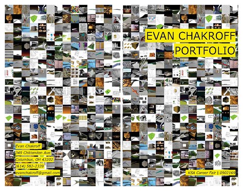
(full set on flickr)
anyway, comments on the layout are certainly welcome. I've got a little time yet before I layout my "real" portfolio... but most of the content will be the same... thanks.
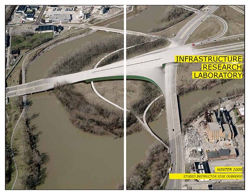
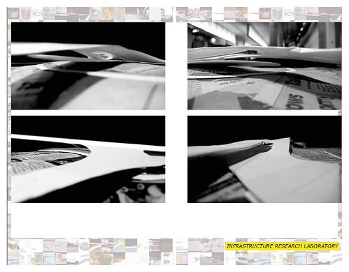
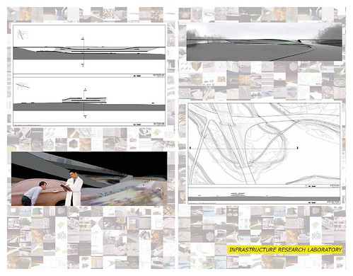
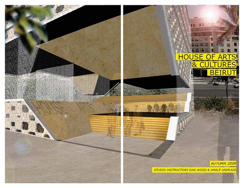
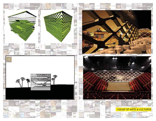
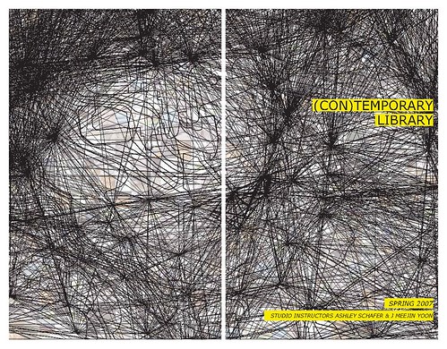
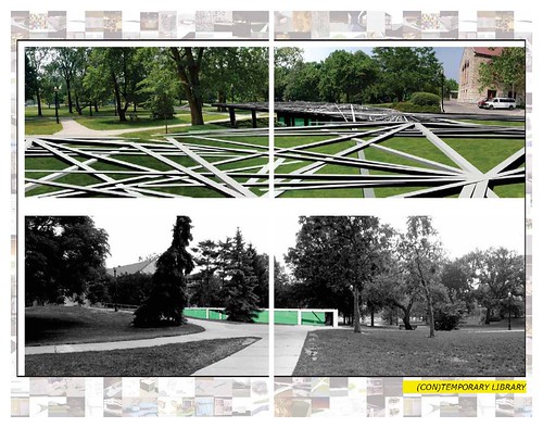
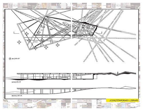
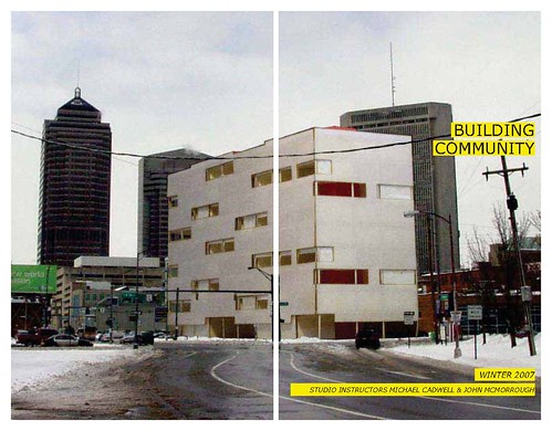
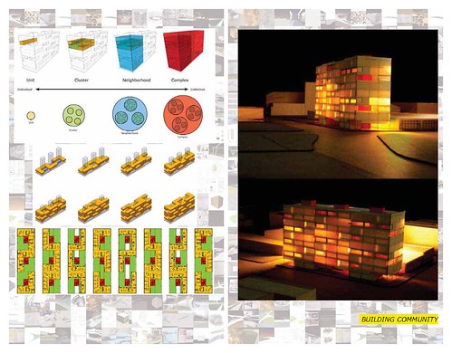
Thoughts on the M.Arch I program at the Ohio State University, 2005-2009, plus additional work with OSU as a critic and lecturer.

4 Comments
I like the boldness of the simple font on the yellow boxes. It really helps it stand out from the work. The collage on the cover is nice too; it's simple without being overbearing.
thanks... this is kind of a departure from older portfolio layouts i've done (example here) where i tried to keep a clean and uncluttered layout (for example, i never had title text over an image) but i think the boldness of this version works well in some cases.
i think the large text over the single full-bleed images works, but some of the spreads with multiple images are pretty weak.... next version i'll probably remove the screened-back cover collage from the background....
i think the yellow highlighted text is a bit dated, but it seems to work here. it does more when you use it sparingly. also, i think the non-full bleed images sit a bit awkwardly, especially the images with white boxes over the collage background. otherwise pretty good for a quick pass.
not bad for a couple hours worth of work!
Block this user
Are you sure you want to block this user and hide all related comments throughout the site?
Archinect
This is your first comment on Archinect. Your comment will be visible once approved.