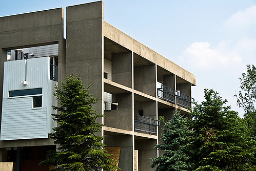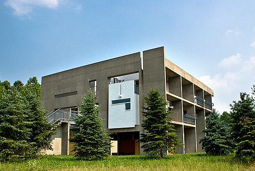

(image from flickr/mlindqvist)
During the second half of Summer Quarter, 2007, I had the opportunity to work with Jeff Kipnis and Jose Oubrerie on a documentation project. My task was to sort through piles of old sketches, an endless succession of rolled construction documents, several of Jose's old sketchbooks, a few hundred 35mm slides, and exactly three Zip Disks, in order to compile a more-or-less complete archive of the design, planning, and construction of Jose's Miller House, built in Lexington, Kentucky, completed in 1991.
During these two months spent scanning slides and photographing sketches I had ample time to familiarize myself with the building, though I regretfully never visited the site (I hope to rectify this as soon as I return to Columbus). What follows is my own take on the building, informed significantly by Jose's explanations and Jeff's analysis. Unfortunately, I'm not at liberty to include any of the images I spent so much time cataloging, so I hope flickr can provide relevant images, at least until their authors complain....
From the early sketches it was clear that the house was always conceived as a collection of three separate dwellings within a common boundary. This scheme was based on the programmatic necessity of three separate living quarters to accommodate the independent lives of the family members, and in the built work, they do indeed remain independent, raised above a common ground floor, and connected only by catwalks.
Early plans show the three volumes overlaid on a grid with the center left open, suggesting a renaissance palazzo, or an urban square. In later studies the grid remains, but the dwelling volumes shift and expand over the course of the design process, compressing the common areas and circulation routes to the point where the sight lines become limited and focused, and sectional connections give the space a sense of dense urbanism.
In early site studies, Oubrerie planned three structures for the site: a small tower, a slender house, and what was to become the Miller House, representing a line, plane, and volume respectively. A small concept diagram shows that the Miller House was conceived not as a closed volume, but as an “exploded cube” -- a collection of surfaces.
Study models suggest how this began to translate into an architectural proposition. The clearest evidence is in the early treatment of the roof plane, elevated and disconnected from the exterior wall surfaces, which remain intact and connected.
In later studies, however, the treatment of each façade as an autonomous composition attest to the persistence and growing importance of the “exploded cube” diagram, eventually resulting in the realization of the facades as disparate elements. In the final building each facade is self-supporting: the concrete was poured and these separate pieces defined the building’s volume before the structural steel of the interior was erected, and before finish work and glazing could finally clarify the extents of the enclosure.
The “exploded cube” diagram thus freed each surface from dependence on any other, obfuscated the exact extents of the interior space, and allowed each facade a high degree of autonomy which was maintained throughout the design and construction process.
The “exploded cube” diagram gave Oubrerie a great deal of freedom in the composition of the facades. Each façade was developed as a separate entity, affected somewhat by the neighboring facades and by the interior beyond, but retaining a large degree of independence. Over the course of the design process, this collection of facades evolved from a simple set of formal compositions into a highly specified set of architectural elements, referencing diverse precedents and representing artistic license tempered by the necessities of program and the unique requirements of each façade’s orientation on site.
(West Corner. NW Facade to the left / SW to the right.)
Northwest Façade
While the surface has been punctured multiple times (by the entering catwalk, by the wood-clad volume of the kitchen emerging from the ground floor, by the daughter's bath punching through, and by ribbon windows sliced through to frame views to the landscape) it remains the most planar of the four facades. The surface of the “exploded cube” is mostly intact: its borders are clearly marked by the extents of the concrete wall.
The solidity of this facade is appropriate: the northwest orientation is not conducive for effective solar modulation, and this facade faces the encroaching suburbs, not a particularly attractive vista. The apparent frontality is revealed to be a conceit as the primary (common) entry is around the corner....
Northeast Façade
The entry facade (northeast) retains a notion of the surface, but it has been pulled apart somewhat, punctured by the entry canopy, and torn away to reveal one of the interior living volumesxii. The stairwell emerges as a discrete object, and presages the breakdown of the surface in the southeast facade.
(South Corner. SE to the right. SW Facade to the right)
Southeast Facade
In the southeast facade, the notion of the planar surface has completely broken down. The concrete here folds in on itself to enclose common areas of the house (jacuzzi, media room, library), and the private dwelling volume is left exposed. This facade is a collection of discrete objects, deriving its form from the interior program.
Southwest Façade
Inspired in equal parts by the Corbusian “brise-soleil” and by the porticoes of an American southern vernacular, the southwest facade proves to be most ambitious, and the most ambiguous. Construction documents show it to be completely independent of the interior volumes, connected only by catwalks added almost as an afterthought, yet it is also the only facade accessible from all levels of the house. These connections to the interior allow this facade to act as a space for inhabitation, rather than an enclosing surface. However, this is arguably the most planar of the facades if one considers the plane established by the gridded portico which reaches up to match the roof line of the planar, adjacent, northwest facade surface.
This face, therefore, occupies a transitional zone between the planar northwest facade and the three-dimensional southeast, as evidenced by the corner conditions. At the western corner, the side aligns with and completes the surface of the northwest facade, yet at the southern corner, the portico is missing a bay: a waterspout implies the continuation of the grid, but it remains incomplete. There is no direct connection to the southeast, the portico stands as a discrete object.
That Oubrerie cites classicism, de Stijl, deconstruction, and American vernacular as influences for the four facades (NW, NE, SE, and SW, respectively) indicates that there is an interest here in an overarching history as well as in formal manipulation. This, however, should not be taken as a purely academic exercise: the unique formal strategies of the individual facades create a variety of spaces around the exterior, and the progression clockwise from northwest is one of increasing openness, increasing accessibility, and increasing ambiguity between interior and exterior. As such, this is not a literalization of architectural history, but rather an internalization and redeployment of its lessons with a keen eye towards site orientation and programmatic necessities.
--
It is also interesting to note the similarity in strategies employed here by Oubrerie, and decades earlier by Corbusier, particularly in his Villa Shodan, in Ahmedabad, India, completed the year before Oubrerie joined Corbusier’s office. Both buildings are basically cubic in form, both feature a parasol roof raised on columns and apparently not connected to the exterior walls. The orientation on site is nearly identical in both cases. The square plans are both rotated nearly 45° from north, each façade relatively open or closed to take advantage of solar orientation. Both feature sun-filtering porticoes facing southwest. The porosity of the cubic volume blurs the distinction between interior and exterior, and the building envelope is somewhat ambiguous in both cases. In early studies, the Miller House featured a long ramp for circulation, and though this was eliminated, the early inclusion of an architectural promenade shows affinity for Corbusier’s plan. The extension of the ramp out into the landscape seems an antecedent for Oubrerie’s extension of the catwalks and stairs past the building’s cubic volume.
Perhaps the most striking similarity is the programmatic zoning in section. In both Villa Shodan and the Miller House, the ground is dedicated entirely to public activities, with the common living areas, kitchen, entry, and service areas all located on the ground floor. In both houses, the first main level above grade contains private baths and study areas, while the private bedrooms are all located on the second level above grade.
The two differ in their approach towards the elevated private areas. In Villa Shodan, the floor plates are mostly intact, and they make the divisions in section all the more clear. They show a clear tri-partite attitude toward the public-to-private gradation as the scheme develops in section. While the floor plates create these divisions in section, there is no equivalent in plan. Though privacy varies from level to level, there is little distinction between the private zones for the individual members of the family. In the Miller House, by contrast, the floor plates are nearly absent, only evidenced by catwalks and terraces at the proper level. The private dwelling zones are connected in section, and distinguished from the common areas by material treatment as well as the physical disconnection.
--
So that's about it. I'll try to get permission to put up some more images, and Jeff or Jose if you're reading this, feel free to censor (or correct) anything, as you see fit... for all I know this bit of text might be copyrighted....
Anyway, after a few months studying the Miller House, I did not return to OSU for autumn quarter: in September, 2007, I moved to Basel, Switzerland to take a 12 month internship at Herzog & de Meuron, postponing my final year of graduate studies. While I'm contractually prohibited from showing any of the work, in my next post I'll try to give a brief recap....
Thoughts on the M.Arch I program at the Ohio State University, 2005-2009, plus additional work with OSU as a critic and lecturer.


7 Comments
if you do get down here to ky, you should also check in at university of kentucky. last semester a grad studio did current-condition as-builts of the whole house. you could compare results!
visiting the house is amazing. like a fun-house. not a single 1/2" that was left unresolved. i spent a full day there and it wasn't enough to satisfy.
Yay for carefully shared insider information!
More on the amazing Miller House in the discussion section, for those of you who don't usually go into the forums.
img from GA Houses #35
Ha! Didn't think I'd see this on the front page again, 5 years later.
Going to meet Jose Oubrerie in couple of hours. This and Steven's posts are gold. Have not seen the house. I am going to take a chance and try to talk about the site and houses with 4 sides carefully arranged. And mostly talk about Mr. Oubrerie himself. This is really spontaneous chance meeting.
Orhan, will you be interviewing - or just having a casual chat? As you probably know, Jose was in Los Angeles for the launch of his book (finally) documenting the house: http://www.amazon.com/Et-Suburbia-Ego-Oubreries-Miller/dp/1881390527
It's well worth a read - a great set of essays, each approaching the house from a different perspective. (Full disclosure: I worked with Jose on that book project in the early stages, and have a few photos in in the book).
For anyone interested in the house, I also recently updated and expanded this post for Arch Daily - check it out.
Block this user
Are you sure you want to block this user and hide all related comments throughout the site?
Archinect
This is your first comment on Archinect. Your comment will be visible once approved.