Sep '06 - Dec '09
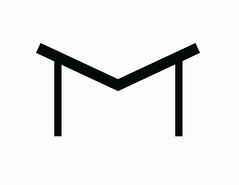
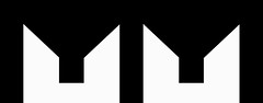
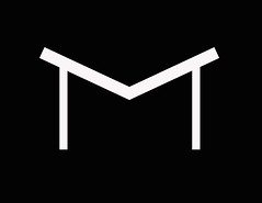
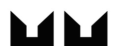
I have been sketching this logo every chance that I got and found that I was thinking way to much into it. All this sketching for a logo but it has got me hooked.
crescent was better. these look forced.
It gave off too many meanings. Forced? I did realize I was thinking to hard but something kept drawing me back to these two.
you had good reasons for the crescent. What are your reasons for this? They look like your initials, which can't be what they're looking for...
Are you sure you want to block this user and hide all related comments throughout the site?
This is your first comment on Archinect. Your comment will be visible once approved.

3 Comments
crescent was better. these look forced.
It gave off too many meanings. Forced? I did realize I was thinking to hard but something kept drawing me back to these two.
you had good reasons for the crescent. What are your reasons for this? They look like your initials, which can't be what they're looking for...
Block this user
Are you sure you want to block this user and hide all related comments throughout the site?
Archinect
This is your first comment on Archinect. Your comment will be visible once approved.