The Harvard Graduate School of Design (GSD) this week announced a new visual identity created in order to help galvanize its institutional and pedagogical aims, claiming it needed an "updated language of forms to communicate the school’s mission and values."
The rebranding effort comes in response to Dean Sarah M. Whiting’s previous call for the GSD community to establish a dialogue with the general public in a way that can embody the "critical design thinking" at the core of its educational program.
The new logo offers a further demarcation from the standard university crest-based designs used by Harvard’s other schools and undergraduate residential houses, embracing the 'Flying H' design invented by alum Nigel Smith into the GSD's graphics system to mark the turn of the 21st century.

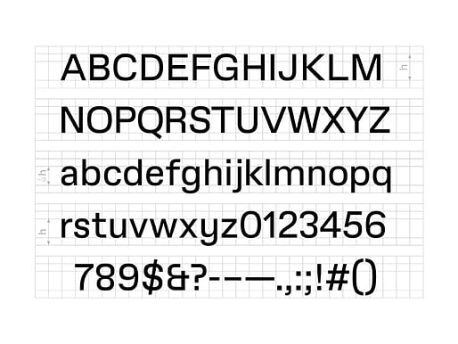
The expressionistic form of John Andrews’ distinct Gund Hall building is a further source of inspiration for the new GSD Gothic typeface, which was the brainchild of the school’s Art Director, Chad Kloepfer. By removing the glyph of the 'H,' the GSD says its new letterform may be made customizable and shared as a template to accommodate a "myriad of creative perspectives" as the institution itself continuously extracts and conforms.
The GSD explains further: "GSD Gothic is both an aesthetic companion to our new logo and a unique means of addressing a wide audience. It needs to be legible in different environments, from signage that feels at home in Gund Hall to dense documents circulating in print or online. It is the workhorse of the identity."
"The typeface will exist in two different formats. A traditional format has different weights and styles — that is, regular, italic, bold. GSD Gothic will also exist in a variable format, an approach to typography suited to the digital world."

"A variable format does not have discrete styles; it can exist in any variable between a set of parameters. This version of the typeface is delivered not in files but in code. It can live on our website and within other digital assets, and it can be programmed to react to dynamic conditions of display."
The process officially began in the Fall 2022 semester and was implemented in phases leading up to this week’s announcement. Harvard notes that the logo and wordmark are meant to function as separate elements but will combine for specific instances in situ, online, and in the stationary correspondence of the GSD community. Harvard emphasized finally that it is also "derived from self-reflexive inquiry, both embodies and represents the GSD’s pedagogical mission."
It is a significant development in the recent history of the school, given Whiting's previous statements, and mirrors one made at RISD last fall when the school launched a brand identity overhaul of its own in the fall for similar institutional purposes.
A comparative overview of the university’s visual guidelines can be found here.
8 Comments
Looks like the graphics people have completed their takeover of the school
"harvard graduate of university school design"
and
"harvard has an h, so our logo is an h"
really nailed it guys. mega pepsi rebrand energy
Jesus H ......
They should have asked Kanye.
Nothing to see here but a graphic identity change wrapped in some virtue signaling. Until Harvard GSD stops stops making people take out loans to attend their school, they really don't have much credibility on equity, improving the profession, etc..
just more self-referential "intellectual" justification for a program that is simply rich enough to create its own self-perpetuating ecosystem. the gsd doesn't care that everyone thinks this is bad, because it doesn't matter; "we're harvard" is enough.
"A visual identity is both a language and a tool. The Harvard Graduate School of Design needed an updated language of forms to communicate the School’s mission and values, as well as a tool to facilitate its pedagogical activities and day-to-day operations with a common set of visual standards."
no one's convinced except those who want to be convinced - this place would make a great backdrop for a kafka novel.
https://www.gsd.harvard.edu/20...
:
I quite like the example wayfinding and temporary signage (images 2 and 3) and GSD Gothic overall, though not a fan of the new blocky "H" logo.
Block this user
Are you sure you want to block this user and hide all related comments throughout the site?
Archinect
This is your first comment on Archinect. Your comment will be visible once approved.