
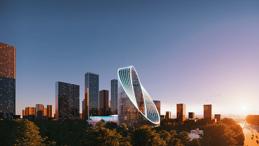
Bjarke Ingels Group (BIG) has unveiled their design for the new R+D headquarters of OPPO, the largest smartphone manufacturer in China. Named the O-Tower, the scheme seeks to reflect the company’s ethos of “endless innovation in the pursuit of perfection” and serve as an iconic gateway to Hangzhou’s Future Sci-Tech City.
Colloquially known as “Heaven on Earth”, the city of Hangzhou has a dual identity as both a hub for innovation, and a center of rich cultural and natural history, hosting three of the world’s 57 UNESCO Heritage sites. The O-Tower sits at an intersection of these two conditions, flanked by a natural lake, a 10,000 square-meter park, and a high-rise urban center.
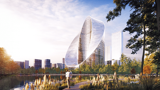
The scheme’s signature massing is shaped in response to the unique needs of contemporary tech companies. While deep, flexible floorplates are desirable by tech companies for accommodating more creative, varied workspaces, shallow floorplates offer enhanced access to daylight and views, thus improving employee well-being and productivity. The O-Tower seeks to balance these two conflicting conditions by taking the perfect office slab depth for daylight, and extruding it in a cylindrical loop to form a large, contiguous floor area on each level. As a final move, the architects “pushed down” the southern edge of the building, thus minimizing the external surface area susceptible to solar glare, and maximizing views out from the inward, shaded courtyard volume.
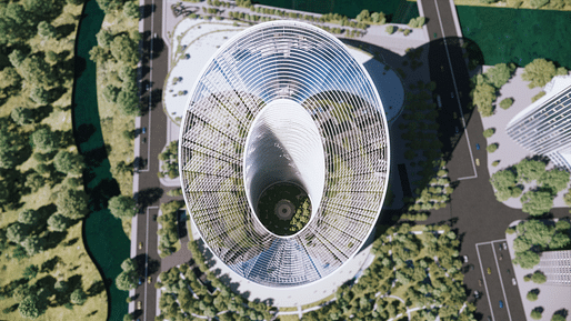
Beneath the sloping O-shaped façade, a series of triple-height voids and terraces are formed by the varying floorplate edges. As well as forming visual connectivity between floors, the voids offer the opportunity for biophilic social spaces and informal shortcuts between floors, thus activating the façade when viewed from outside.
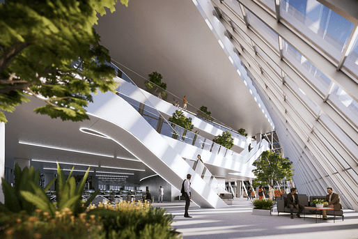
The predominantly glass façade is wrapped with adaptive louvers, orientated according to sun angles and the building’s geometry to minimize solar gain. The architects expect the façade design to reduce solar gain by up to 52%; providing significant savings on cooling loads and enhancing user comfort, while also reducing glare, reflectivity, and light pollution towards its surroundings.
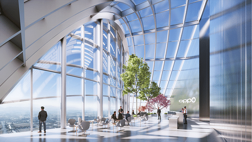
The ground floor of the O-Tower will contain an interconnected public space linking lobbies, exhibition spaces, and the 10,000 sqm park surrounding the scheme. The first three floors will be reserved for public events including exhibitions, conferences, and workshops, while the upper floors will vary between large, spacious floors for complex R+D projects, and traditional floors for administration and executive functions. At the heart of the tower, enclosed by the curving floorplates, a publicly accessible courtyard is envisaged as an “urban living room for the city” with a variety of mineral hardscape and lush softscape surfaces.

Reflecting on the scheme, BIG founder Bjarke Ingels said, “we have attempted to imagine the future work environment of OPPO to be sustainable on a triple bottom line: economically, ecologically and socially. The compact form folding in on itself provides large flexible floorplates with the daylight access and fresh air of a slender tower. The adaptive louvered façade omits incoming solar glare and thermal heat gain, enhancing the passive performance of the building. The tilted loop of the warped roof creates a social shortcut for the OPPO employees and their collaborators connecting the ground to the summit. And the central oasis and the surrounding wetland park expands the public realm into the heart of the complex. Each element is intrinsically intertwined forming the melted loop that is perceivable at all scales – from the urban landmark to the human experience—becoming a manifestation of the design simplicity that is an intrinsic part of OPPO’s brand.”
The scheme has been designed in collaboration with:
7 Comments
They've done it. They've really done it. They finally designed a building that evokes a penis and a vagina at the same time.
And here I thought their NY courtscraper was revolutionary, they now made a building that's screwing itself into infinity...
how long until that concave shiny surface melts an adjacent building or parked car?
I haven't seen a single floor plan for this "design" on any site featuring it. One can imagine how poorly this functions - simply bad on so many levels. Cartoon architecture.
The client probably wanted a one-of-a-kind form that's also a giant logo. The kind of thing BIG excels at. From a technical point of view, it will be interesting to see how RFR resolves that facade.
Of course they don't show the 95% of generic office space which comprises every BIG building ..... at least the OMA CCTV tried to create some internal dynamic to at least pretend there was some logic to the 3D graphic design exercise
toilet + massive turd
Block this user
Are you sure you want to block this user and hide all related comments throughout the site?
Archinect
This is your first comment on Archinect. Your comment will be visible once approved.