MVRDV has completed construction of Concordia Design, a mixed-use building filled with co-working spaces, an event venue, a food hall, a café, and a rooftop terrace.
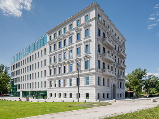
The project is located on Słodowa Island in Wrocław, Poland and entails the renovation and extension of a 19th-century historically protected neoclassical building. As a result, the project retains the historic façade of the existing structure while augmenting the building with a new set of spaces on one side.


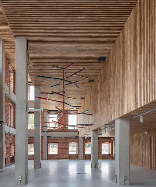
According to the architects, the design is influenced by depictions of Janus, the Roman deity of transitions, time, and duality. The architects write, "The form and interior layout of the building displays a certain symmetry, with triple-height stepped voids at the entrances on each end of the building. However, within this symmetry there are clear distinctions between the “formal” end of the building, featuring the retained façade of the historic building, and the new addition."

"On the formal end, the entrance space hosts the café and exposed brick walls from the original building. The informal end of the building faces the park and hosts the food hall. "
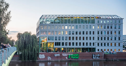
The project's new wing is marked by punched openings and minimally detailed grey-toned walls designed to match the existing structure. The far end of the new building is wrapped mostly in glass while the addition gets progressively more solid as it grows to meet the historic building.
Q2 served as the local Architect of Record for the project.
5 Comments
I quite like this one. More subtle compared to other MRDV work.
I like this. The lobby interior is nice, too.
This is a nice urban composition, with the bridge, tree, river, brick wall, and, of course, graffiti. Then add the progression from openness to closure in the facades and the glass terrace that covers the whole building and opens up to the sky, pulling the scene together and giving it life. And it has an urban message. You get the sense of variety, activity, change, and of memory, of past and present. This design more closely reflects the patterns of contemporary life than would a straight traditional solution.
An argument could be made that the addition doesn't detract from the traditional facade but rather highlights it. I'm debating the need for some kind of horizontal detailing that gives the addition more depth and interest. Then again, its flatness promotes the detailing of the traditional part.
It would be interesting to have traditional alternatives for comparison, though I wonder how well these could be done. If not done well, they would not be convincing and would undermine the older structure. One solution would be to continue the same structure and detailing of the old part, which would probably be monotonous and imposing. Better, two additional traditional sections, different but complementary.
Defense should also be made of the Neo-classical part. This is a clean, well proportioned, and distinctive design that has held up well over the years.
Edouard François did a hotel in Paris you might find interesting, worked within a neo-classical context as well: https://www.archdaily.com/24801/hotel-fouquet-barrier-eduard-fanchanc
Block this user
Are you sure you want to block this user and hide all related comments throughout the site?
Archinect
This is your first comment on Archinect. Your comment will be visible once approved.