
Can affordable public housing be beautiful? It’s a question that for years was answered with indifference.
Fortress-like public housing projects such as Cabrini Green in Chicago set an apocalyptic standard: here was modernism’s urban utopia inverted into a nightmare of corridor stabbings and shattered-window junkie occupation. While this is a building that invites, not repels contemporary hulking monoliths like the 962-unit Sheung Chui Court in Hong Kong may be government approved, they’re hardly aesthetic wonders. Thankfully, in the past decade, beautiful and sustainable affordable public housing seems to have made a resurgence around the world. Here, we define 'affordable' as that which is funded by a public agency for the purposes of housing median to low-income residents. From sites that repurpose scrap metal dealerships to fresh conceptualizations of energy-efficient complexes, here are six striking examples of public housing that rent at market (or lower) rates, or are at least partially government-subsidized to account for low-income tenants.
MIRADOR HOUSING PROJECT
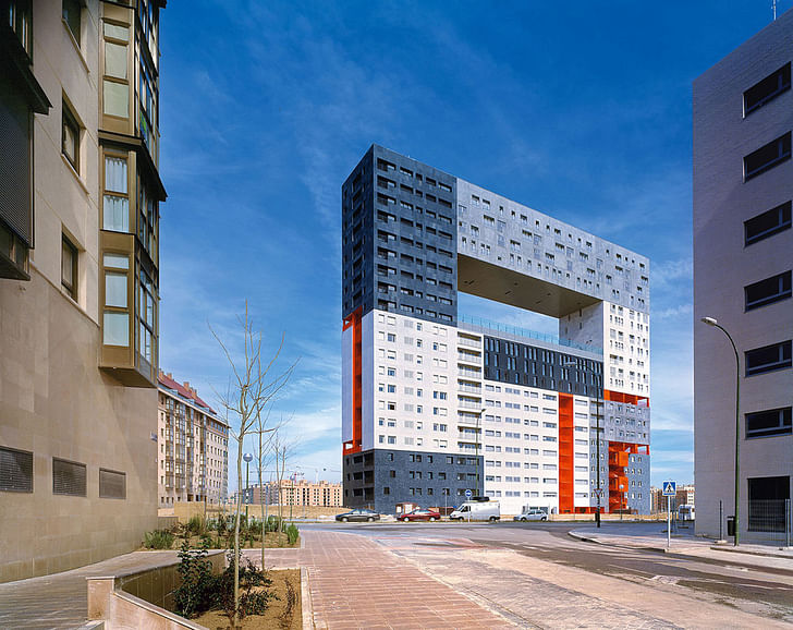
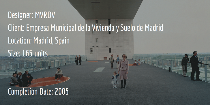
The use of light, color, and innovative circulation distinguishes the Mirador Housing Project from traditional blocky, affordable public housing. Instead of hulking on the landscape like an uninspired blot, Mirador’s innovative color-coded circulation and purposeful porosity creates a dynamic and attractive visual display. A central open air courtyard creates a community space and viewing platform, integrating the context of the larger city while providing a sense of private space. This is a building that invites, not repels, ultimately acting as a social beacon, not a harbinger of doom. The project was funded by the Empresa Municipal de la Viviedna y Suelo de Madrid, which takes its mandate for decent public housing in part from Article 47 of the Spanish Constitution.
LE LORRAIN
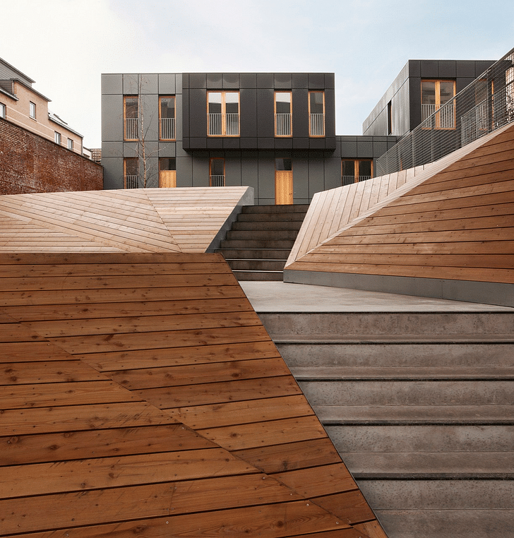
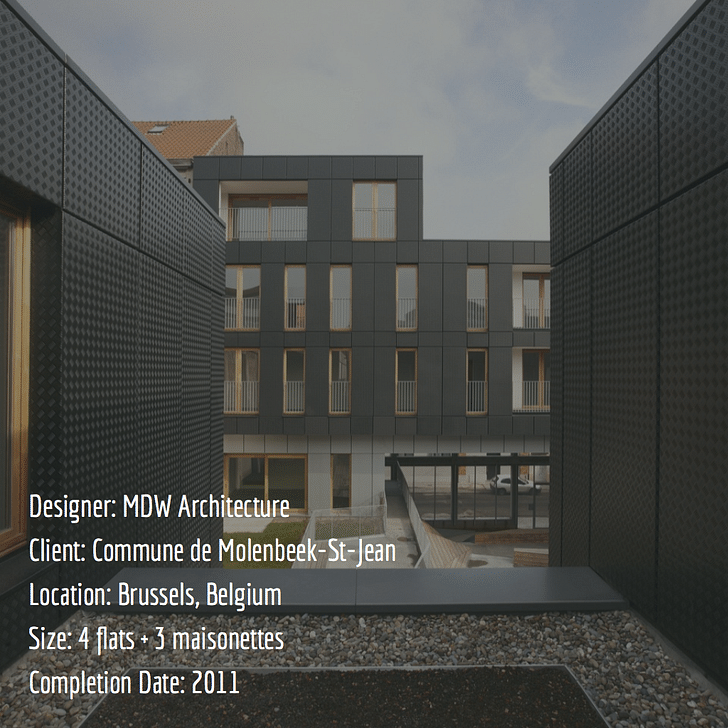
One of the smallest examples of public housing on this list in terms of the total number of units, this former scrap metal dealership is also one of most innovative. The use of industrial materials to create abandoned structures and sites can be elegantly repurposedcosy, private domestic spaces (including a steel mesh front that doubles as both security for the complex and backing for a plant wall) hints at how abandoned structures and sites can be elegantly repurposed to create vibrant yet sustainable living spaces. Funded by the Commune de Molenbeek St Jean, which has a reputation as one of the roughest municipalities in Belgium, Le Lorrain is part of a wider effort to transform Molenbeek into a more vibrant, less violent area.
HAROLD HOUSING PROJECT
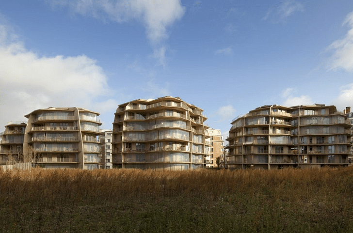
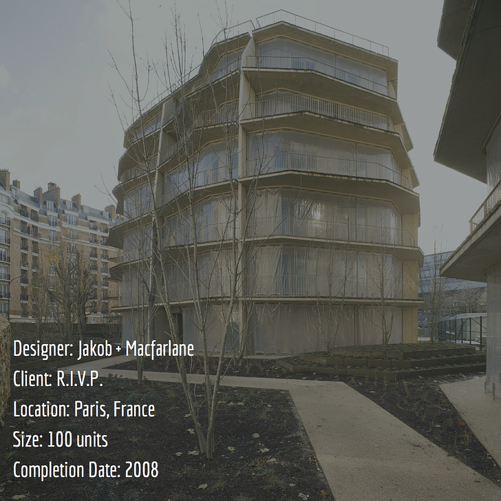
Breaking entirely from the boxy block model, the Harold Housing Project in Paris takes as its design inspiration the irregular yet geometrically soothing shapes of raw minerals. This was partially aesthetic, partially pragmatic: the units are built on a restricted and somewhat peculiarly-shaped site in the city’s 19th arrondissement that was formerly the grounds of a hospital. This choice results in irregularly shaped units, giving ample opportunities for unusual views and engagement with the outdoors. Pockets of vegetation scattered throughout the three-unit complex soften the overall aesthetic, creating a holistic and welcoming vibe. The project was funded by the Régie Immobilière de la Ville de Paris, which has been constructing low cost and affordable public housing since 1923.
HONEYCOMB APARTMENTS
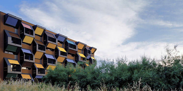
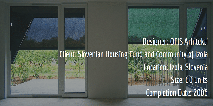
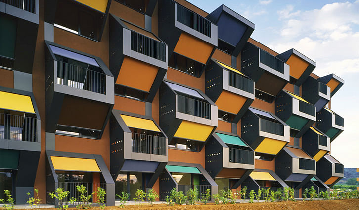
What does an architect do with two plots of 60x28 meters? If you’re design firm OFIS, you create a colorful textile-draped array of units from singles to three bedrooms that are designed to be flexible. The apartments have no structural elements inside them, allowing for more layout choices and instantaneous reorganization. The exterior a colorful textile-draped array of unitscolor and material choices accomplish three things in one: they amplify the perceived size of the interior spaces by a trick of perspective, help retain heat in winter and cool air in the summer, and inject energy into the space. The Slovenian Housing Fund, which is a public financial and real estate fund, paid for the bulk of the construction cost of the apartments; the Community of Izola was responsible for the remainder of construction costs as well subsidizing the rent of the lowest income tenants.
HATERT HOUSING
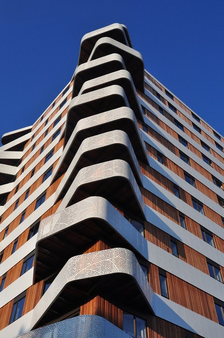
In the “keep zooming in, it only gets cooler” category, Hatert Housing by 24H Architecture features a series of jaunty off-set, free-flowing balconies with a meticulously patterned wrap-around frame that rewards a detailed view while creating some vivid light displays during different times of day. The complex also has dedicated an entire floor for a community health center, creating a mixture of private residential and public space that is designed to create a strong (and healthy) community. The largely socialist city (currently, 16 of its 39 council seats are occupied by equal parts Socialist and Green parties) paid for the construction of this project.
PEARCEDALE PARADE
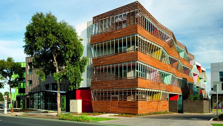
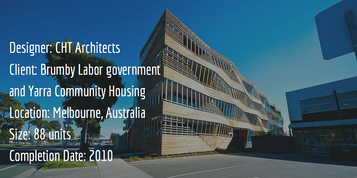
Sustainability is the design throughline for this project, which features cross-ventilated units and solar-powered heating. However, like many of the best affordable public housing, the notion of public housing still carries a taint of the undesirablePearcedale Parade expresses a strong visual identity, through an excellent use of color and an unusual facade that juts both in and out. This is partially a political move: in Melbourne's state of Victoria, the notion of public housing still carries a taint of the undesirable. Pearcedale, by virtue of being visually arresting and energy efficient, was jointly funded by the former Brumby Labor government and the homeless-prevention-organization Yarra Community Housing to help eradicate this perception.
This piece is part of our special editorial theme for July 2016, Domesticity. Check out related content here.
Julia Ingalls is primarily an essayist. Her work has appeared or is forthcoming in Slate, Salon, Dwell, Guernica, The LA Weekly, The Nervous Breakdown, Forth, Trop, and 89.9 KCRW. She's into it.
18 Comments
I wonder if the inhabitants would find these buildings attractive. They're certainly interesting!
Yeah, imagine if they could be the clients of their buildings like rich people are..., they'd look a lot different for sure.
left swipe, left swipe, left swipe, left swipe, left swipe, left swipe . . . .
The projects certainly appear innovative in images taken most likely when they were first built. I wonder how "successful" they have been in meeting the resident's needs and what they look like now.
Interesting on the outside. I can't imagine the interiors are nearly so "wonderful" in architect's eyes but pics would certainly be illuminating. MVRDV are the only firm to even render in people! Is it any wonder the average Mary and Joe have little understanding or respect for architecture? And ChrisDx has asked the important questions.
... and Aravena has answered many.
Once again the poorest in society are the victims of outlandish experimentation by celebrity architects. It's like the 1960s never happened. Most of these will be demolished in 40 years time, they've learned nothing from the cascade of failures of the postwar period. Architects are stuck in perpetual typological amnesia.
It's the architect as the hero, interpreter of the zeitgeist I wish we could get over. How long is this stupid revolution going to last!
The OFIS honeycomb project is horrible - every time I visit archinect my eyes want to vomit. Please update splash page ASAP.
^ Just thinking the same thing. I don't know which is the best one, but that one is down right depressing.
Impressive projects..
Some of the comments here are really spot on.
The title is misleading. It's essentially eurocentric and definitely not the world. I have seen equally innovative public housing projects that are known globally and is still thriving decades later.
There's a reason these projects are all shown as brand new and uninhabited. Because they'll age badly.
People who can afford choose their housing don't choose to live in buildings like these.
This is like an Onion article. I was totally duped by "most attractive" in the headline, I confess. (I think that Le Lorrain is nice-looking.)
On another topic: how about featuring the "best performing" or "most affordable" public housing projects? Just a thought.
And another thing! Projects like these are a big reason why people don't like or trust architects.
Finally:
Okay, now I really have to get going...
It's one thing for an architect to design affordable housing for a municipality or housing agency, and an entirely different thing for an architect to educate and work with the residents as clients to develop dwellings that are both attractive visually and comfortable/efficient to live in. Architects should always put the needs and desires of the residents first and try to set aside their own egos.
Ridiculous that there are no unit layouts or interior photos shown. As if the quality of any project begins and ends with the exterior facade.
Block this user
Are you sure you want to block this user and hide all related comments throughout the site?
Archinect
This is your first comment on Archinect. Your comment will be visible once approved.