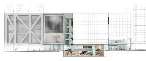

A new $450 million renovation of the Museum of Modern Art (MoMA) complex in New York City by Diller Scofidio + Renfro and Gensler is getting ready to make its official debut.
As part of the expansion, the museum has also re-opened its dedicated Architecture and Design galleries, which, contrary to previous iterations for the museum's approach to curating architecture and design topics, will now be spread out along every floor of the museum complex. The change reflects a "curatorial vision of a 'both–and' approach, acknowledging architecture and design both as integral to the interdisciplinary conversation with the visual arts and as autonomous disciplines with specific histories and methodologies," according a MoMA press release.
Ahead of the much-anticipated opening, Michael Kimmelman, architecture critic for The New York Times, previews the ever-expanding museum's latest iteration in a recent column, calling the addition "smart, surgical, sprawling and slightly soulless."
The museum started off in 1932 in a mansion located on the site of the current complex, and has been expanded many times throughout its nearly 90-year lifetime. That includes a signature, purpose-built museum by Edward Durell Stone and Philip L. Goodwin that was completed in 1939. Philip Johnson made an addition in 1953 and again in 1964. In the 1980s, Cesar Pelli expanded the museum once again. That was followed by another sizable expansion in 2004 by Japanese architect Yoshio Taniguchi. The latest iteration of the museum, designed by Diller Scofidio + Renfro and Gensler, adds 47,000 square feet, including a series of galleries that are located within an adjacent tower designed by French architect Jean Nouvel.
The expansion includes a wholesale reworking of the museum's galleries and curatorial regime, as well, which has been retooled to be both more inclusive of diverse artists and less hierarchical in terms of art historical lineage than was previously the case. Under this new curatorial agenda, according to an interview with Ann Temkin, chief curator of painting and sculpture at the museum published in The New York Times, the museum will display "more work for more people." Plans call for many of the new galleries to be reorganized every six months in an effort to better highlight the museum's expansive permanent collection.
This emphasis is highlighted in the design of the new spaces, which feature multiple entrances and larger sets of interconnected galleries. Kimmelman writes, "Gone are the days when the museum told a single story about modern art as a sequence of -isms, expressed in linear fashion."
4 Comments
F*CK MoMA
The FolkArt Museum will never be forgotten.
Really, Are you a member?
All told not a horrible article, but it presents a cloud of non-critical criticism not for something specific, but more about a strange sense that the idea of "selling out" still has relevance. Which brings about the fundamental question, what really becomes the role of critique? What is it's discipline? Or is it just a seventeen year old fanboy commentary on fantasies of un-compromising existence? A wistful remembrance of a time lost, a romanticism of seeing the band when there were only 20 other people in the room and they all went on to start their own band.
https://slate.com/culture/2017/07/the-history-of-calling-artists-sellouts.html
more space and yet the curation is getting more watered down into general time periods and concepts like “energy” and “building citizens” among the design related shows. Wish the museum would just move the architecture collection to another building where it could do serious shows again.
Kimmelmans review is better than his usual, as he is essentially an upper east side art critic, but his architecture observations are still shallow and deterministic — design decisions aren’t inevitable politics. The Taniguchi atrium wasn’t “dubious” but extremely necessary. This addition seems more utilitarian and mcurbanist than previous versions.
Block this user
Are you sure you want to block this user and hide all related comments throughout the site?
Archinect
This is your first comment on Archinect. Your comment will be visible once approved.