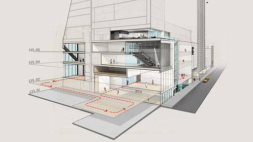

As the Museum of Modern Art begins the final stage of its $400 million overhaul, it will close for four months to reconfigure its galleries, rehang the entire collection and rethink the way that the story of modern and contemporary art is presented to the public.
The Picassos and van Goghs will still be there, but the 40,000 square feet of additional space will allow MoMA to focus new attention on works by women, Latinos, Asians, African-Americans and other overlooked artists...
— NY Times
Over the span of its 89 year history, The Museum of Modern Art has been the subject of both praise and disappointment among cultural elites. In particular, its Diller Scofidio + Renfro-designed plan to expand into the adjacent American Folk Art Museum, by Tod Williams Billie Tsien Architects, was the subject of sharp criticism when it was announced only a few short years ago.
But as that project draws closer to its opening day by the end of this year, the museum has decided to use the months of its temporary closure (between June 15th and Oct. 21st) as an opportunity to reconsider how it exhibits its world-famous collection. This not only means a reassessment of the segregation of media, but also that of racial and sexual representation.
“A new generation of curators is discovering the richness of what is in our collection, and there is great work being made around the world that we need to pay attention to,” said Glenn D. Lowry, director of the museum. “It means that the usual gets supplanted now by the unexpected.” The changes in programming reflect MoMA's commitment to the city from which it has been accruing larger and larger swaths of real estate.
Additionally, the renovation will include additional space from the demolished American Folk Art Museum as well as through 53W53, the new residential skyscraper designed by Jean Nouvel.
the MOMA is surprisingly not contemporary.
Losing the folk art museum is a pity. I'm not nostalgic about buildings but that one was more interesting and challenging than the bland facade that will replace it. It didnt seem out of place at all in the early renderings with the nouvel project. It would be interesting to hear the actual reason it was torn down. Was it really just the wrong aesthetic, Donna?
All 8 Comments
"Self reflection"? Really?! As in the way this stupid boring glass box will reflect back to its visitors a society that allows a true masterpiece of the discipline be demolished because the museum director and patrons were butt-hurt by it?!? #FOLKMOMA
DS+R work for the past ten years or more suuuuuuuuuuuuuuucks.
MOMAs race to irrelevance began long before they added emojis to the permanent collection.
I hope that unfinished section of ceiling gypsum board is intentional and part of the final design.
I hope they leave the old facade alone. A nice bit of history and not a bad facade for its time, plus it must be historic at this point.
the MOMA is surprisingly not contemporary.
Losing the folk art museum is a pity. I'm not nostalgic about buildings but that one was more interesting and challenging than the bland facade that will replace it. It didnt seem out of place at all in the early renderings with the nouvel project. It would be interesting to hear the actual reason it was torn down. Was it really just the wrong aesthetic, Donna?
Will, if I recall correctly MOMA's leader (forgot his name) tried hard to assemble the real estate of the entire block and the Folk Art refused to sell. So he was angry over the "spite house" aspect of the Folk Art and I imagine absolutely gleeful when he tore it down.
2 points-
1- It's interesting to see how MoMA feels the need to compete with other institutions to provide gallery spaces that are XL to accommodate XL work (see: Guggenheim Bilbao). That exhibition space seems to large for the current collection, So I'm curious how they will hang work in it.
2- A real reconciliation with the collection and who is (not) represented would have been for them to hang a more diverse collection in the 1st place- forcing them to actually make curatorial judgements. The excuse that they need more space to include others is kinda thin, allowing them to not challenge field trip canon.
Block this user
Are you sure you want to block this user and hide all related comments throughout the site?
Archinect
This is your first comment on Archinect. Your comment will be visible once approved.