
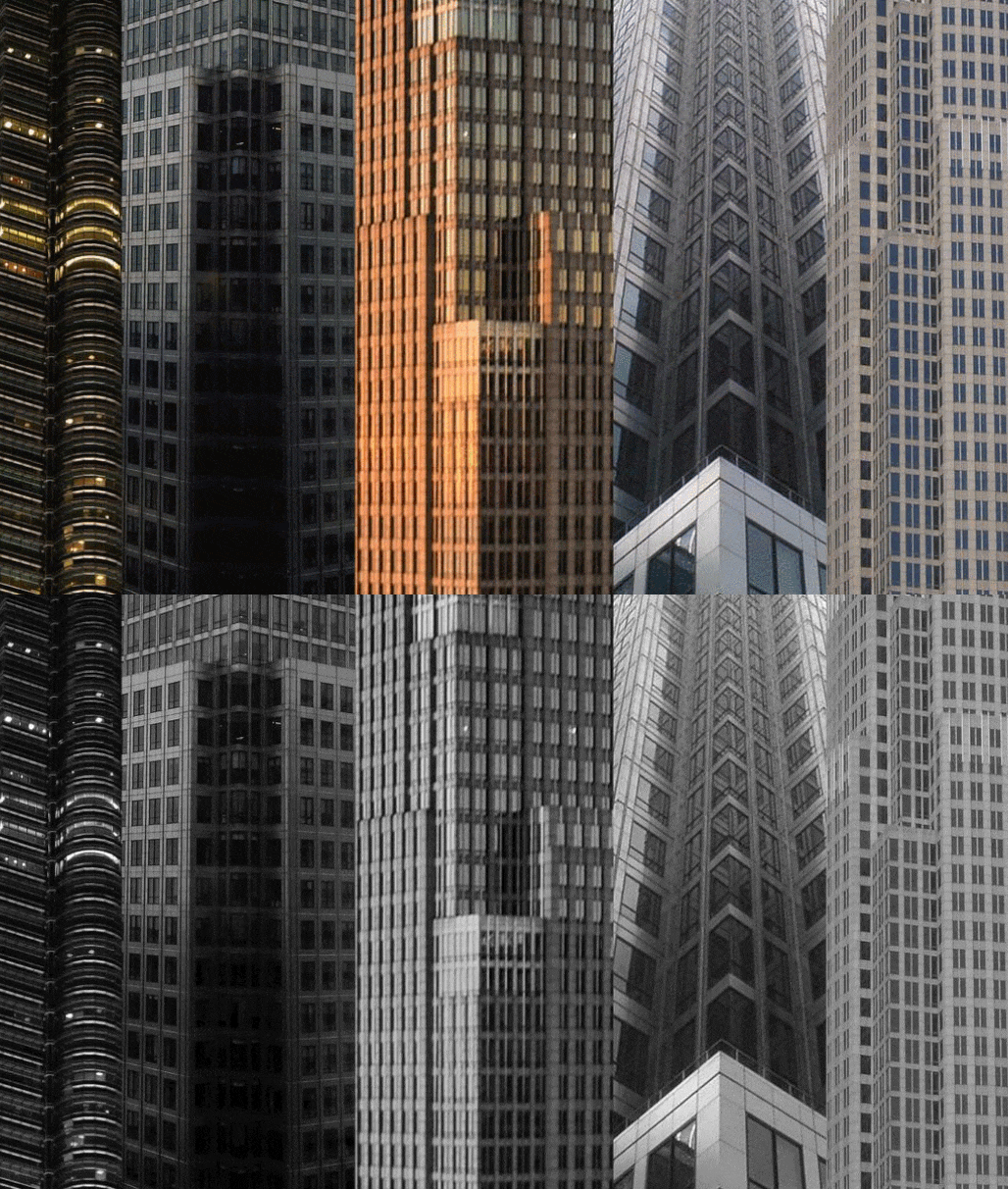
César Pelli has a reputation for designing some of the world’s tallest and most elegant buildings.
And though the architect's facilities with glass skin buildings reached their highest stages late in his career, Pelli's earlier skyscrapers also showcase a deftly skilled artist at work. In the early 1990s, especially, Pelli worked to explore the high-rise corner as a site of architectural experimentation. These efforts, where Pelli carves away at otherwise monolithic edges to create stepped and puckered profiles, can be likened to the "quirks" used in woodworking, subtle changes in geometry that mask the juncture of two pieces of wood. At the scale of the skyscraper, quirks create softened edges around otherwise planar towers, and break down a tower's geometries into more visually pleasing configurations.
Let's take a look at Pelli's quirky corners.
César Pelli is known widely for designing some of the world’s tallest buildings, including the Petronas Towers in Kuala Lumpur and the Salesforce Tower in San Francisco, among many others. But the height of these structures, while impressive, represents only one facet of the complex and ever-evolving design perspective Pelli worked to develop over his nearly 60-year long career.
In his later years, working with Pelli Clarke Pelli Architects, Pelli pursued not just tall buildings, but incredibly smooth ones, too. The firm’s Salesforce Tower, Torre Sevilla, and Landmark Abu Dhabi skyscrapers, for example, through their sweeping, glass-and-mullion-wrapped forms, shimmer amid their surroundings, dematerializing through a subtle gradient of rounded edges, slight relief, and structural repetition against sun-kissed backdrops. The buildings embody high points of both of facade design and skyscraper style.
These towers also help mark the culmination of a career-long trajectory for Pelli, who often worked to minimize the bulk of his office’s high-rise commissions through a variety of architectural maneuvers. As Ada Louise Huxtable writes in her 1982 book, The Tall Building Artistically Reconsidered: The Search for a Skyscraper Style, “Pelli consistently proves his case by designing some extraordinarily sensitive skyscraper skins. If he cannot make excessive size of bulk acceptable, he tries to ameliorate it by turning oversized towers into objects of precisely analyzed, remarkable refinement.”
Huxtable continues, “His is a well-mannered artistry. He does not seek bombast; he divides, frames, and color-codes the thin, light, vitreous wall that is part of the modern technological miracle of skyscraper engineering, treating it as a taut, enveloping membrane or as a smooth aggregate of discretely designed panels and subtly graded parts.” The characterization still applies.
Pelli’s earlier works, specifically, the towers he designed in the late 1980s and 1990s, showcase a different facet of the sensibility his later works entail, however.
Among this body of work, Pelli’s towers are often defined by their planar geometries, and, to put a finer point on it, by their corners. Early Pelli-designed towers represent an element of what Huxtable refers to as the “Neo-Modern” strain of the then-contemporary postmodern architecture movement. Towers crafted in this vein, according to Huxtable, represent a “calculated extension” of modernism, rather than a wholesale rejection of it, and work to use “sentiment and rigor” to “enlarge the range of visual and sensory experiences.”
In these projects, Pelli manipulates materials extensively, as in the World Financial Center towers from 1986-1987 shown above, to achieve a new range of visual expression for the skyscraper type. The lower portions of the four-tower cluster designed at the base of Minoru Yamaski’s Twin Towers are wrapped in stone and glass panels shaped to relate to the project site’s surrounding buildings. As the towers step up to ascend to their final heights, the windows grow to their maximum extents, reflecting more conventional glass skyscraper massing and materiality.
Stepping, as an operative maneuver deployed to minimize a building’s scale, is a key Pelli trick represented in his work from this era. But aside from stepping in section, many of Pelli’s towers also stepped in plan, adding subtly to the often extruded and repetitive floor plates common to this era’s tall buildings. Viewed one way, the maneuver can be seen as a way of sculpting large-scale buildings to reduce what might otherwise be a more monolithic mass. This process, subtractive in nature, helps to create a more subtle transition between a tower’s otherwise flat and regimented facades.
In woodworking, the technique is referred to as a “quirk,” and often accompanies beading and other types of reveals to help smooth the transition between two pieces of wood. At the scale of the skyscraper, quirks create softened edges for gargantuan buildings, and, of course, it probably helps that the puckered corners that result allow for a greater number of corner offices.
While Pelli is not the only architect to use this visual and formal device, he was probably the best at it. Presented below are five projects from the 1990s that showcase Pelli’s Quirks in all of their subtle and geometric glory.
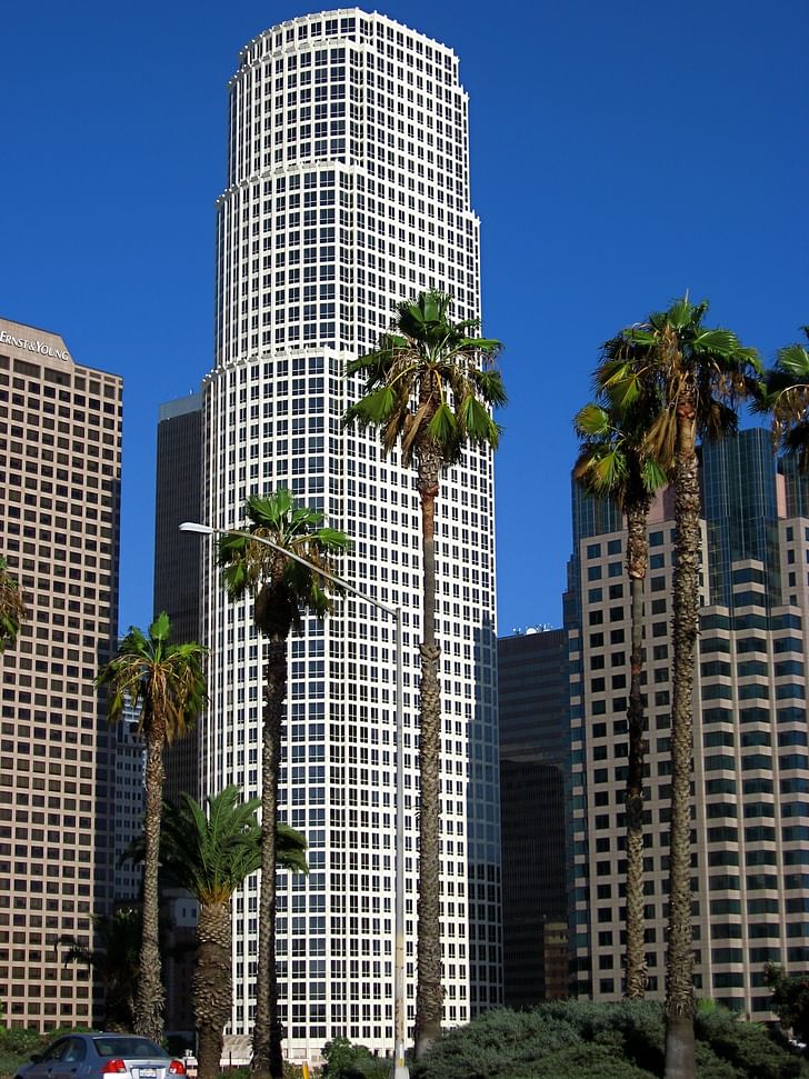
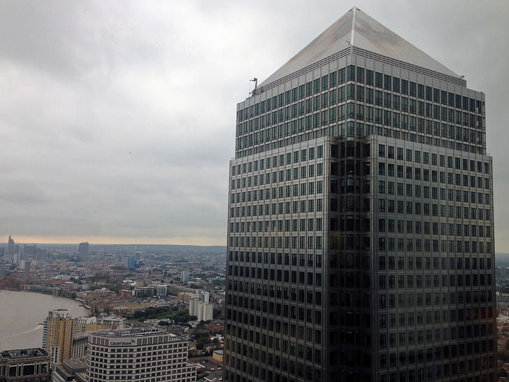
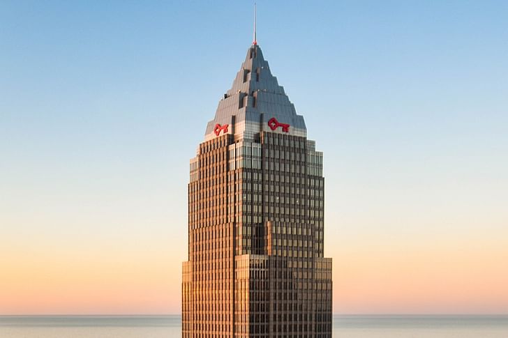
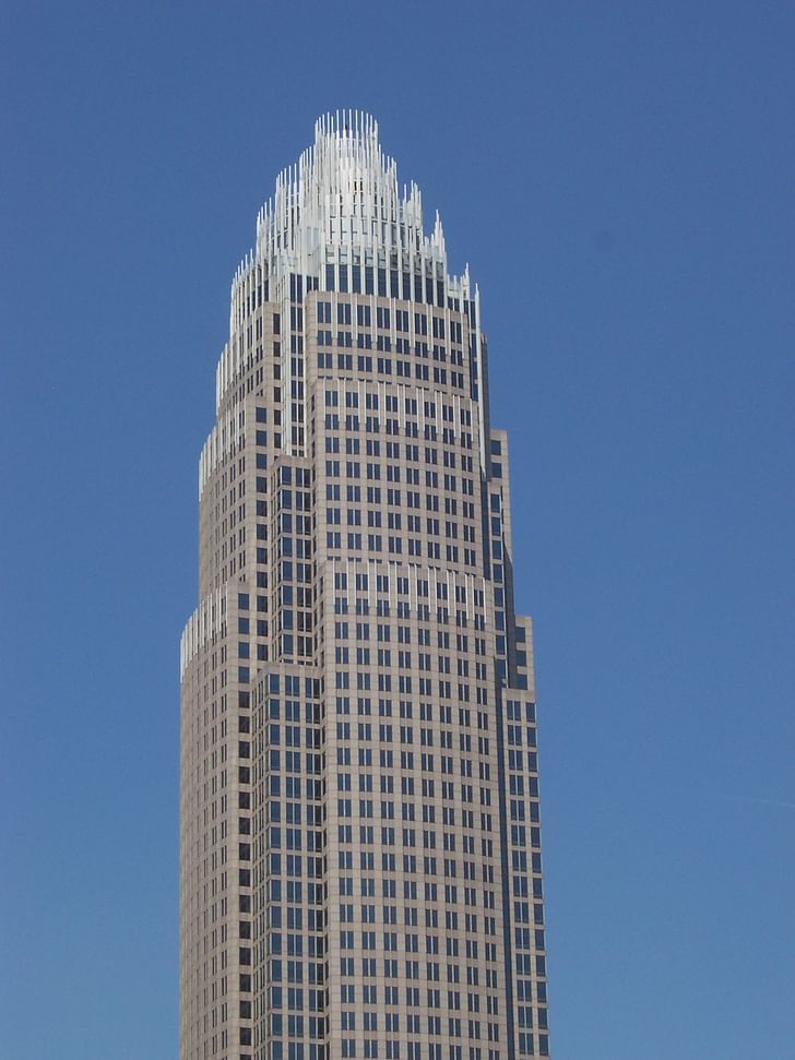
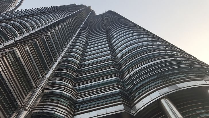
Though these examples represent but a few of the different corner types Pelli used in his high-rise projects, they highlight the architect's sensitive and skillful approach in a particular moment in time. As the somewhat later example of the Petronas Towers suggests, Pelli's experimentations with quirky corners reached a high point in the late 1990s, just before he fully embraced the rounded, smooth geometries that would go on to define the architect's towers of the 2000s and on.
Antonio is a Los Angeles-based writer, designer, and preservationist. He completed the M.Arch I and Master of Preservation Studies programs at Tulane University in 2014, and earned a Bachelor of Arts in Architecture from Washington University in St. Louis in 2010. Antonio has written extensively ...
2 Comments
nice article, but Key Tower is certainly not located in Cincinnati. Try Cleveland
Very interesting investigation
Block this user
Are you sure you want to block this user and hide all related comments throughout the site?
Archinect
This is your first comment on Archinect. Your comment will be visible once approved.