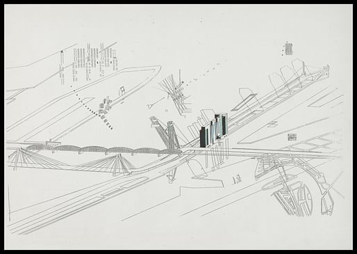

There was no programme, there were no plans. It was a tectonic exploration of form, articulation and presence—the gratification to work on a form by virtue of its own rules: scale, proportions, aspect, consistency. — DRAWING MATTER
"The triptych itself started with an A3 drawing of the building, gradually expanding it with the growing context and plot. Rem came with the idea of featuring different aspects of the whole project in one drawing. I devised a series of overlays floating over the main image to visualize all kinds of information. An otherwise classic aerial view became a multilayered panoply of information, a mash-up of scales and techniques.'
"Rem wanted to show the building as you drove past it. Following the curves you would see the building from many different angles. From there I invented a set of perspectives that I called ‘autogrammes’. They show the building unfolding and collapsing as you drove toward it and swerved away over the bridge. Another diagram explains the transparency of the slab/tower and how the slanted towers reflect the water back into the city. In addition there was the idea of mapping all different footprints and all the various typologies from minimal accommodation to entire villas and public facilities that were in the building."
3 Comments
Thanks for this, having seen the screenprint up close and personal it is very nice to see its development.
rando, you are welcome. looking at them is a nice refreshment in these post-rendering times. where they are coming from and the nature of that collaboration make a lot of sense to me.
Thank you Orhan. As a distant insider I can reveal that there will be a sequel to this on Drawing Matter sometime soon. Highly recommend to sign up for their newsletter (drawingmatter.org).
Block this user
Are you sure you want to block this user and hide all related comments throughout the site?
Archinect
This is your first comment on Archinect. Your comment will be visible once approved.