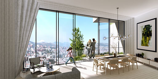
Rising 33-stories, the stack of concrete boxes that will make up the IQON tower in Quito, Ecuador, will become the city's tallest building. Designed by Bjarke Ingels Group, the firm's first project in South America recently began construction.
Plans for the residential tower involve the creation of an 'urban tree farm'—"we are letting La Carolina park climb up and into the building by planting native trees and plants on the terraces," says the architects. Each terrace will host a different species of tree, allowing the building's façade to celebrate the country's biodiversity.
But, the scheme goes beyond the typical phenomenon of vertical forests by incorporating the trees into part of a green cycle. "Once the vegetation planted on the terraces of the building outgrows their planters, they can be replanted in parks all over the city," the firm explains.

The design is a series of stacked, concrete boxes, rotated to provide the best possible views and create outdoor space. The curved tower overlooks the massive La Carolina Park, and offers sweeping views of the country's famous volcanoes.
The project will be in good company; Safdie Architects recently revealed plans of their own for a 24-story residential tower with planted terraces, overlooking the 165.5. acre park. Other high-profile starchitects and designers such as Bernardo Fort-Brescia and Phillippe Starck have announced projects as well, sure to transform the capital's skyline.
5 Comments
glad to see trees in ecuador don't need more than 4 inches of dirt to grow full size.
This design takes everything I’ve learned about minimizing waste and throws it right into the non-recyclable waste bin.
Huge amount of surface area. And probably a waterproofing nightmare. I’d love to see those details to prove me wrong :D
think that the popularity of pixel arch, and BIG, has to do with the desire to have human scale reaffirmed in these banal boxy glass developments. However, building out pixels is a very inefficient way to do this—probably why The BIG towers usually dont end up having these elements when finished. Is it just marketing then? Dishonesty? . Why not just go back to pattern windows, and human scale craft elements done in a modern way (not talking about BIG personally but arch generally)
It's the diagrams, that's why BIG's so big...I could explain their projects with those diagrams to my mother and she would understand, she doesn't need to read up on Derrida or Virilio just to "get" their buildings and I don't need to read up on them in order to explain those buildings to her, win-win! And inefficient is where simple construction ends and architecture begins :)
There is Modernism: then Post-modernism, Cornell Contextualism, Critical Regionalism, Deconstructivism, Post-structuralism, New Urbanism and of late, Parametricism. All of which have been, I think, attempts to "correct" aspects of the "incomplete project" that is modernism. But for too long now, the Bjarke Ingels Group and others, apparently having learned nothing from the last three decades, have been serving up big honking conglomerations of programmatic stuff which are little more than unreconstructed modernism. Sometimes, BIGger is just the same old shit that a Myron Goldsmith or a Gordon Bunshaft might have proffered half a century ago, only stacked with a twist and festooned with "native species." My concern is that this stuff replicates asexually. My students were looking at this very project today in studio, uncritically, as virtually all of the classes that would have taught them critical thinking have been replaced by software tutorials masquerading as "representation" courses and "theory" classes disguised as critical thinking courses.
Block this user
Are you sure you want to block this user and hide all related comments throughout the site?
Archinect
This is your first comment on Archinect. Your comment will be visible once approved.