
Archinect’s Get Lectured series has shone the spotlight on numerous lecture posters from architecture schools and departments throughout the U.S., and a few outside the States, since late 2013. During this past fall semester, I reached out to some of our previously featured Get Lectured schools to give a brief rundown of how their most recent posters came to be.
Although a school’s lecture program can depend on factors like size, location, and budget, a lecture poster is still considered a relevant communication device as it embodies what a great deal of everyday communication has become: succinct and visual. Do schools use their lecture poster solely to communicate timely information to the public? Or can the poster go beyond to represent particular ideals?
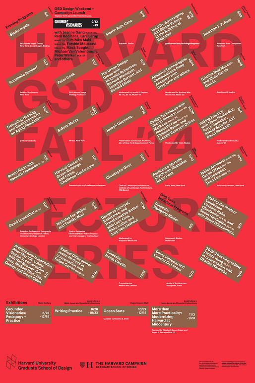

↑ Harvard GSD, Fall '14; Fall '13
A straightforward and eye-catching poster design may just be that for schools that prioritize getting the word out right away. This can easily work for well-known schools that continuously attract multiple influential speakers every term. Public Programs Manager Shantel Blakely at Harvard GSD describes their colorful calendar-like design that (unsurprisingly) have no specific symbolism to the school as, simply, abstract graphic design works. The same idea can be assumed for SCI-Arc’s recent posters, which use the same design throughout the year with different colors. (1,2,3,4)

↑ SCI-Arc, Spring '15
While many schools will use corresponding graphics to visualize their lecture series, a poster design can also reflect the school’s shifting philosophy and identity. The Yale School of Architecture (YSoA) posters represent the school’s graphic identity revamp by Pentagram in 1999, a time when Robert A.M. Stern became dean and the school was revitalizing its reputation to escape the growing “safety school” perception from incoming graduate students not accepted into Princeton, Columbia, or Harvard.



↑ Yale School of Architecture Spring '15; Spring '14; Fall '13
According to Pentagram co-principal Michael Bierut – who set YSoA’s poster design parameters still used today – the different fonts and text styles in the posters signify these changes, as if “[the graphics] have come together only for an instant, before rearranging themselves into some new formation.” While only the students can honestly consider if the YSoA is an innovative hub, it’s no question that a strong graphic identity can greatly contribute to a school’s public image for years to come.
The lecture series is especially valuable for programs that are smaller, newer, and based in geographically isolated locations. Besides a means of exposure, it serves as a guide for deans and faculty to keep track of which topics garnered the most interest from students and are worth further exploration in class or future lecture programs. For the South Dakota State University’s 4-year-old Department of Architecture (DoArch), the first two lecture posters reflect that the series is as much of a work in progress as the academic program itself. “Our first series did not have a theme, frankly we felt lucky to get people out here,” DoArch instructor Sara Lum wrote. Their second series ”Convention” represented one step forward in building the program.


↑ (Top) South Dakota State University, 2013-Spring 2014; (Bottom) Fall '14
Schools also use their lecture posters to further promote their ideals of open-mindedness and interdisciplinary collaboration – and what school doesn’t do that? This collaborative element extends to schools commissioning their own students or non-affiliated designers from other creative fields to design the posters, therefore allowing individual graphic styles to be showcased. Plus, it's a great way students with a knack for graphic design can add to their portfolios. The University of Wisconsin Milwaukee and the University of Oregon are a few of the numerous schools that maintain ongoing "traditions" of selecting students to design their posters.

↑ University of Oregon, Fall '14
The University of Toronto Daniels Faculty had their last two posters visualized by Dutch graphic design studio catalogtree, who also handfolded them with the Miura-Ori technique. In print or as an animated gif, the lecture poster turns into a fun, interactive piece of visual marketing.
Jordan Geiger, lecture program coordinator and assistant architecture professor at the University at Buffalo sums up what many schools aim to reflect through their lecture posters. He explains the University at Buffalo’s posters are “a self-conscious part of [the] department's and school's transformations, growth, and engagement with new forms of research and design discourse” that were influenced by changing faculty groups and their discussions on local and broader topics.
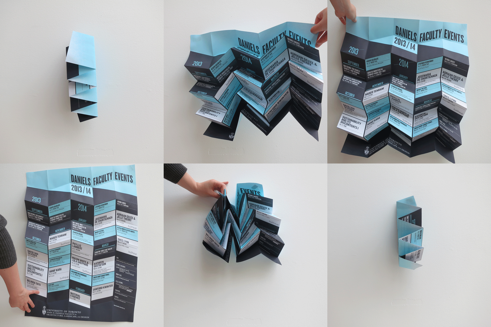

↑ (Top) The University of Toronto, Daniels Faculty Events 2013-2014; (Bottom) University at Buffalo, Fall '14
With all its design possibilities, the lecture poster is an experimental tool for schools to test their own visual marketing creativity in publicizing their pedagogical identities and current interests, and maybe invite some friendly competition to see who can show off the best-looking poster. The lecture poster is only part of the elaborate process in coordinating a lecture series. However, its design and the series it advertises could be that first impression that draws the larger community into a school's architectural discussion, or better yet, prospective students.
Want to share your school's lecture series and the story behind it? Email us at connect@archinect.com or contact the author.
Check out our Get Lectured Pinterest page to see our growing collection of featured posters.
1 Comment
University of Toronto wins.
"Branding" is a dubious term for lecture poster design. Communication of a brand/info is probably closer to what they do--a cherry on top. Harvard and Yale have nice graphic posters, but branding is really 400 years of institutional building. Graphic Designers use the B word to oversell their importance.
The Yale posters communicate a brand, but it looks like an an old man with expensive taste that might be seen on the Upper East Side. It looks like a department store.
Is that what they want to communicate? The rest are more vibrant and progressive.
Block this user
Are you sure you want to block this user and hide all related comments throughout the site?
Archinect
This is your first comment on Archinect. Your comment will be visible once approved.