Grosse Pointe is Water.....the building should be like water, fluid, light, refreshing. It should sparkle against the flat monolith brick structure which has its opens cut from the surface.
Oh by the way, I do like the way the lighting was worked out to
light the signage for the building. It does really make the signage become part of the building.
yo squirrelly!...i got your email and i wrote you back on your hotmail account...let's meet at the getty center, at a bar, at one of the l.a. architecture schools, starbucks on ventura, wherever,,,you're call...
first of all, i have finally managed to post all of my pictures from last week's site visit to the ftp site. everything from me should be in a folder called "fromPuddles" there's about 200 snapshots total but many of them were incorporated in the montages that i posted earlier (refer to page 3 of this thread). i didn't take a lot of interior photos as i was more interested in the context of the building itself. incidentally, the inside was very clearly tight for space and the library was busy that sunday afternoon. for anybody who doesn't yet have access to the ftp site, hit joshcookie with an email as he is one very helpful hombre.
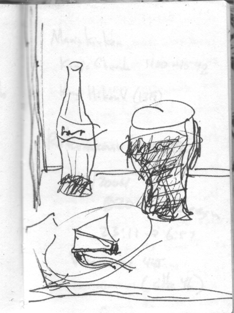
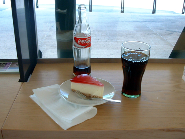
secondly, i haven't done much design work on this project yet...but i will admit that one of the things that i like about the fanning howey scheme was the mention of adding a cafe. with that in mind i feeling that this new library should be—at least in part—about cheesecake & a coke so here's a sketch to accompany that though...
and, yeah, i'll admit that it's not a new sketch, but rather one that was based on a visit to a cultural center a few years back. i have an odd habit of sketch encounters with food. i also documented that moment via a photograph...
...now if only i had a good book i could happily make myself comfortable in the breuer designed adult room.
found a book...i'm now thinking my proposal will called something like coke, cheesecake & kafka...now if i can just get that old fireplace working before the cold kills off this thread.
regarding program and survey information from the library:
Please Mister Postman, look and see
(Oh yeah)
If there's a letter in your bag for me
(Please, Please Mister Postman)
Why's it takin' such a long time
(Oh yeah)
For me to hear from that library of mine
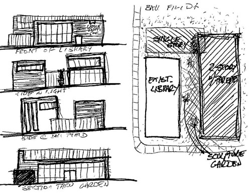
Ok, I kinda got sucked into the revery. I have never submitted anything like this before, so If the picture doesn't post, I'll have to try again. But here is my five minute sketch. Now I have to get back to my job.
Ok, I don't know how to post an image. Anybody want to help? Its a 106KB Tiff file.
Sarah you need to upload it to flickr or picasa or somewhere first, then link to it with the grey text format below. Ask if you need more help, we are all eager to see it!
Sarah - cool sketch. As for help: when you see the pic on your fliickr site, right click and copy the "image properties" address. Then paste that into the following formula:
{img}http:etcyourimagepropertiestext{/img} and but using the [] brackets instead of the {} ones.
Yay. Now the other trick to know is: when you paste your image location info, after that text enter ONE space, then "width=418" without the quotation marks and that will keep it the right width so it won't get cut off on the side.
For those of you who are keeping up with this thread, but aren't on the list for email circulation, I picked the drawings up at the library Sunday afternoon. The place was quite busy for a Sunday afternoon, not to mention Superbowl Sunday. The drawings should be scanned and uploaded to the FTP site for everyone's viewing by the end of the day tomorrow. Honestly I haven't even had a chance to look at them myself. It really is a beautiful building, though, and in a wonderful location. My hat goes off to everyone involved thus far. Let's keep up this momentum!
chili- again, huge thanks for venturing out on such a cold day to get the drawings. those are a very important piece of this puzzle.
i was also surprised by how busy the library was the previous sunday afternoon when i was there. it's a very small facility and easily felt crowded.
snooker- thanks for adding some more breuer pictures. i'll have to admit that this endeavor has been a nice crash course on breuer for me. i really didn't know much about him beyond the whitney over on 75th street.
thanks, snooker. hard to believe it's a breuer. i can see it in the 60's looking precast sunshades, but that split-face CMU elevation is pretty dismal. if it weren't for the meticulous detailing around the slit window openings, you could mistake it for most any ol' commercial/industrial building. breuer had quite a range. these lesser known buildings are in some ways more interesting than the more famous structures.
Takiura was able to visit with Breuer’s widow during the last years of her life. Modernism, she told him, was not about the flashy or the expensive — “it was all about decency,” she said, about sharing technology and design with the wider world.
Yutaka Takiura, is an architect who worked in Marcels office. He is a professor and a practicing architect in New York. I ran across this article in the Bismark, North Dakota Paper. Thought I just post this part of the article for people to read, if they don't have time to read the whole article.
i bet that's not split-face block but some very meticulously cut stone or custom-textured concrete. same era to the bush-hammered walls of rudolph's yale a+a. snooker can probably tell us, but i'd also bet it has a different presence than split face when you're standing there in person.
Actually Steven it is split face block...very early split face block.....which was most likely developed here in Connecticut because of Paul Rudolph's work in New England. He did a state
office building in Boston, and a most of the buildings on a Campus in South Eastern Massachusetts, along with the church in Boston's Back Bay. Then of course there is Yale School of Architecture.
I'm not sure of how this building was used by the Torin Company. I think I will call around and see if someone has some history on the building. I know one of these two buildings was the international headquarters for this company. There were a number of manufacturing plants designed by Breuer for this company over the years.
The windows on the building you reference are mirrored glass set into precast concrete frames, which are cast to act as sun shades. It is really an odd feeling walking by the building.
this brings up an argument that should be made for the library: while we've heard the comments 'undistinguished' and 'not according to breuer's spec'/'not according to breuer's wishes' here and there, there are a couple things that not only distinguish the library but also make it special. one person has told me (and i need to follow up on this) that w hawkins ferry, the one responsible for breuer's involvement and for furnishing it with the calder and the kandinsky, was actually a student of breuer. it was because of his involvement that breuer allowed for the building to be sheathed in brick to satisfy local sentiment.
sooooo...what grosse pointe has is a fairly uniquely local design - one that the community influenced - by an otherwise (so-called) 'international' bauhaus master. that should count as distinguished by my reckoning
After living with the care and thought that went into the details of Breuer’s houses, Takiura said, “If (every night) you go to sleep looking at the best, at something you love, and every morning you wake up to the best — 10 years later, your life’s totally different.
is another article/editorial on the breuer library demo from Jan 24
and this small response to the article originally posted by puddles: Save Grosse Pointe library
Yes, the Grosse Pointe Central Library is truly an icon ("Icon is worth saving," Jan. 20). It was designed by Marcel Breuer, an internationally renowned architect. The Ferry family donated to that building for our community and put into it such artwork as Calder's mobile and the tapestry by Wassily Kandinsky. It is also representative of its time. Why should it be torn down?
At best, perhaps it can be enlarged with upper stories. Failing that, it should be sold to someone who will keep it in our community.
still haven't received anything from the library. left a message for the director that had sent the materials asking her if - in lieu of hardcopies - i might be able to get digital versions of the program statement and the survey.
sorry this has been slow to get started, but we can do one of a couple things:
-delay the end. the 'deadline' was really just a logical time to conclude our efforts, the release of the rfp. we can stretch past that, if necessary, but that just keeps us all distracted from work longer.
-proceed with concepts/ideas independent of the hard program and site information. our results may be a little left field (ha!), but still can serve the cause of brainstorming/idea generation.
i'm leaning toward a combo, but option 1 is most appealing to me, because i'm counting on the red thread attracting a fair number of entrants...
if we do #2, perhaps we can establish (via extrapolation from articles, emails, info on the library site, etc.) a 'soft program' to guide/focus our efforts.
I like the combo also, we can dissect the current proposal to get rough requirements to get started with and refine later. I still like a solid end date, whatever that date may be.
j
Instead of thinking of this as "designing without restraints," I think this is a good opportunity for us to help them develop the program. What do they really need, outside of simply assigning floor areas to programmatic functions? I remember reading there was some debate within the library whether the library should adapt to the needs and interests of their younger patrons. Someone had suggested "hang-out" space and a cafe as possible means to attract teenagers. While this is still controversial within the library, I think it would be meaningful for us as architects to contribute to this dialog by helping them develop these alternative programmatic elements.
i agree with jafidler- let's think of it as an opportunity to help develop the program, taking into account that when we get their program there will be some merging.
on a parallel note- i think this was mentioned before, but i'm not sure: how about organizing a seminar on marcel breuer? i don't know if it could take place in the library or not. maybe generally about his life work at different stages and ending with an analysis of the library itself. i think we could contact teachers from universities in the area. the analysis is easy if there's a teacher willing to assign it to his/her students.
maybe the local aia chapter or some similar organization could help sponsor this event. it would help reinforce the importance of marcel breuer and help with the appreciation of the value of the building.
Steven, how do you think it best to get this sort of dialogue rolling? If they know they're getting true volunteer effort toward their cause, they surely would entertain such a notion...
for marcel breuer's admirers
Grosse Pointe is Water.....the building should be like water, fluid, light, refreshing. It should sparkle against the flat monolith brick structure which has its opens cut from the surface.
Oh by the way, I do like the way the lighting was worked out to
light the signage for the building. It does really make the signage become part of the building.
yo squirrelly!...i got your email and i wrote you back on your hotmail account...let's meet at the getty center, at a bar, at one of the l.a. architecture schools, starbucks on ventura, wherever,,,you're call...
*your
Has that program shown up yet???
first of all, i have finally managed to post all of my pictures from last week's site visit to the ftp site. everything from me should be in a folder called "fromPuddles" there's about 200 snapshots total but many of them were incorporated in the montages that i posted earlier (refer to page 3 of this thread). i didn't take a lot of interior photos as i was more interested in the context of the building itself. incidentally, the inside was very clearly tight for space and the library was busy that sunday afternoon. for anybody who doesn't yet have access to the ftp site, hit joshcookie with an email as he is one very helpful hombre.
secondly, i haven't done much design work on this project yet...but i will admit that one of the things that i like about the fanning howey scheme was the mention of adding a cafe. with that in mind i feeling that this new library should be—at least in part—about cheesecake & a coke so here's a sketch to accompany that though...
and, yeah, i'll admit that it's not a new sketch, but rather one that was based on a visit to a cultural center a few years back. i have an odd habit of sketch encounters with food. i also documented that moment via a photograph...
...now if only i had a good book i could happily make myself comfortable in the breuer designed adult room.
found a book...i'm now thinking my proposal will called something like coke, cheesecake & kafka...now if i can just get that old fireplace working before the cold kills off this thread.
regarding program and survey information from the library:
Please Mister Postman, look and see
(Oh yeah)
If there's a letter in your bag for me
(Please, Please Mister Postman)
Why's it takin' such a long time
(Oh yeah)
For me to hear from that library of mine
Ok, I kinda got sucked into the revery. I have never submitted anything like this before, so If the picture doesn't post, I'll have to try again. But here is my five minute sketch. Now I have to get back to my job.
Ok, I don't know how to post an image. Anybody want to help? Its a 106KB Tiff file.
Sarah you need to upload it to flickr or picasa or somewhere first, then link to it with the grey text format below. Ask if you need more help, we are all eager to see it!
Ok, I'm going to try again. Why do I get distracted so easily.

http://www.flickr.com/photos/15301603@N00/380667841/
Well that didn't work right, but the link does. Let me try again.

for sarah, see how easy this is...
Ok, I'm not so tech savy. I'm going to need step by step instructions. Pretend you're tell your grandmother how to do it.
How did you do THAT!!!
Sarah - cool sketch. As for help: when you see the pic on your fliickr site, right click and copy the "image properties" address. Then paste that into the following formula:
{img}http:etcyourimagepropertiestext{/img} and but using the [] brackets instead of the {} ones.
Please practice so we can see you do it....
Ok, did that work?
YEAH!!!!!! I did it!!!!
So now I'm sorry its posted twice, and for my COMPLETE lack of skill.
Yay. Now the other trick to know is: when you paste your image location info, after that text enter ONE space, then "width=418" without the quotation marks and that will keep it the right width so it won't get cut off on the side.
Now please go on an image-posting spree!!!
For those of you who are keeping up with this thread, but aren't on the list for email circulation, I picked the drawings up at the library Sunday afternoon. The place was quite busy for a Sunday afternoon, not to mention Superbowl Sunday. The drawings should be scanned and uploaded to the FTP site for everyone's viewing by the end of the day tomorrow. Honestly I haven't even had a chance to look at them myself. It really is a beautiful building, though, and in a wonderful location. My hat goes off to everyone involved thus far. Let's keep up this momentum!
sweet thanks Chili.....hopefully u got to catch some of the game too!
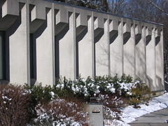
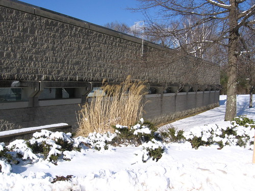
I went out on Saturday and snapped a couple of photos of commerical buildings Breuer designed for the Torin Company.
chili- again, huge thanks for venturing out on such a cold day to get the drawings. those are a very important piece of this puzzle.
i was also surprised by how busy the library was the previous sunday afternoon when i was there. it's a very small facility and easily felt crowded.
snooker- thanks for adding some more breuer pictures. i'll have to admit that this endeavor has been a nice crash course on breuer for me. i really didn't know much about him beyond the whitney over on 75th street.
thanks, snooker. hard to believe it's a breuer. i can see it in the 60's looking precast sunshades, but that split-face CMU elevation is pretty dismal. if it weren't for the meticulous detailing around the slit window openings, you could mistake it for most any ol' commercial/industrial building. breuer had quite a range. these lesser known buildings are in some ways more interesting than the more famous structures.
Takiura was able to visit with Breuer’s widow during the last years of her life. Modernism, she told him, was not about the flashy or the expensive — “it was all about decency,” she said, about sharing technology and design with the wider world.
Yutaka Takiura, is an architect who worked in Marcels office. He is a professor and a practicing architect in New York. I ran across this article in the Bismark, North Dakota Paper. Thought I just post this part of the article for people to read, if they don't have time to read the whole article.
http://www.bismarcktribune.com/articles/2007/01/05/news/update/doc459e74e474acb713435706.txt
Wow, am I glad we don't get that much snow. All for the cause though, right?!
i bet that's not split-face block but some very meticulously cut stone or custom-textured concrete. same era to the bush-hammered walls of rudolph's yale a+a. snooker can probably tell us, but i'd also bet it has a different presence than split face when you're standing there in person.
Actually Steven it is split face block...very early split face block.....which was most likely developed here in Connecticut because of Paul Rudolph's work in New England. He did a state
office building in Boston, and a most of the buildings on a Campus in South Eastern Massachusetts, along with the church in Boston's Back Bay. Then of course there is Yale School of Architecture.
I'm not sure of how this building was used by the Torin Company. I think I will call around and see if someone has some history on the building. I know one of these two buildings was the international headquarters for this company. There were a number of manufacturing plants designed by Breuer for this company over the years.
The windows on the building you reference are mirrored glass set into precast concrete frames, which are cast to act as sun shades. It is really an odd feeling walking by the building.
ah well...
this brings up an argument that should be made for the library: while we've heard the comments 'undistinguished' and 'not according to breuer's spec'/'not according to breuer's wishes' here and there, there are a couple things that not only distinguish the library but also make it special. one person has told me (and i need to follow up on this) that w hawkins ferry, the one responsible for breuer's involvement and for furnishing it with the calder and the kandinsky, was actually a student of breuer. it was because of his involvement that breuer allowed for the building to be sheathed in brick to satisfy local sentiment.
sooooo...what grosse pointe has is a fairly uniquely local design - one that the community influenced - by an otherwise (so-called) 'international' bauhaus master. that should count as distinguished by my reckoning
Steven,
Here is another good read: probably one of the more articulate articles written about Breuer.
http://www.cdnarchitect.com/issues/ISarticle.asp?id=169713&story_id=112308155015&issue=11012005
a good line to remember:
"...Breuer's methodology of retaining small commissions so that they may serve as design "laboratories" for his larger projects."
here's my fav bit from those articles
After living with the care and thought that went into the details of Breuer’s houses, Takiura said, “If (every night) you go to sleep looking at the best, at something you love, and every morning you wake up to the best — 10 years later, your life’s totally different.
“That’s the importance of design.”
is another article/editorial on the breuer library demo from Jan 24
and this small response to the article originally posted by puddles:
Save Grosse Pointe library
Yes, the Grosse Pointe Central Library is truly an icon ("Icon is worth saving," Jan. 20). It was designed by Marcel Breuer, an internationally renowned architect. The Ferry family donated to that building for our community and put into it such artwork as Calder's mobile and the tapestry by Wassily Kandinsky. It is also representative of its time. Why should it be torn down?
At best, perhaps it can be enlarged with upper stories. Failing that, it should be sold to someone who will keep it in our community.
Ann Kondak
Grosse Pointe Woods
via the DFP...
still haven't received anything from the library. left a message for the director that had sent the materials asking her if - in lieu of hardcopies - i might be able to get digital versions of the program statement and the survey.
sorry this has been slow to get started, but we can do one of a couple things:
-delay the end. the 'deadline' was really just a logical time to conclude our efforts, the release of the rfp. we can stretch past that, if necessary, but that just keeps us all distracted from work longer.
-proceed with concepts/ideas independent of the hard program and site information. our results may be a little left field (ha!), but still can serve the cause of brainstorming/idea generation.
I like the latter. Who doesn't miss designing without restraints! Besides, now none of our ideas can "wrong."
i'm leaning toward a combo, but option 1 is most appealing to me, because i'm counting on the red thread attracting a fair number of entrants...
if we do #2, perhaps we can establish (via extrapolation from articles, emails, info on the library site, etc.) a 'soft program' to guide/focus our efforts.
just some initial thoughts...
I like the combo also, we can dissect the current proposal to get rough requirements to get started with and refine later. I still like a solid end date, whatever that date may be.
j
Instead of thinking of this as "designing without restraints," I think this is a good opportunity for us to help them develop the program. What do they really need, outside of simply assigning floor areas to programmatic functions? I remember reading there was some debate within the library whether the library should adapt to the needs and interests of their younger patrons. Someone had suggested "hang-out" space and a cafe as possible means to attract teenagers. While this is still controversial within the library, I think it would be meaningful for us as architects to contribute to this dialog by helping them develop these alternative programmatic elements.
Steven I did alot of dreaming about the project last night, so I'm off to a good start.
Another link which is important:
http://www.aavc.vassar.edu/vq/articles/bauhaus_winter06
i agree with jafidler- let's think of it as an opportunity to help develop the program, taking into account that when we get their program there will be some merging.
on a parallel note- i think this was mentioned before, but i'm not sure: how about organizing a seminar on marcel breuer? i don't know if it could take place in the library or not. maybe generally about his life work at different stages and ending with an analysis of the library itself. i think we could contact teachers from universities in the area. the analysis is easy if there's a teacher willing to assign it to his/her students.
maybe the local aia chapter or some similar organization could help sponsor this event. it would help reinforce the importance of marcel breuer and help with the appreciation of the value of the building.
good call jafidler.
Steven, how do you think it best to get this sort of dialogue rolling? If they know they're getting true volunteer effort toward their cause, they surely would entertain such a notion...
docomomo has already done an exhibition- barry bergdoll did the talking. did someone here contact him at some point?
check out page 9 of their fall 02 newsletter
the library director just faxed the program to me and gave me contact info for the survey!
will scan the program asap and get it onto josh's ftp.
awesome!!!
SWEET.
all,
please check the email string, at your convenience...
I contacted Barry Bergdoll about a week and a half ago; he said he would look into it and suggested he would be contacting the board.
Block this user
Are you sure you want to block this user and hide all related comments throughout the site?
Archinect
This is your first comment on Archinect. Your comment will be visible once approved.