Firenze, IT
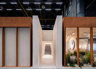
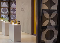
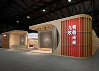
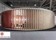
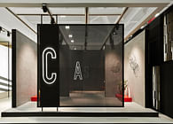
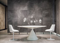
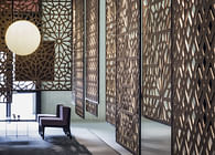
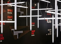
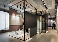
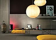
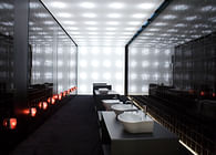
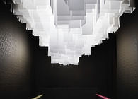
The inspiration for this project came from the tension between archaic and contemporary so deeply expressed by the city of Istanbul, where contrasts are the spirit of daily life. To epitomize this kind of tension we adopted a simple but powerful alphabet of opposed neat geometries. The overlaying of linear and monochromatic elements created different perspectives giving deepness to the space. Thus shaping an ideal background to the display of a wide range of product families, enhancing their decorative and plastic qualities and, at the same time, making clear all their technical features.
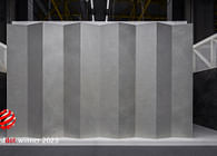
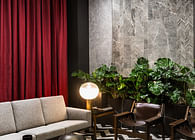
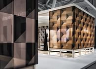
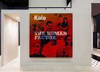
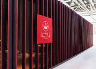
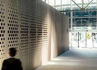
The project was able to speak both to professionals and consumers through symbolic chromatic matchings: white - the company, four different shades of gray - the thematic exhibition clusters, oak wood to express a solid sustainable attitude. Outside, the randomness of a proto-digital decorative tapestry made of monochrome blocks and inside, a wide transparent and open environment disclosing the vocations of the brand: research, innovation, quality, style.
Status: Built
Location: Istanbul, TR
Additional Credits:
client | kale group
trade show | unicera 2016 istanbul TR
creative direction | paolo cesaretti
design team | paolo cesaretti | paola danesi | francesca panizza
visual design | modiki
styling | deniz galip
contractor | studio/nakışçı
area | 750 sqm
photo | luca rotondo

