Firenze, IT
Kale Italia | Stand Design Format 2017/2018
Stand Design and Visual Communication at Cersaie 2017
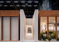
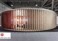
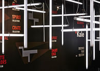
Our design for Kale’s new stand at Cersaie 17 pushes the company at the forefront of a new trend: a mutable and fluid ceramics market made of smaller numbers, higher quality and wider offer. It’s a simple, light design - almost a pop-up temporary showroom – along with a very iconic visual communication.
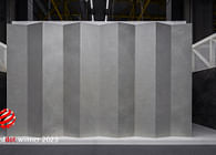
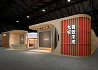
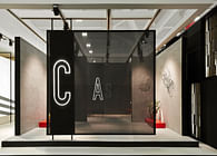
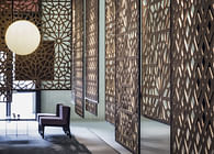
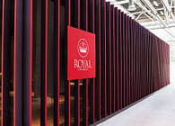
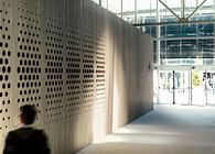
We used versatility as a conceptual frame. A low-definition modular design complemented with an external semi-transparent digital printed fabric skin. The modular elements are easily reusable giving shape to ever new display spaces and the fabric skin is a communicating surface providing always new messages and identity.
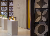
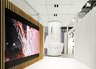
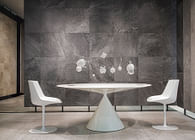
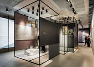
Adopting semi-transparent walls to display solid ceramic surfaces was a challenge. A radical choice indeed, a real switch of mind. We found a solution designing self standing displays organized in a continuous landscape of vertical and horizontal ceramic surfaces, thus placing the product collections at the core of the exhibition.
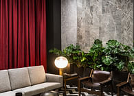
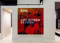
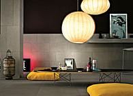
Celebrating the 60th anniversary of Kale Group, orange red banners hanging from the ceiling underline the Company’s timeline and highlights, gifting at the same time the welcoming lounge areas with a festive feel.
Status: Built
Location: Bologna, IT
Firm Role: Architect
Additional Credits: client | kale group - trade show | cersaie 2017, bologna IT - creative direction | paolo cesaretti | paola danesi | with noel perk - visual design | claudia astarita - contractor | la bottega - area | 700 sum - photo | lorenzo pennati | denis molinari

