
Follow this tag to curate your own personalized Activity Stream and email alerts.

Pantone has selected "Peach Fuzz" as its official Color of the Year for 2024. Twelve months after announcing "Viva Magenta" as its selection for 2023, the New Jersey-based company continued with the springtime palette with a light and bright color they claim will have an impact on an increasingly... View full entry

Pantone has announced Viva Magenta as its Color of the Year for 2023, ending a (mostly) blue-gray-hued streak that’s predominated for the past three years. Offering a “new signal of strength” that’s useful for “writing a new narrative,” the eye-catching shade of red can set the... View full entry
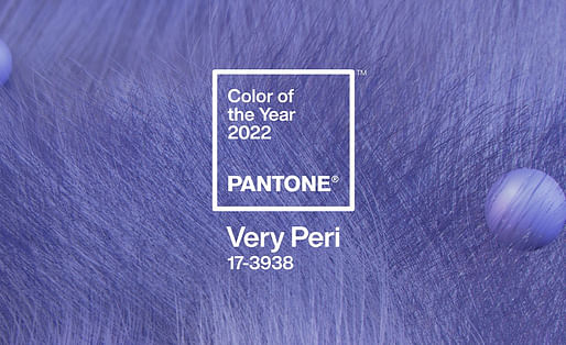
Pantone’s much-heralded Color of the Year has been announced, with “Very Peri” taking the top billing as pastels continue to dominate the annual list. The lilac-esque shade of blue is supposedly embiotic of the shifts in cultural attitudes and individual expression as we move towards a more... View full entry

The announcement of the Pantone Color of the Year seems to cause the media to stir every year. While everyone jumps on the hype showcasing how "excited" they are, how do color trends impact architects? Don't get me wrong; I love seeing the use of color in projects. The study of color theory... View full entry

Color plays an important role in architecture. Whether it's to create a mood or embellish on an interior's detail colors helps architects and designers convey many things, some have made entire careers out of color and its uses. Just ask Verner Panton, Josef Albers, or Paul Klee, color and... View full entry

"Color is the place where our brain and the universe meet." Famed artist Paul Klee said it best when it comes to describing color and its importance in our lives. With that said, Pantone, a leader in color matching and color systems has announced the 2019 Color of the Year. Pantone Color of... View full entry
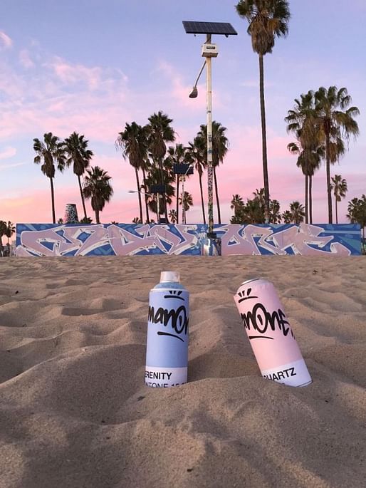
They decided that pink and blue were calming and cause for calmness. Then they decided that to convince you that you needed calm, they montaged a butt-load of anxiety ridden images with scratchy graphics and capitalized words that evoke social pressure and inadequacy. [...]
Don’t encourage everyone to chill, when you really want them to be docile. Don’t urge everyone to slow down when you really want them to buy.
— Pete Brook via medium.com
This delicious rant against Pantone's "Color of the Year" awards, which this year went to "Rose Quartz" (pink) and "Serenity" (blue), brought to you by "writer and curator focused on photo, prisons and power," Pete Brook. His critique of the competition, and the presentation of its winners... View full entry