
Bjarke Ingels Group (BIG) has designed a major residential complex in Athens, Greece. Named Park Rise and commissioned for LAMDA Development, BIG’s scheme is part of The Ellinikon, described by LAMDA as “Europe’s largest urban regeneration project and a smart city being built from the ground up in Athens.”
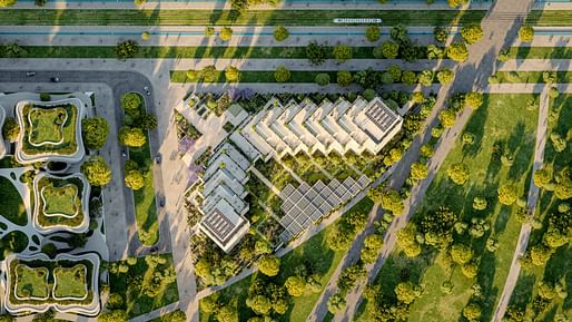
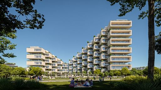
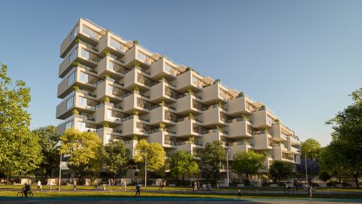
Park Rise will form the centerpiece of Little Athens, a new residential neighborhood located within the Ellinikon master plan. BIG’s concept will contain 88 residential units across five building cores: two rising to five floors, two rising to eight floors, and one rising to 12 floors.
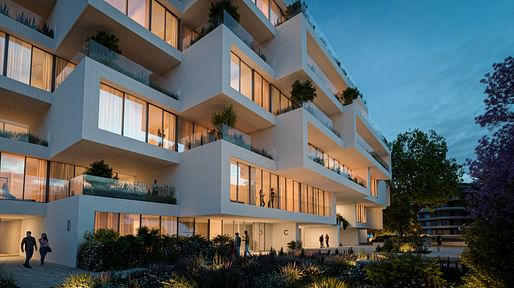
From the outside, the scheme is defined by a curved concave facade which, the architects say, “creatively reimagines the classic Greek column while adding a soft geometry to the aesthetic.” Off-white glass-reinforced concrete with exposed aggregates is integrated into the facade to “harken to the natural landscape.”
Inside, the residential units are designed with a material palette comprising Oakwood floors, neutral wall tones, and large expanses of glass. Flute patterns are integrated into vertical surfaces with smooth finishes to soffits and flooring, presenting an “elegant interplay of textures.”
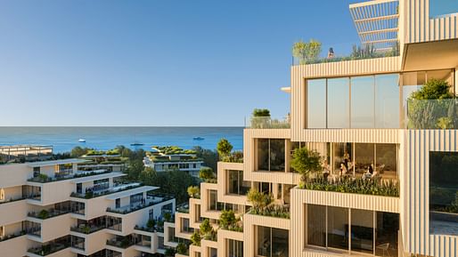
BIG is one of several notable firms associated with The Ellinikon, with Foster + Partners, Kengo Kuma & Associates, Aedas, and Sasaki also involved in the design. The self-described “sustainable, master-planned smart city” is located on the grounds of Athens’ old international airport, and will also incorporate the largest coastal park in Europe, Greece’s first residential skyscraper, and the largest commercial complex in the country.
News of BIG’s contribution to the master plan comes in the same month that the firm unveiled a new sofa piece for Natuzzi Italia. In July, meanwhile, BIG, ICON, and Lennar revealed the first completed home at the 3D printed Wolf Ranch development in Texas.
15 Comments
"Europe’s largest urban regeneration project"
In what sense, generally and specifically in context of site, is this a regeneration project, since there doesn't appear to be an urban area to be regenerated? (I'm just looking at the pictures.) Or will it somehow revitalize the greater Athens area?
the article states it's on the site of a former airport
Yes the irony of a 'little' city outside of an original, narrated as regenerating a non existent urban context, while probably really performing as a device of land speculation.
Then there's the facade that “creatively reimagines the classic Greek column while adding a soft geometry to the aesthetic.” The sides are fluted, I suppose.
The language is simple minded at best, more likely disingenuous, if not flat out dishonest. Why do they write such things except for purposes of promotion and deception? Heaven help us if BIG actually believes them.
When language goes, it takes the culture with it.
Both advertising and propaganda. . . represent the conscious or unconscious pressure on a genuine society to force it into a mass society, which can only be done by debasing the arts.
Northrop Frye
it's a fine building for what it is, but the forced effort to pretend this isn't just an application of the generic prototype BIG is known for degrades it. i think it's genuine bullshit, the presumption that this architecture is meaningless and so any descriptions are done with the cynical disinterest of a student writing an essay on an assigned topic. ed: to clarify, i'm referring to the architect's own descriptions of the work.
I should clarify. The regeneration remark is attributed to LAMDA, the development group, the column remark to the architects.
cf. IQON, BIG's residential tower in Quito, Ecuador:
From the architects:
Quito’s biophilia is carried from the public spaces below into the private domain of each home via the sculptural planters that are integrated into the architecture of the building. The planters become a unique concrete sculpture inside the apartments – creating space for the root zone of the tree for the apartment terrace above – while transforming the façade of the building into a celebration of Quito’s verdant biodiversity.
https://www.archdaily.com/993395/iqon-big?ad_source=search&ad_medium=projects_tab
that latter is at least objectively true. Not sure if the effect is biophilic or not. The fluted accents on this Greek project are more like 60s brutalism than Greek anything. What a strange thing to declare. The text reads like they think buyers are morons, which can't be good. The building itself reads like a copy of the OMA residential towers in Stockholm. Nice. But at least that one owns up to its inspiration.
The language is branding, nothing more, essentially meaningless, and can't be taken seriously. OK words wash before our eyes so we think they are OK, this for a popular firm that gets many projects, most of them in my eyes not especially striking or significant. The language tries to make the work seem like more than it is, and many are taken in. Much of our culture is like that. I'm curious how architecture historians will treat this age years from now.
I don't see the image I'm thinking of in the ArchDaily link, but if I'm remembering correctly the resulting tree pits from all the terraces become a "sculptural feature" in all the units below.
Edit: You can kinda see it from the outside with the pleated concrete that partially blocks the glazing.
Edit 2: It was Dezeen
@taz, yeah that one at least is real. Guess they didnt have anything to hang their hats on with the Greek project.
@gary, if you read the histories from the renaissance there was just as much bullshit called and spouted. Vasari was a gossip as much as a historian. And he remains the source of sources...meaning all the future humans will probably take what they get and be glad for it. Assuming we are still around long enough for a history to be read by anyone who cares at all...
@taz, oh...I remember seeing both of those images before (particularly last one) but never made connection to the tree pits invading the space in that way. Just assumed it was purely sculptural I guess? Definitely gives me a greater appreciation!
Medieval and Renaissance architects had some contact with Neoplatonism and Humanism; Mies read Aquinas, other philosophers; Postmoderns had brushes with Foucault, Baudrillard, who themselves reexamined past thought—and so on. All these architects showed deep engagement with the continuum of architecture, in acknowledgement or reaction.
My only point here is there was the context of some kind of discussion. With BIG, you get trendy words but no sense of thought or culture of any kind, nor engagement with site and culture, nor with architecture itself, thus his flip, naive reference to the Greeks here. He shows no understanding of them at all. This is, after all, a major project in Athens.
And that may be where we are now, drifting.
They are the SOM of our time, a firm that speaks to the zeitgeist and out-maneuvered their competitors to define the architectural aesthetics of a social media age.
https://archinect.com/news/article/150381010/big-unveils-a-new-sofa-piece-designed-for-natuzzi-italia
monosierra's comment may best describe BIG's work and our times. With him and others we get essentially sparse, transparent, open work with minimal design, without reference, maybe based on a simple gimmick. The same might be said about the sparse architecture of social media. But both aren't based on anything substantial yet are invested with all manner of open, airy optimism. Build them, get people together, and wonders will happen. We see what Facebook and Twitter have done to the culture, to the political and social scene, the proliferation of disinformation and hatred, individual and social malaise. There are benefits, but these haven't transformed us.
BIG describes his boxes as "pixels." This faint reference to technology is a weak, meaningless metaphor. As for myself, I don't like the idea of living in a box.
This project is not a good example of BIG explaining its work, for sure. The rest of the comments about BIG in general are harder to agree to. BIG can be hit or miss true, and this is a miss. When they hit though it is only fair to say they did something right. Quite often they do very good work and explain it very well with all the logical connections working and everything, and they do manage to connect to the world around them. This time the archi-babble quotient is high, even embarrassing. The building is not bad on its own though.
Personally I find it hard to not be impressed by how well BIG leverages the needs of their clients and their sites to get something good done. Many if not most architects would not get half so far, and to be frank we all know that. Not sure why BIG pisses so many people off.
Block this user
Are you sure you want to block this user and hide all related comments throughout the site?
Archinect
This is your first comment on Archinect. Your comment will be visible once approved.