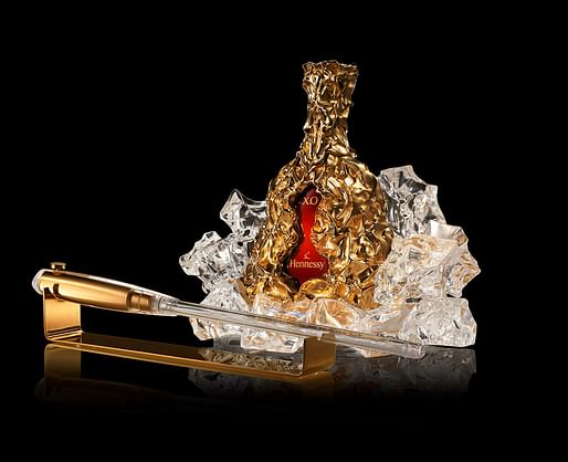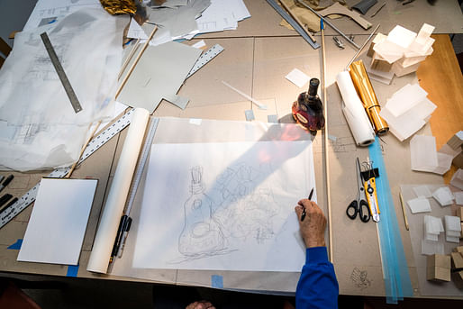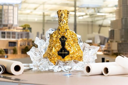
In celebration of the 150th anniversary of Hennessy X.O., the French cognac distiller has unveiled a sculptural decanter designed by Frank Gehry. Using his signature style, Gehry reimagines Hennessy X.O's classic design. The new bottle is wrapped with crinkled 24 carat gold-dipped bronze and encased in a "fractured" glass glorifier to illustrate its inspirations of water and light.

"I wanted to bring it to life, and so I took inspiration from its birthplace and used this crumpling effect of the material that gives it a feeling of movement," Gehry said in a statement. "The materials I've chosen catch the light and make this a really beautiful object on its own, but then you realize it is a bottle of Hennessy X.O."

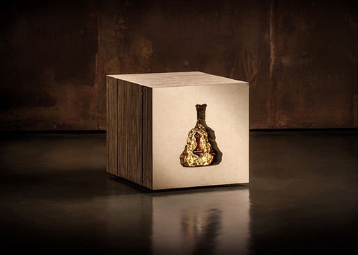
Gehry has also pulled from past explorations in his conception of the packaging for this new collection. The decanter, glorifier, and fusil are packaged in a protective case made imprinted with Gehry's signature and made of compressed cardboard, paying homage to Gehry's early endeavors with corrugated cardboard furniture back in the 70s.

"It was an honor to be asked to celebrate this milestone for Hennessy X.O. While I was excited, it was also daunting because a bottle of cognac is already a work of art—one you can smell, taste, and feel—it doesn't need embellishment as it's already there," Gehry added. We are showing how we can be creative within that language. There's such a powerful history and a serious emotional commitment from the people that make this product. It has a resonance that's interesting to tie into and become a part of."


29 Comments
Gehry was hired after another designer's proposal was rejected.
Interestingly, it was discovered that after half the bottle is consumed, no one gives a rip about the decanter design.
Wow, way to really stretch yourself there, Frank. JFC that's hideous.
Top priority design commission here in 2020.
should have been just a cardboard box with a twisty straw.
I don't think this is very good, but I do love this image: the packaging is so FOG.
Also, did he do this?
/\ Good news! Part 11 comes quickly, because Part 10 only takes about three or four millionths of a second.
Does "So FOG" mean wasteful, simplistic, and not terribly functional?
Honestly I kinda love it.
Ha. Glad I’m not the only one.
I do too. The whole ice cube design works well with his crinkly style.
You'd only wish y'all have fun working in your office at his age of 92 y.o.and 6 days a week, designing interesting projects with high visibility and loving it. And, wearing red converse shoes at no charge!
when your very existence makes you money, doing whatever, who cares. haters going to hate.
There are other demographic factors other than age that come into play;economics and social capital can make it easier to navigate to old age; not to mention being part of a profession that provides shelter to every group with all demographic parameters represented but limiting competition through exclusion.If the playing field is truly leveled and everyoneone has the same access to an architectural education/licensing as he did the outcomes would definitely be different. that you can analyze other factors have played to his advantage so he i
really? you're an idiot papd. you took this opportunity to make a political statement and didn't bother reading the man's bio.
Big admirer of his here, and some of his work. Other of his work, not so much. Life is interesting that way, and complicated.
For example: how much of this thing is about brand, and not necessarily design? Also: to Donna's point, the packaging for this thing is very compelling.
And because I can't resist a parallel spoof:
I'd take a bottle of Suntory over Henny any day.
Who knew that Hennessy's new clothes is a discarded wrinkled candy- wrap stuffed in a nasty laser-cut layered carton box - a hideous sort of design. If it was done by an unknown design student in their first year - it surely would have resulted in a failing grade. But since it was done by the "master"-wrinkler, who was the first to do "wrinkling" of facades and other design-y things - then, well, guess it works.
They were buying the name, of course, but perhaps they should have opted for another name as the design could been a bit more 'effort-full' then recycling contents from office garbage bin... Cheers!
Oh lighten up.
In other news, Victorinox announced that Daniel Libeskind will design a commemorative Swiss Army knife to mark 129 years of bleeding fingers.
LOL this is a quality joke. Well-played, citizen!
I actually laughed out loud. Good one.
8 likes, I think that's a record! can NS or EA verify?
That was quite funny citizen! Still smiling.
Think he mixed up the design for the Eisenhower memorial and the Hennessy
For liquor packaging design the Finlandia Vodka bottle is hard to beat. Looks like a chisled block of ice.
gehry is still impressive. Love this design, esp.the boxes. They are so outrageous.
For an architect with the dreaded burden of a free hand I think he is still way ahead of where most of could hope to be in the same shoes.
.
As much as the reference to a paper-bagged 40 or handle, may be a bit obvious, I like it.
Also, that centerfold-spread of the box/packaging is nice!
Block this user
Are you sure you want to block this user and hide all related comments throughout the site?
Archinect
This is your first comment on Archinect. Your comment will be visible once approved.