
“We are pleased to be able to preserve and share these important drawings, which document numerous projects and reflect Michael Graves’s manifold interests and talents, here at the museum, where he was known as family, and with our global audiences,” — Planet Princeton
The Princeton University Art Museum has acquired a collection of nearly 5,000 drawings created by postmodern-era architect Michael Graves.
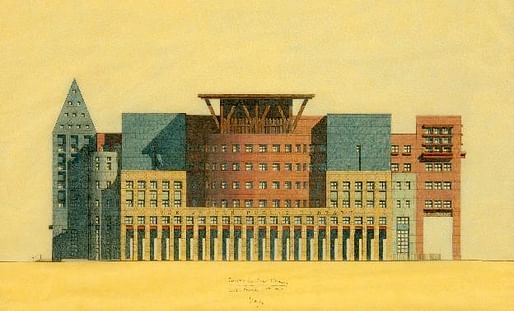
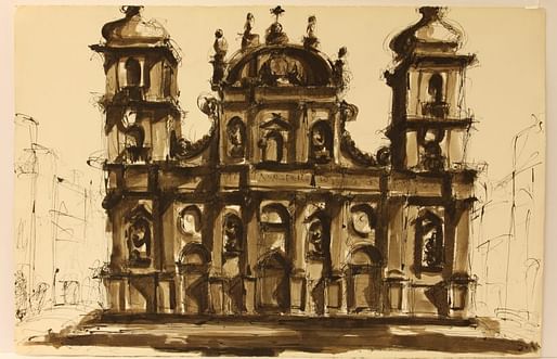
Graves, who died in 2015, was a prolific artist who sketched out many of his iconic building proposals using his signature yellow-, sienna-, and aqua-hued color pencils. The gifted collection is filled with many examples of Graves's virtuosic output and includes drawings made with ink washes, pen and marker, and pencil, as well.

Graves started his practice in 1964 at Princeton University, where he taught for 39 years before retiring in 2001. Throughout that long and storied career, Graves drew up designs for an incredible array of boundary-pushing buildings, including the Portland Building in Oregon, the Dolphin and Swan hotels at the Walt Disney World resort in Florida, as well as an unbuilt proposal for a controversial expansion of the Whitney Museum in New York City, among many others.
Sylvia Lavin, professor of history and theory at Princeton University told Princeton Planet, “As a prolific artist, architect and practitioner, Michael Graves considered drawing to be the foundation of his creative output.” Lavin, who is a scholar of Graves's work, added, “This corpus of work that will now reside at the museum will facilitate rich research and teaching opportunities around Graves’s enormously robust legacy.”
10 Comments
In 1980 a small group of us Sci Arc students visited the tiny office of Graves. There were 3-4 young architects or recent students working there (he wasn't in the office) and they were doing prismacolor drawings on yellow flimsy papers for an upcoming show at Max Protetch Gallery in New York who was dealing in his and others' architectural drawings. All the personnel in the office knew how to do a typical "Graves" drawing on a production line system.
This is not to take away from their value and influence on the architectural discourse. I had many friends in school who mastered that style at the thick of post modernism.
Cartoon elevations, perfect for cartoon architecture.
Back in the day at RISD the favored flavor was isometric on vellum, one of several reasons I switched to industrial design.
Beautiful drawings.
they sure are!
yup. but i'll never understand why someone would choose yellow trace over white. especially someone so sensitive to color in his designs.
It gives it an aged look. The romanticist in him, although there's a fair bit of rationalism in his work.
Because yellow trace is (or can be) gorgeous.
I started drawing in a similar technique in college, and I still do it. They do have a slightly vintage feel. But I really love it because if you are doing a project with white plaster walls, you can color them with white Prismacolor, and they pop off the page.
Too true! Especially in stu cco loving California.
Block this user
Are you sure you want to block this user and hide all related comments throughout the site?
Archinect
This is your first comment on Archinect. Your comment will be visible once approved.