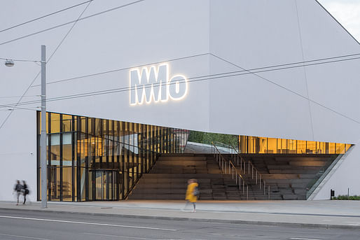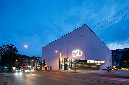
The Studio Daniel Libeskind-designed MO Modern Art Museum in central Vilnius opened its doors to the public today. At 3,100 m2, the building — which is also Lithuania's largest private museum — houses nearly 5,000 never-before-seen works by Lithuanian artists from the mid-20th century to the present. Studio Libeskind teamed up with locally based Do Architects and Baltic Engineers for the project.
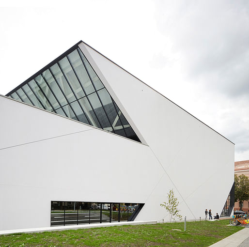
Located in historic Vilnius, the museum's design pays tribute to its past and present. Its rectilinear exterior facade is clad in luminous white plaster as a reference to local materials in the city, according to Studio Libeskind. The minimalist facade is contrasted with a dramatic open staircase that intersects the building on a diagonal axis.


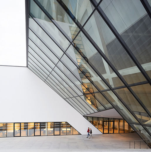
The staircase leads to a stepped open-air terraced roof that serves as a gathering space for public performances and events. A 5-meter fully glazed, cantilevered wall provides views of the public terrace from inside the galleries.

On the northern side of the building, visitors enter through a two-story glazed entrance into a light-filled lobby, which features playful details like geometric skylights and an interior glazed opening that offers visitors a peek into the art collection's storage vault. At the core of the museum is a black spiral staircase that connects the main gallery to the lower lobby.


Open floor-plan galleries provide 1,300 m2 of exhibition space for permanent and temporary collections. The building also includes a cafe, bookstore, educational spaces, auditorium, storage, and administrative space.
The design also prioritizes public space, with almost a quarter of the project site being dedicated to green space. Plus, a street-level public garden displays sculptures by winners of the Lithuanian National Prize for Culture and Arts.


Find more project photos in the gallery below.
7 Comments
Surprising restraint from Libeskind, i like it.
An art museum that doesn't display art?
That's quite a delightful project im(h)o.
Yeah, I'm pleasantly surprised at how restrained this is! And I really love the "lifted skirt" corner with the amphitheater stairs. (Kind of an inverted lifted skirt, I guess.)
Not bad considering how horrible these things can be, even though a museum of modern art is the easiest program to fulfill.
It appears to be way better than Liebskind's awful Denver Art Musuem.
Block this user
Are you sure you want to block this user and hide all related comments throughout the site?
Archinect
This is your first comment on Archinect. Your comment will be visible once approved.