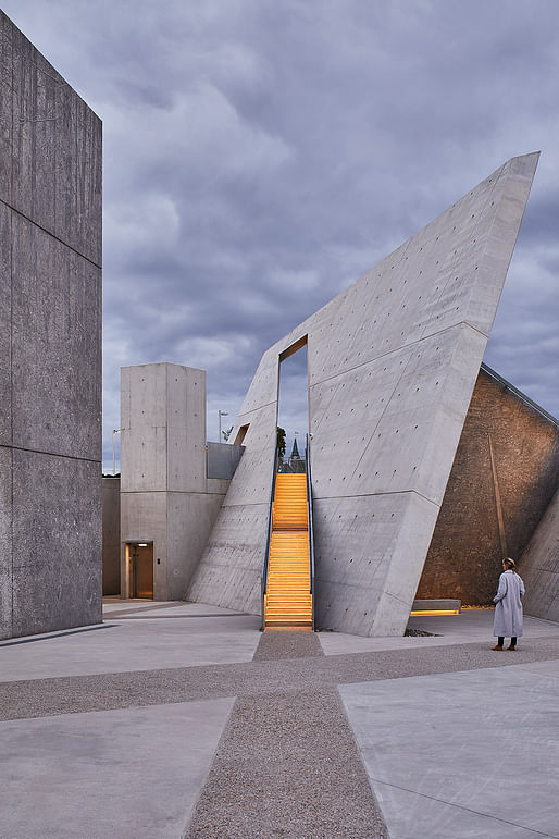

Last week we mentioned the Canadian National Holocaust Monument celebrating its grand opening in Ottawa. The stock of available imagery has been very limited for the last years and consisted of mostly the same aerial rendering in a few variations.
Now we've received new photographs that give a better understanding of the completed monument design — a collaboration between Studio Libeskind, Lord Cultural Resources, Canadian photographer Edward Burtynsky, Montreal-based landscape architect Claude Cormier, and holocaust scholar Doris Bergman.
"This monument not only creates a very important public space for the remembrance of those who were murdered in the Holocaust," Daniel Libeskind said in a statement, "but it also serves as a constant reminder that today’s world is threatened by anti-Semitism, racism and bigotry. Canada has upheld the fundamental democratic values of people regardless of race, class or creed, and this national monument is the expression of those principles and of the future."
From Studio Libeskind's project description:
"Centrally located at the corner of Booth and Wellington Streets across from the Canadian War Museum, the .79 acre site connects the museum to the historic center of the capitol city. The cast-in-place, exposed concrete Monument is conceived as an experiential environment comprised of six triangular, concrete volumes configured to create the points of a star. The star remains the visual symbol of the Holocaust – a symbol that millions of Jews were forced to wear by the Nazi’s to identify them as Jews, exclude them from humanity and mark them for extermination. The triangular spaces are representative of the badges the Nazi’s and their collaborators used to label homosexuals, Roma-Sinti, Jehovah’s Witnesses and political and religious prisoners for murder.
The Monument is organized with two physical ground planes that are differentiated by meaning: the ascending plane that points to the future; and the descending plane that leads visitors to the interiors spaces that are dedicated to contemplation and memory. Six triangular concrete forms provide specific program areas within the Monument: the interpretation space that features the Canadian history of the Holocaust; three individual contemplation spaces; a large central gathering and orientation space; and the towering Sky Void that features the eternal Flame of Rememberance, a four meter-high form that encloses the visitor in a cathedral-like space and frames the sky from above."
"Edward Burtynsky’s large scale, monochromatic photographic landscapes of current day Holocaust sites – death camps, killing fields and forests – are painted with exacting detail on the concrete walls of each of the triangular spaces. These evocative murals aim to transport the visitor and create another dimensionality to the interiors spaces of canted walls and labyrinth-like corridors.
The Stair of Hope rises from the central gathering space, cuts through a dramatically inclined wall and points at the upper plaza towards the Parliament Buildings; a gesture that recognizes and acknowledges the Canadian survivors who have contributed much to Canada and who continued to play an important role in exposing the dangers of state sponsored genocide.
Surrounding the monument, a rough landscape of various coniferous trees will emerge from the rocky pebbled ground. This landscape will evolve over time representative of how Canadian survivors and their children have contributed to Canada."
All photographs courtesy of Studio Libeskind.
UPDATE: A new set of photographs, showing the monument in greater detail, can be found here now.
Much better pictures. I may visit the site this weekend if I have time.
All 8 Comments
The overhead photo is too heavy on the symbolism for me. But the other two, more intimate, playing with lighting...I like
Also the third, ground level view I think provides a better sense of the overall context, than the overhead. With it's almost disconcerting, energetic, vehicular flow.
(Spoiler alert)
It's pointy!
I pass by this thing twice daily. The pictures don't show the galvanized chain-link fence along the lower sloped wall.
The Brutalist concrete structures are about as depressing as the original concentration camps.
Why not, for once, go with life affirming structures that transcend death. Maybe it should have been given over to a landscape architect in the first place. And built hard by a freeway. WTF?
It's not a freeway... that road you see in the aerial is a 60KPH scenic road along the river. Eventhough the design is meh, It's well sited and immediately across from the excellent war museum.
What would a life-affirming memorial to genocide look like? The idea is efed up on its premise.
You would be celebrating the people whose lives were taken. Not a real hard concept to understand. Why would you even make a 'memorial to genocide'?
That is a rather gauche expression of power. Seems totally inappropriate.
UPDATE: We just published a new set of photographs, showing the monument in greater detail, here.
Thanks for posting those.
Much better pictures. I may visit the site this weekend if I have time.
Thanks for posting. Brutalism has its roots in the Atlantikwall fortifications of Nazi Germany in the 1930s. They were designed and built by the Organization Todt which was a kind of German Corps of Engineers on steroids. If there could be a more inappropriate genre for a memorial to people whose lives were lost in the Holocaust I don't know what it could be.
Block this user
Are you sure you want to block this user and hide all related comments throughout the site?
Archinect
This is your first comment on Archinect. Your comment will be visible once approved.