
“Our curators and the architectural team have spent more
than two years in conversations about the nature of our collection, the history of our
installations, the continually changing nature of art, and our opportunities and responsibilities
for engaging our audiences. The outcome of these discussions is a design that accommodates
a global view and new perspectives on modern and contemporary art, and that embodies the
metabolic and self-renewing nature of our institution.
— Glenn D. Lowry, Director of The Museum of Modern Art
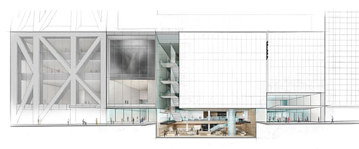
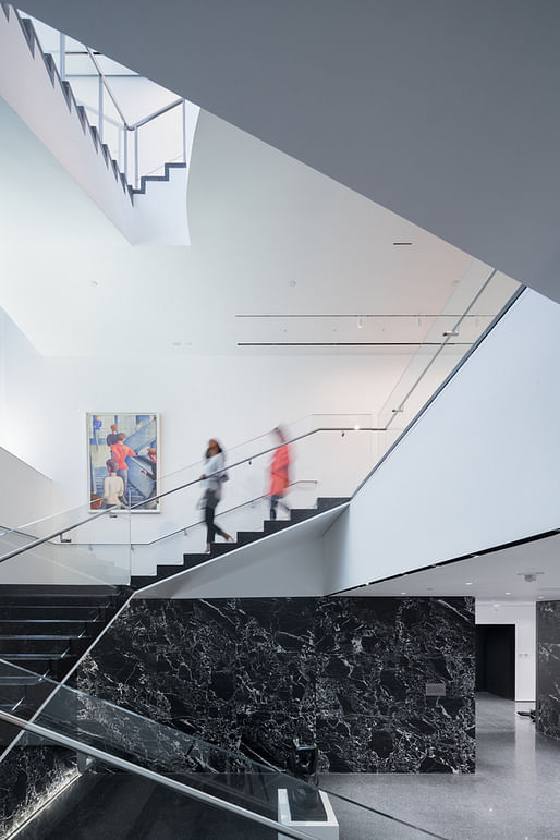
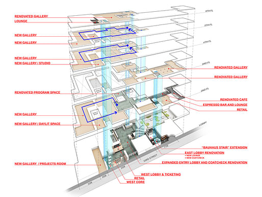
Glenn D. Lowry, Director of The Museum of Modern Art, today revealed the completed renovation of the east end of the Museum’s campus and unveiled the full design of a multi-year expansion project, developed by MoMA with architects Diller Scofidio + Renfro in collaboration with Gensler.


The goals for the project are threefold: to increase gallery space and allow the Museum to exhibit significantly more of its diverse collection in deeper and more interdisciplinary ways, to provide visitors with a more welcoming and comfortable experience, and to better connect the Museum to the urban fabric of midtown Manhattan.
The textural depth and interlocked spatial complexity! The sense of the handmade and glorification of craft on every surface! The utter uniqueness of the project as compared to any other building on the entire planet, a true labor of love and thing of beauty!
Oh wait I was talking about Folk Art Museum. Who put these shopping mall photos up here?
All 5 Comments
"Slow corrosion" must be the overarching curatorial theme of the MoMA as it turns away from progressive design and architecture and to the power of lame PR narrative... and fading relevance. The renderings look more like a Starbucks redesign than world class museum.
DS+Rs virus of bland white box art bays across the city will be great for bad performance art for years to come.
I haven't seen it in person yet. It sort of looks like a very nice airport or shopping mall.
Seriously. Are we sure that Gensler didn't design this?
The textural depth and interlocked spatial complexity! The sense of the handmade and glorification of craft on every surface! The utter uniqueness of the project as compared to any other building on the entire planet, a true labor of love and thing of beauty!
Oh wait I was talking about Folk Art Museum. Who put these shopping mall photos up here?
What happened to passing through the building and seeing art? Was that counter to Moma's ticket price model?
I think the truth is that the MOMA aesthetic has been appropriated by high end retail over the past 20 years or so. MOMA looks like a mall because the malls decided they wanted to look like MOMA.
That said, the average mall has better and more efficient interior planning than MOMA.
Block this user
Are you sure you want to block this user and hide all related comments throughout the site?
Archinect
This is your first comment on Archinect. Your comment will be visible once approved.