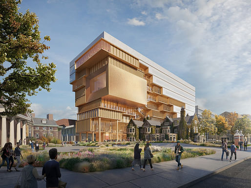

A proposed new University of Toronto building at 90 Queen’s Park Crescent will bring together academic and public spaces to create a hub for urban and cultural engagement.
The proposal will come forward for consideration by university governance.
— University of Toronto
Designed by Diller Scofidio + Renfro, the newly unveiled 90 Queen’s Park proposal for a nine-story building is expected to become the permanent home of University of Toronto's School of Cities in addition to a number of academic units from the Faculty of Arts & Science, the Institute of Islamic Studies, a branch of the Anne Tanenbaum Centre for Jewish Studies, and the Archaeology Centre as well as spaces for the Faculty of Law, the Faculty of Music, and the Royal Ontario Museum.
"Among the building’s showpieces is a music recital hall, with a large window serving as an exceptional backdrop to the stage and providing the audience with south-facing views of the Toronto skyline," reads the announcement. "Above the hall will be a 400-seat event space with similar skyline views. There will also be a café on the ground floor and a multi-story atrium leading up to the recital hall."
Charles Renfro, DS+R partner-in-charge, comments on the new building's interplay with the historic, 118-year-old Falconer Hall: "This 'campus within a campus' is revealed in the building's dual identity—a smooth cohesive block of faculty offices and workspaces gives way to a variegated expression of individual departments as the building is sculpted around Falconer Hall, the historic home of the law department. Several public programs are revealed in the process."
“Falconer Hall provides an opportunity to integrate the old and the new in an exciting way,” says Delgado. “As opposed to an addition to an historic building, what we see here is a novel and creative way of having a historic building influence a new building.”
This is garbage lip-service to working within context. There is nothing reverential about this design... where is the influence? The banal mass loosely disintegrating at the outline of the existing building? Creative and novel this is not. A grossly inappropriate scale that regurgitates the same tired tricks, all the while rationalizing and proclaiming its importance through nonsensical jargon.
All 11 Comments
.
I suppose the school could be faulted for loading up the program and allowance has to be made for limited space on an urban campus. Also you need to see what DS+R is transitioning, the non-ecstatic rear of the Royal Ontario Museum.
But this is a stacked monster. That box recital room is just corny. A picturesque campus is being devoured by it and other outsized abstractions.
Meanwhile Robarts Library is being renovated with the addition of the glassed space:
https://www.constructioncanada...
The school has had a chance to assert its identity and remake itself. It's just moving further into incoherence.
Toronto's shakers and movers too often confuse visionary with flashy and meaningless. I see how they may have taken Drake a little too literally.
Should be "confuse flashy and meaningless with visionary", which means they are most asuredly not 'movers and shakers'.
That's just ugly.
At a concert, the lights go down and we focus on the individual performers, but more we are taken by them to their performance, to the worlds of Bach or Bartok, and with these worlds we enter the universe of music. Here, we see as backdrop the city of Toronto. The device is reductive and distracting.
I'm not saying Toronto isn't an attractive city.
It's hard to believe more is a stake here than someone thought wow isn't this a neat idea. Similarly, there doesn't seem to be much involved in the building that speaks to the identity of the University of Toronto in particular or to the dynamics of education in general. It's just a lot of stacked empty space, much of it wasted, that feels overpowering and pointless. We lose all sense of human scale. Nine stories is too much for this location anyway, but more could have been done to maintain perspective and proportions.
Falconer Hall, a distinctive building that has stood up well for over a century, that has endured change and wears it, that represents continuity and memory, is dwarfed and trivialized. Whatever glitter this building has will wear off quickly.
Well said. If you're going for iconic, make sure it doesn't overwhelm the place, especially if it resonated emotionally with the inhabitants.
So much for context.
This will look "great" in -30C and with ice dangling from all those overhangs. Honestly, had no idea this was being proposed.
Have they tried turning it up side down already?
Less stairs to climb to attend the recitals.
“Falconer Hall provides an opportunity to integrate the old and the new in an exciting way,” says Delgado. “As opposed to an addition to an historic building, what we see here is a novel and creative way of having a historic building influence a new building.”
This is garbage lip-service to working within context. There is nothing reverential about this design... where is the influence? The banal mass loosely disintegrating at the outline of the existing building? Creative and novel this is not. A grossly inappropriate scale that regurgitates the same tired tricks, all the while rationalizing and proclaiming its importance through nonsensical jargon.
Context? Ridiculous.
I'm usually repulsed by avant-garde buildings which look like they are piercing, eating or humping traditional buildings. It's perverse.
Block this user
Are you sure you want to block this user and hide all related comments throughout the site?
Archinect
This is your first comment on Archinect. Your comment will be visible once approved.