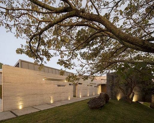
Blending elements of brutalism and pronounced geometric framing, the Murray Music House designed by Carazo Arquitectura is technically a single family home, designed for two parents and three children. The fundamental concept underlying its design is "Living Through the Experimentation," which helps to explain the use of changeable elements like ceiling-suspended fabric chairs and mesh netting in the hallways. By placing malleable objects into the solid frame of the home, the architects hope to constantly engage the occupants in creating new uses for spaces such as the bedroom, kitchen, and the hallway. "Experiencing a home like Murray Music includes exploration, giving another meaning and other use to spaces that normally have specific functions," as the architects explain. But these elements are not the only method of inspiring experimentation.


The rather severe geometry, which includes a black rectilinear frame hovering over the kitchen and a vertical slanted skylight with unabashed mullions, is purposeful. "The geometry of the house plays a fundamental roll for the understanding and coherence of the various programs involved in the project, through the scale, subtraction and addition granted by the multiple forms," the architects state. "The openings allow natural lighting and ventilation through each of the spaces. The kitchen area extends as an integrating element of the dwelling with the social area, which allows the participation of all the inhabitants in the housework, hierarchizing this space through the height, the overhead lighting, and the views to the landscape."


The surrounding Costa Rican landscape also plays a crucial role in the design of the house. The upper level is designed to let in as much natural light as possible, creating a constantly changing canvas of sunlight. The ceilings, meanwhile, serve as a link between the interior and exterior worlds, providing shelter for the social activities within while encouraging engagement with the landscape. In almost every element of the design, the architects have worked to banish stagnancy; the 395 square meter house welcomes change.

The architects note that "taking advantage of the site characteristics such as topography, trees and orientation, allowed to adapt to the steep slope of the land, designing a two level house with specific characteristics for each environment. The lower level has the quality of being immersed in the ground and within a wooded area that promotes privacy, generates a threshold of silence and the earth and grass provide climatic comfort, creating cool environments during the day and warm at night. The trees cover a good part of the facades, generate shadows, light projections that pass through the branches and paint the panorama with their trunks, roots and leaves making of this space, located in the depth of the ground, the ideal place for the bedrooms."


The textured concrete of the exterior, which is interrupted by occasional rectangular slits, smooths out in the underground bedrooms, although the seams of each bedroom concrete panel are left exposed. This effect recalls the unapologetic rawness of brutalism, although the use of a wood floor, cabinetry, and black-framed windows helps to ameliorate the severity. The visual power of these forms and materials ultimately spurs a constant awareness of one's surroundings, creating a home that repels static living.

No Comments
Block this user
Are you sure you want to block this user and hide all related comments throughout the site?
Archinect
This is your first comment on Archinect. Your comment will be visible once approved.