
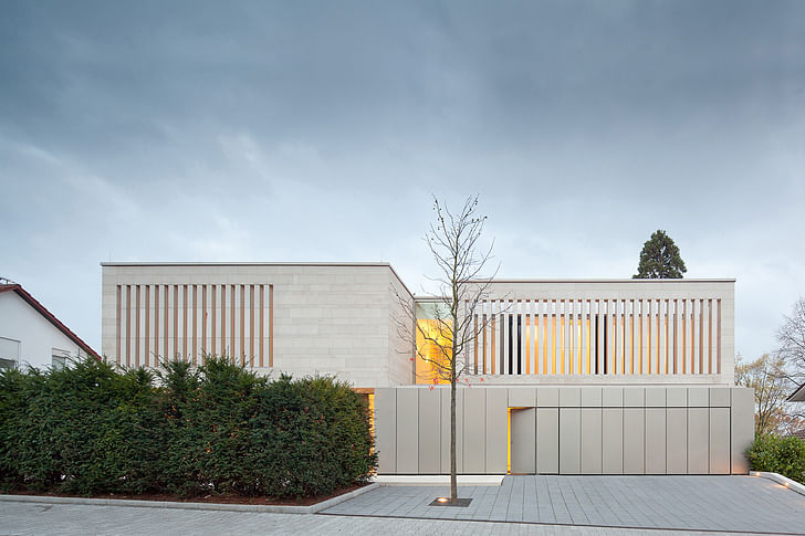
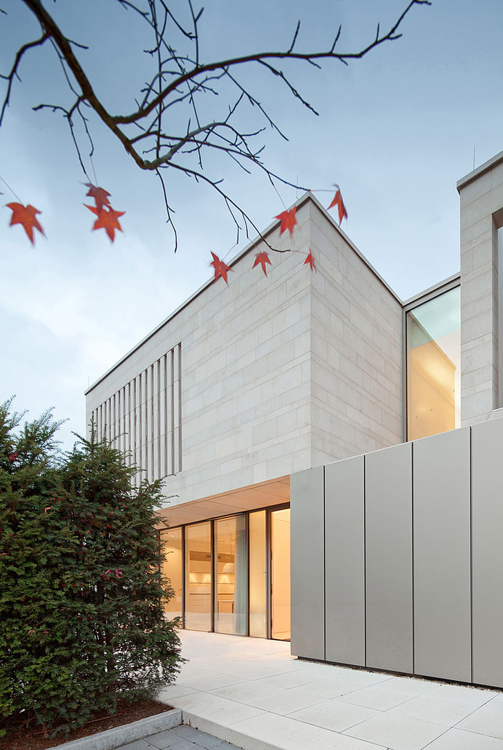
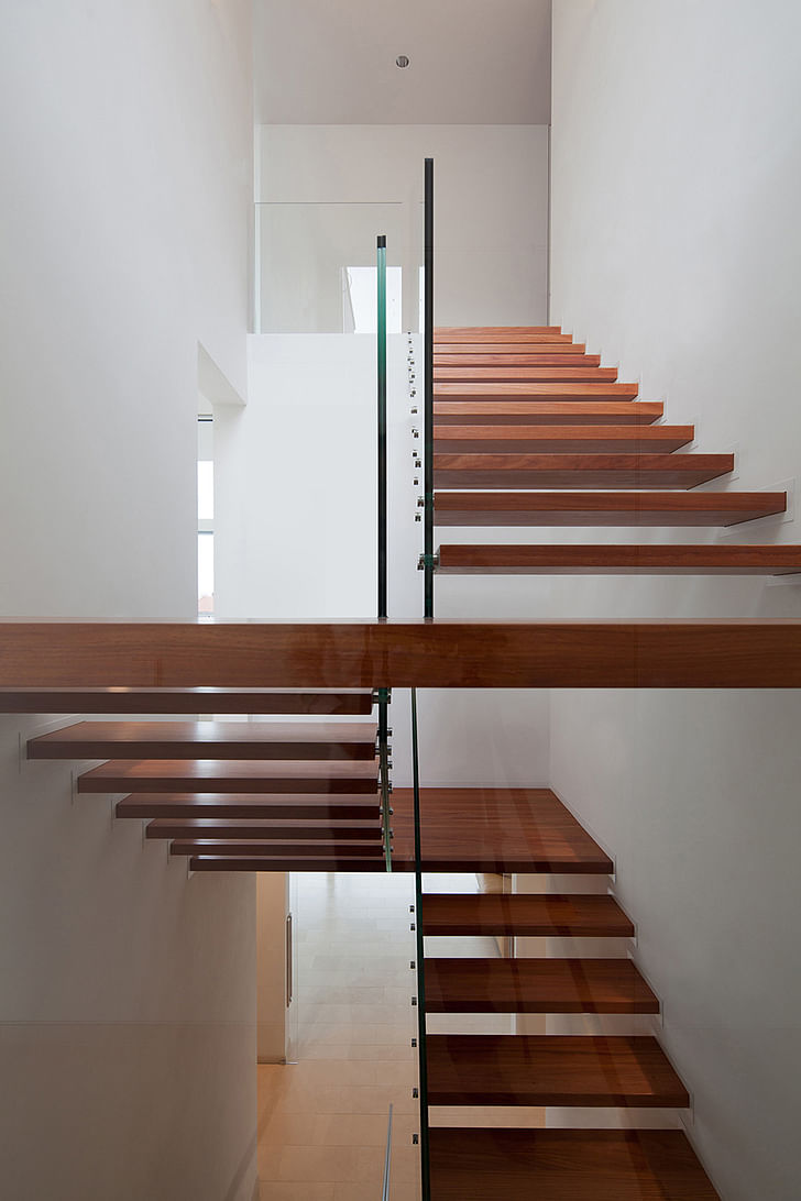
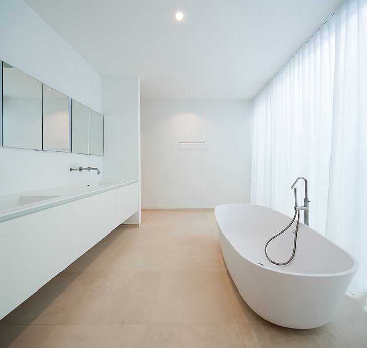
While designed as a private residence, the shape of Wannenmacher-Möller's Weinheim Residence has inklings of cultural and industrial institutions. The home's stretched linearity is a sleek version of the stacked shipping container aesthetic, made of aluminum and glass on the ground floor, and light-colored stone on the upper. Inside, surfaces are similarly light and clean, resembling a bright and airy white-cube gallery. Built for a family of five, the house morphs neatly from two stories into three, as the steep plot slopes downwards from the street-facing front into the back garden.
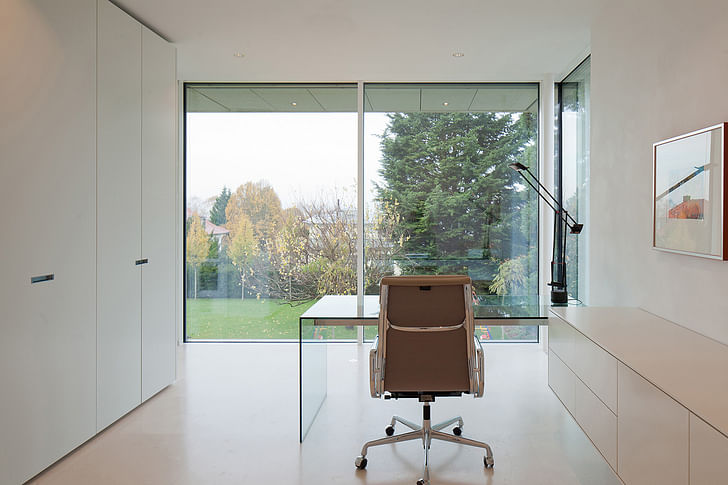
The ground floor is kept private from the street by a row of hedges, and slats over the upper floor's windows obscure the interior while letting light seep in and out. The reverse side is nearly all glass, providing an uninterrupted view of the sweeping backyard -- dotted with a single tree to obstruct views into the house from other properties. The interior space is contained to be at once both open and private.
Project Description from Wannenmacher-Möller Architekten:
This detached house with a self-contained flat is being built on a plot of approximately 2,000 square metres in a prime residential area of Weinheim (Bergstrasse) for a family of five. The design is for a building that is split into individual volumes and that has two storeys facing Weinbergstrasse in the northeast and three storeys facing the garden in the southwest due to the extreme slope of the plot. A detached house, built in 1999, which still exists on the plot, is to be retained and included in the design.
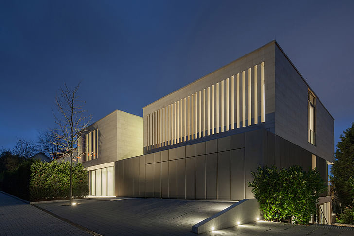
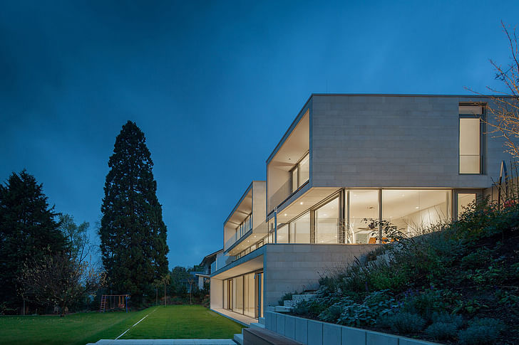
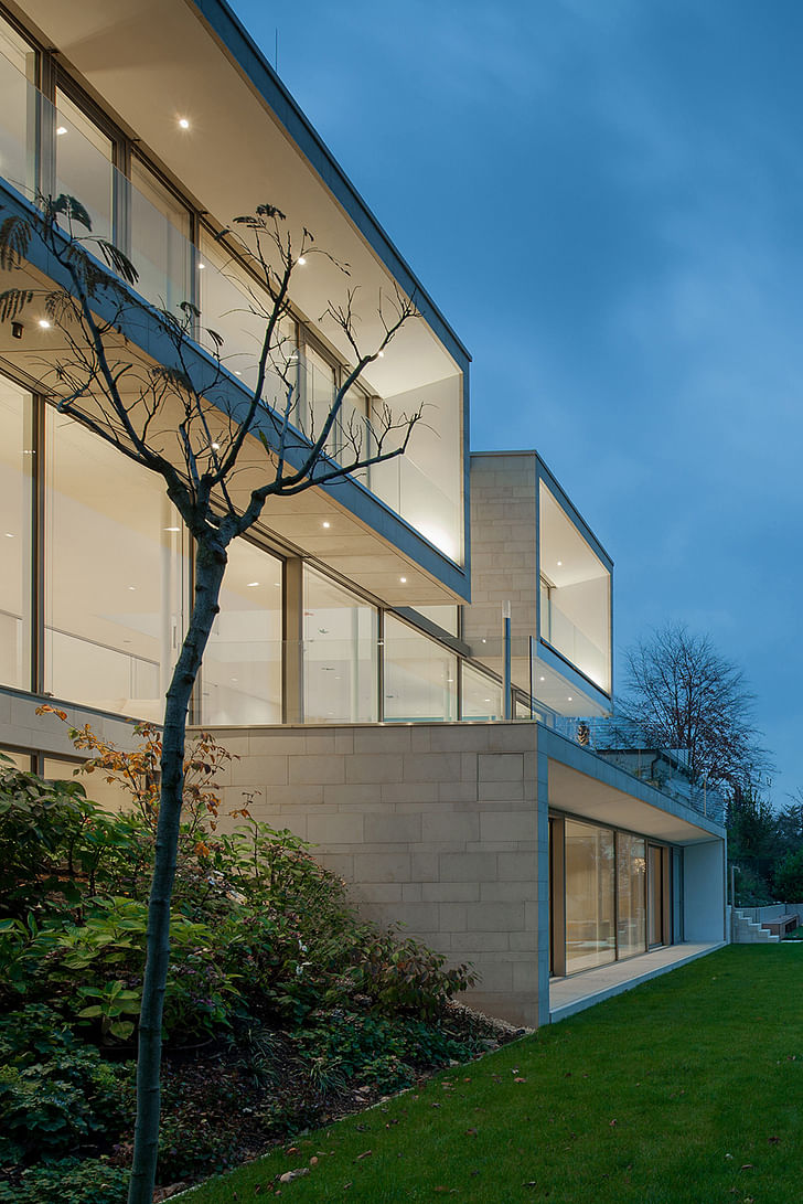
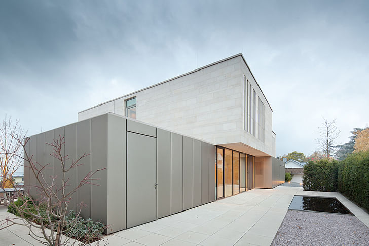
The playful arrangement of the various volumes, characterised by sections that protrude or are set back, makes the 800 square metre house appear smaller and helps to integrate it into the smaller structures in the existing surroundings. On the southwest side the lower storey protrudes so far into the garden that its roof area forms a terrace area in front of the living/dining area on the first floor with a depth of almost 4m. This level is given a generous extension in the southwest because of the way the building is set back, allowing a pleasantly proportioned outdoor area to be created. There is a tree in the centre of this outdoor area, giving it a special atmosphere and also screening it from the existing building that is immediately adjacent to it.
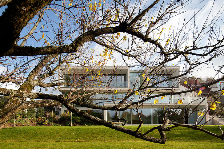
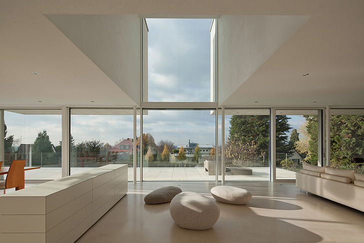
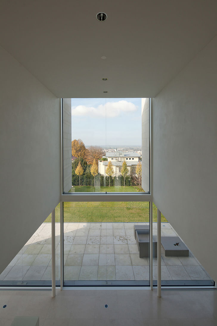
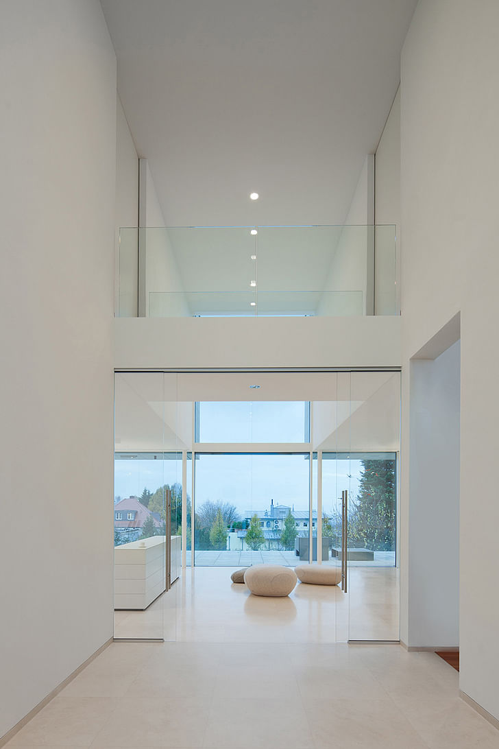
The division of the building’s volume is mirrored by its architectural design. The ground floor, which is faced entirely in glass and aluminium, contrasts with the upper level, which is clad in light-coloured natural stone. The façade that faces the street is mostly closed in order to fulfil the client’s wish for protection against uninvited onlookers. On the side facing the garden, however, the design is open and allows indoor and outdoor areas to merge together.
ShowCase is an on-going feature series on Archinect, presenting exciting new work from designers representing all creative fields and all geographies.
We are always accepting nominations for upcoming ShowCase features - if you would like to suggest a project, please send us a message.
Former Managing Editor and Podcast Co-Producer for Archinect. I write, go to the movies, walk around and listen to the radio. My interests revolve around cognitive urban theory, psycholinguistics and food.Currently freelancing. Be in touch through longhyphen@gmail.com
Are you sure you want to block this user and hide all related comments throughout the site?
5 Comments
a very safe, clean approach.
I like the interior. The outside looking, I think, is not like a home, not warm enough~ I still prefer a house giving people warm and love.......This one, it looks a little cold~Just my opinion....
I think looking cold is the point. Definatly a lot of surfaces to wipe down if you have children.
the language of dwellings never changes... no one seems desired to change it
Notice that there is no sign of human beings - they would mess everything up.
Archinect
This is your first comment on Archinect. Your comment will be visible once approved.