
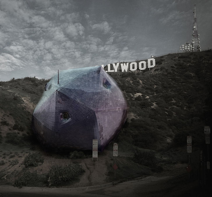
With juried first, second and third place winners, as well as an owner's choice winner, the Hollywood Competition has selected four different visions of a potential "house of the future" sited just beneath the Hollywood sign. Here's a closer look at each of the winning projects, and what those designs could portend for the next iteration of residential design.
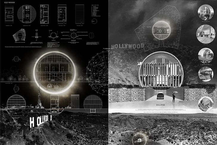
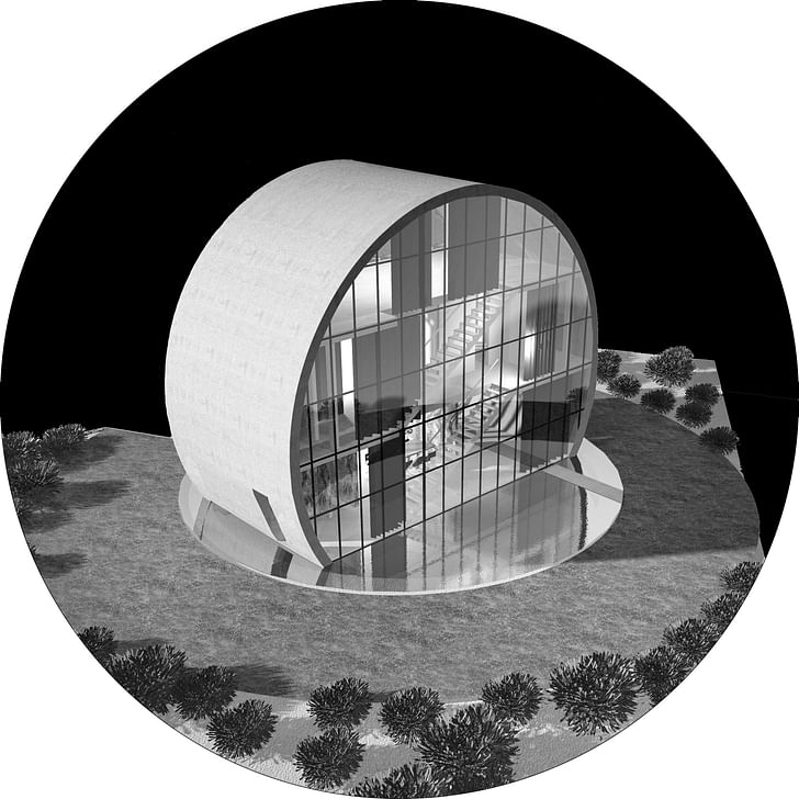
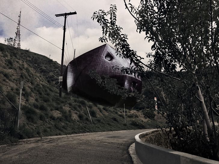
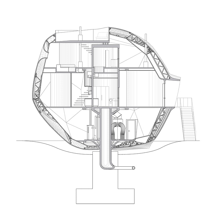
What’s striking about the four designs that took the top places in Arch Out Loud's Last House on Mulholland competition how such a variety of aesthetic approaches all center on a common ethos. From landscaped camouflage to stylish echoes of modernism, each design highlights a quintessential element of the city it overlooks while also addressing sustainability and comfort. Selected from 500 entries, the juried first place winner, “Ambivalent House,” is a kind of cratered, amorphous spheroid that seems to be peeking out at the surrounding landscape through recessed porthole windows. Meanwhile “Eclipse,” the choice of the real-life owner of the site Steve Alper, is quasi-modernist, a concrete circle strewn with mullions that sits astride a reflecting pool.
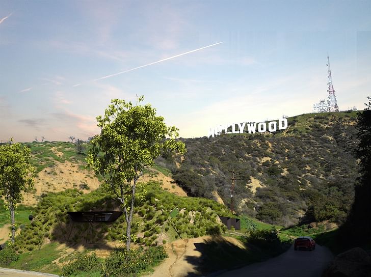
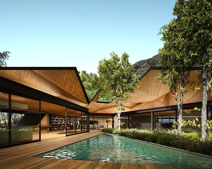
“Hollywood Hill,” the second place entry from Mexico’s FGO/Arquitectura, is perhaps the most (literally) bent on preserving the existing landscape of the site. The exterior of the house is disguised so effectively that initially it doesn’t even appear to be in its own rendering. However, the interior each design highlights a quintessential element of the city it overlooks, while addressing sustainability and comfortopens up in a way that’s faintly reminiscent of the startling angularity and materiality of the Sheats Goldstein residence. As the designers explain, “The Project arises as a response to regenerate the site in a natural way. Mimicking the surrounding orography with a geometrical slab which reduces the visual impact and ecological footprint, [the house] contains multiple green roofs, which act as a natural cooling system and water collectors to be reused. At the center of the project an organic vane is opened to illuminate and ventilate the house in a natural way, at the same time it produces an spectacular view of the landmark Hollywood sign. Playing with geometry to open windows through the slope.”
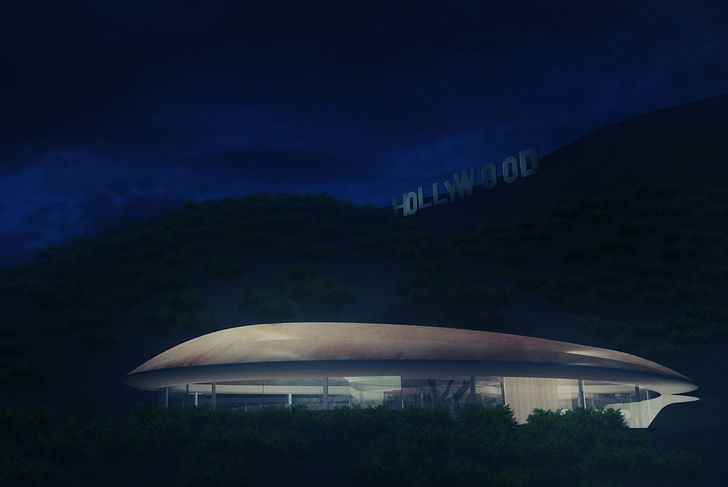
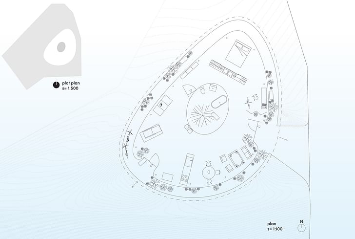
The third place entry from the Japan/L.A. team of YBDD, NHD, “The Last House,” takes advantage of the views offered by the site with a glass exterior while relying on an open, no-wall model that makes the most out of its elliptical floorplan. It offers a kind of sleek yet low-lying presence, like the structural equivalent of a celebrity sun-bathing. a kind of sleek yet low-lying presence, like the structural equivalent of a celebrity sun-bathing“The Last House is an experimental house for the near future,” designers Yohannes Baynes and Noriaki Hanaoka explain. “The Last House uses a combination of traditional techniques and emerging technology to form a double skin roof. The Last House favors the use of passive technology systems that work in harmony with the site. The structure is nestled into the landscape to reduce exposure to heat and maximize cool air flow. The natural slope is embraced and used to define space in a house with no walls. The last house seeks a minimal impact upon its environment, yet [creates] a noticeable sliver of light below the Hollywood sign.”
The difference between the jury’s first place pick and the owner’s pick is perhaps most illustrative of how architects analyze architecture versus the gut-feeling approach of those outside of the profession. The jury, which consisted of Thom Mayne, Tom Kundig, Jimenez Lai, David Basulto, Peter Zellner, Jenny Wu, Jonathan Segal, Heather Roberge, Paul Petrunia, Dwayne Olyer, Frank Clementi, Ron Radziner, Christine Theodoropoulos, Benjamin Ball, Hollywood is, after all, about dreams Greg Lindy, Edward Lalonde, Andrew Zago, Jason Long, Lawrence Scarpa, and Andrea Lenardin Madden, chose the winner through a set of complex lenses. Jason long felt that “the best of the submissions to this competition confront these issues head-on by imagining new ways for architecture to both broadcast toward and shield us from the community around us.” Benjamin Ball, meanwhile, explained that “I used the site - its cultural significance and meanings associated with the Hollywood Sign -as the lens through which to evaluate the work.” Steve Alper, meanwhile, noted that “in making the owner’s choice, I felt compelled to choose Eclipse - simply because I've never seen a house like it, and then I dreamed about it. Hollywood is after all, about dreams.”
However they were chosen to become the winners of their respective categories, both first place entries take similar approaches to the site. In their comments for “Eclipse,” the design team of Italian A2.0 Studio di Architettura explains that “The site is strongly characterized by the wild pattern of the surrounding nature. From here the view is open to the wide landscape, from the hills to the LA urban sprawl. The sheet music is complex, made up of overlapping signs, located on a fraught ground, characterized by icons of the global collective imaginary. The project is based on simplification, on reduction, on pure forms, on the enhancement of well-being and sustainability. The circle is the representation of these concepts, in analogy with the iconic Hollywood sign and its own shadow projected on the hills.” This house’s response to the evolving problem of iconicity in architecture is perhaps its most important statement
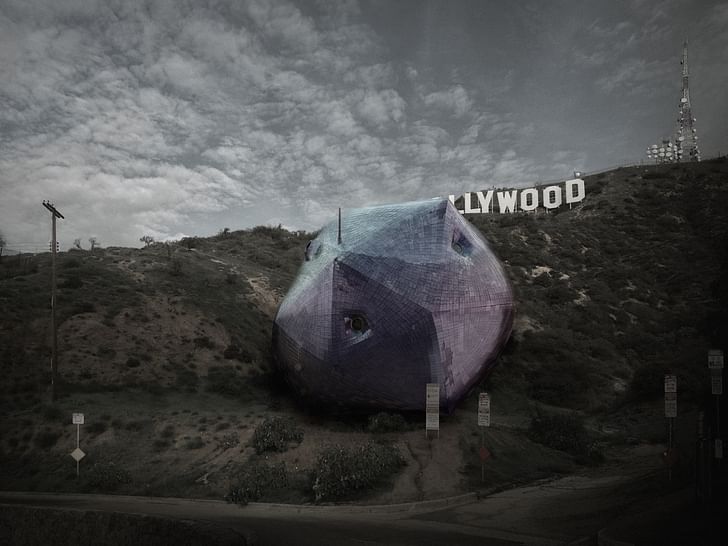
Much like their Italian counterparts, Hirsuta, the design team for “Ambivalent House,” also tackled the headwinds of iconicity. As they explain, “This house’s response to the evolving problem of iconicity in architecture is perhaps its most important statement. For a building’s external expression to run counter to historical modes of iconicity - clear expression of meaning or intent, singular messaging, and so forth - and instead provide multiple, ever-ambiguous readings seems an approach to iconicity worth exploring at this time, in this place. While we believe that an experimental house on this site would become, somehow, inevitably iconic, we feel that responding to, for example, the Hollywood sign with yet another sign would only reinforce established models for architectural semiotics. Instead, and assuming some form of semiotic project still persists in architecture, ours would most closely resemble an empty signifier capable of absorbing multiple readings from one viewer to another, at one time or another.”
Ultimately, the houses seem to point toward a highly aware and integrated future for residential design. Instead of a “style,” these houses form the signature pieces of an ethos. Even though each of the designs qualifies as its own singular unit, the attention paid to landscape and adaptability Instead of a “style,” these houses form the signature pieces of an ethos(both in terms of flexible plans and how the buildings interact with a variety of different social and political trends) makes these houses part of a larger urban whole. They are embedded in their physical and political environment. Instead of attempting to shape the world around them, the houses deliberately cater to the world as it is, and as it will be.
When asked how they decided to enter the competition and how they felt now that they had won, the L.A.-based team of Jason Payne, Michael Zimmerman, Joseph Giampietro, and Ryosuke Imaeda said “most generally, this competition was a wonderful coming together of a compelling brief on a building type we consider the primary site of architectural experimentation (the house,) an amazing site, an actual owner with a real stake in the game, an excellent jury, and strong, insightful coordination by the competition organizers. For us, the private residence remains the most productive venue for the pursuit of real experimentation and design innovation, the place where new ideas are most often born and developed prior to their dissemination to other building types. Hirsuta was established primarily as an office for experimental work and as such considers the house as central to its efforts rather than as a stepping stone to larger building types. Further, this project’s site in the Hollywood Hills made it especially poignant for us, local as we are to Los Angeles.”
Julia Ingalls is primarily an essayist. Her work has appeared or is forthcoming in Slate, Salon, Dwell, Guernica, The LA Weekly, The Nervous Breakdown, Forth, Trop, and 89.9 KCRW. She's into it.
Are you sure you want to block this user and hide all related comments throughout the site?
6 Comments
Stupid utopian bullshit
I'm ambivalent about this.
Turds galore.
I would suggest that these architects check out the Hollywood Imaginarium FB page and make some suggestions of their own.
i like the cannon ports
"Instead of a 'style,' these houses form the signature pieces of an ethos."
Ugh.
Archinect
This is your first comment on Archinect. Your comment will be visible once approved.