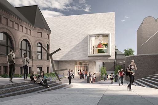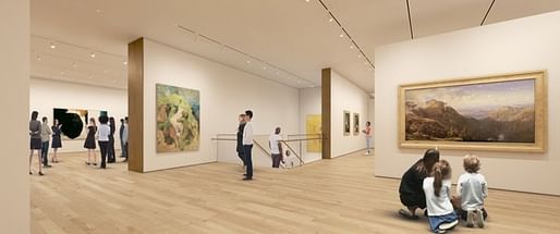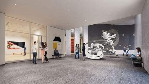

To those concerned about the renovation of the Hood Museum of Art, the situation is charged with paradox: The architects Billie Tsien and Tod Williams, who protested the Museum of Modern Art’s dismantling of the Folk Art Museum they designed in Manhattan, are now transforming the Hood, an award-winning museum designed by Charles Moore [...].
“It’s almost as if they were getting revenge for what MoMA did to their Folk Art Museum [...] It’s totally insensitive to the Moore building.”
— nytimes.com


Tod Williams and Billie Tsien previously in the Archinect news:
13 Comments
Seems like a split along party lines.
AM Stern is against it?
SHOCKING.
NYTimes Drama Pimping
When you have no architecture critics, it becomes tales of Revenge! Sex! Murder!
What bothers me about this is that Moore's architecture is so inclusive and whimsical while TWBTA's design is dry and withholding. Their architecture isn't even minimal enough to establish an interesting visual contrast.
damn davvid...but I'm with you on Moore. I do like TWBTA
Where people complain about BIG's loudness, TWBTA by contrast, is restrained, quiet and respectful to not only architecture, but people and the experience.
"Moore's architecture is so inclusive and whimsical while TWBTA's design is dry and withholding."
Everything seems written in tweet sized narratives. Since this is an "addition" and not total subtraction of Moore's design, creating another "whimsical" design would have been a bit much. Especially next to a neoclassical building, subtlety is needed.
The narrative tying this to folk art is dubious in many ways, most of which is that Folk Art is a demo of a building very rooted in NYC while this is really only relevant to Dartmouth Students first and maybe Moore preservationists a distant second.
Nate, Why does subtlety need to be dry? There is a false assumption that bold/visible/loud statements are always cheap and unsubtle. Its this false assumption that seems to be at the core of TWBTA's aesthetic. In my opinion, their work is too much about tone .
Davvid, have you ever been in the Folk Art or Barnes? They were both bold AND rich in experience. I'm not sure what tone means...but I assume that Charles Moore would be too tame for your taste.
Heard somewhere that B. Tsien was a student of Charles Moore. Maybe she got a C on a project and was like "someday.... I'll have my sweet revenge!" Since we are all making shit up at this point.
The discourse of this project to be disappointing. Ok, this is a Charles Moore project, but does that in itself make it worth saving? What is the programmatic and arch. value of what's being added vs. what is being lost? All I hear is narratives from predictable interests. The Charles Moore foundation and Dartmouth have expected lines, but who is there to give a trustworthy opinion since there are no real critics left.
Is it on the level of say, a Folk Art or Rudolph's Orange County? How much is being preserved? Whose opinion matters in this equation? I wonder if Dartmouth originally wanted to replace the whole wing...
Nate, I'm sure you know what tone means. It seems like TWBTA places a lot of emphasis on tone. They are modernists, but they are not too much about modernism. They emphasize materiality and detail, but they're not too much about material and fabrication the way that Zumthor or H&deM are. And the result is an architecture that is *about* tone or perhaps decorum. Sometimes its pleasantly quiet. Sometimes its just banal. I found the Logan center in Chicago to be banal. The Folk are Museum was charming. Haven't been to the Barnes.
Agree with ^davvid, there is mismatch of firm for this renovation. Could have used a former Moore firm or even a solid preservation firm, design proposal is just providing a clean, empty veil over an otherwise inviting entry. The big thing the NYT article is trying to say (not without dramatic flair) is that adaptation and renovation is a fine art, that there are ethics to framing over and covering up notable existing architecture. Ironic, indeed.
Sounds like we want to talk about anything but the quality of what is being proposed and some comments about "modernists not about modernism" whatever that means. The client wanted a new building, this looks like a decent design that probably improves the experience (knowing TWBTA it will look better in reality because they ARE about fabrication).
Nate, what quality do you want to talk about? The granite floor outside? The wood floor inside? The white walls? The track lights? The brick? What is there really to talk about? Its all so ordinary. How beautiful can a recessed light really get? To me, it looks like there is a whole lot riding on the splendor of one square slightly protruding window.
In the absence of design, I can't help but think about why there is an absence of design. Thats what inevitable brings me to think about "restraint", "withholding", "deprivation"
Block this user
Are you sure you want to block this user and hide all related comments throughout the site?
Archinect
This is your first comment on Archinect. Your comment will be visible once approved.