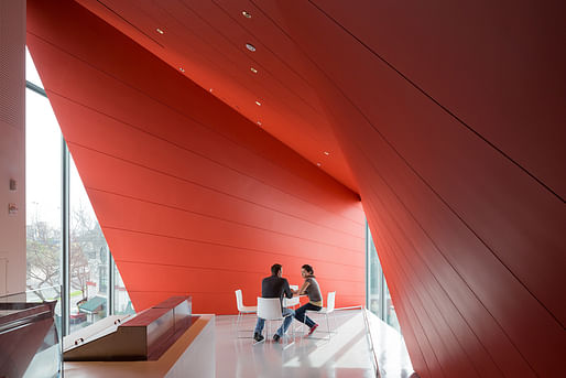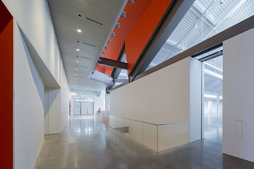

Although the renderings and Twitter pics of Diller Scofidio +Renfro's Berkeley Art Museum and Pacific Film Archive produced a heated response on Archinect, evaluating the museum from a programmatic standpoint makes it appear as less of a "giant TV on the sidewalk" and more a clever fusion of needs into an elegant, if perhaps somewhat muscular, form. The museum is part art exhibition space, part film gallery/archive. DS+R have chosen not to mask these separate identities into an amorphous form, but rather to architecturally demarcate these two mediums. Viewed from the side, as in Iwan Baan's photographs above and below, this choice results in an elegant exterior wrap that offers visual intrigue with the glassed-in multipurpose space peeking out between the two halves. This asymmetrical glimpse of the interior gives the building a muscular quality, as if it is in motion.


There are perhaps inadvertent throwbacks to Renzo Piano's BCAM at LACMA throughout the interior, not only with the red and white coloration (is this now an art museum template?), but the emphasis on the ceiling as architectural feature.


Viewed from a street-level perspective, the guff-raising "TV on the sidewalk" makes more sense in an urban context. Billboards, both animated and static, make up a huge part of an urban pedestrian's experience. Arguably, the conceptual presentation of a giant screen on the sidewalk is in keeping with the larger urban context while creating an additional showcase space. The design saves itself from becoming too pushy by quickly scaling back on the Oxford Street side, preserving the sidewalk and giving way to a less visually confrontational facade. It's eye-catching but it's not soul-numbing.


The feeling that the building is constantly in motion is reinforced by the choice to drape the stately facade of the exhibition section of the museum with a cafe clad in the exterior skin of the film side, as if film is gently extending itself into the realm of the exhibition space. Which, conceptually, it is: the museum is attempting to showcase both established artworks and the relatively newer medium of film without compromising the artistic lineage of either. Viewed from this perspective, one could argue that the Berkeley Art Museum is a design success.


5 Comments
The galleries look nice, but the form is ..... Flaccid. Like you are trapped inside of a deflati balloon.
And I like the Broad.
Just think we are falling into the “Out-There Movement”.
Flaccid is an excellent descriptor.
Mimi Zeiger used "pale". Pale and flaccid.
I just wish they would have done what it takes to get the cladding continuous - its all dented up on the north side
the spatial experience look studied and well thought, but the exterior isn't in the same quality as the exterior!
Block this user
Are you sure you want to block this user and hide all related comments throughout the site?
Archinect
This is your first comment on Archinect. Your comment will be visible once approved.