
Construction of the forthcoming Queens Library has begun at Center Boulevard and 48th Avenue in Hunters Point of NYC's Long Island City. Steven Holl Architects won the commission back in 2010 to design the new $30.6 million public library. Surrounded by recently built skyscraper condominiums and nearby attractions like the Gantry waterfront and Louis Kahn's Roosevelt Four Freedoms Park, the Queens Library is set up to become the latest landmark for the changing neighborhood.
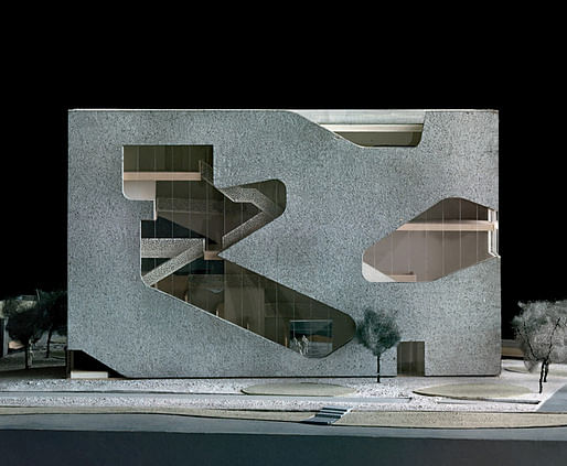
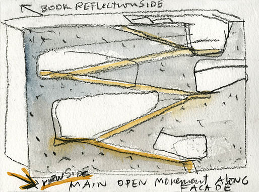
The library's new design was developed in effort to provide more communal space for local residents and create new connections to surrounding areas in the neighborhood. The library is encased within an exposed concrete square volume coated in aluminum for a "subtle sparkle". Users would move up and along a series of bookshelf-flanked stairs and will encounter the separate children's, teen, and adult areas of the building's fluid program. Glazed cuts in the facade also further open up the building and give views of the surrounding city outside.
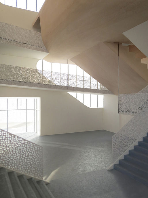
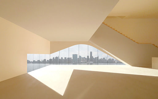
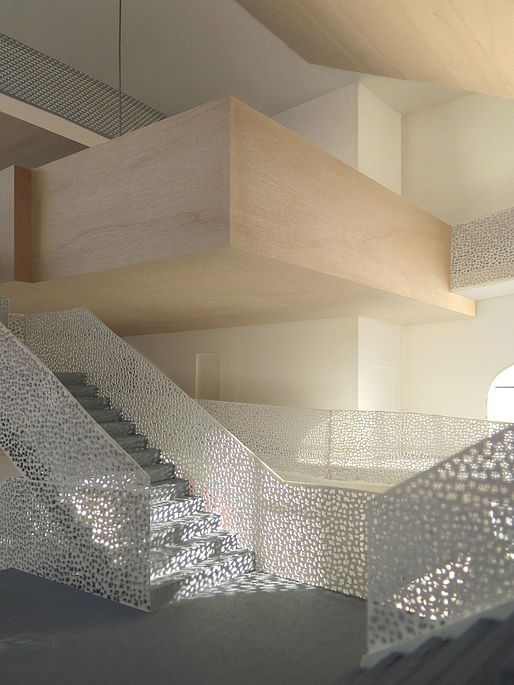
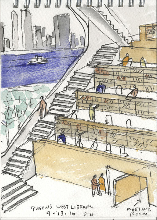
The library also includes an outdoor reading garden and a low-park office pavilion bordered by a small forest of ginko trees. Visitors can also walk up the stairs inside to reach the rooftop reading garden that shows off panoramic views of the city.
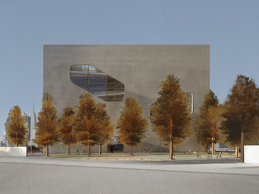
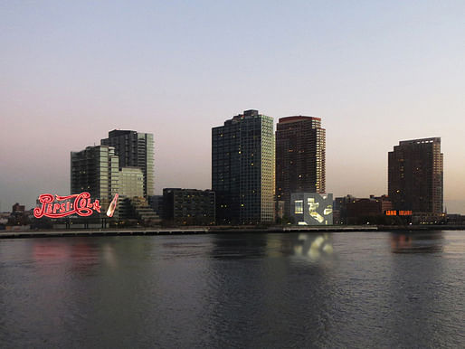
In celebration of the groundbreaking, an exhibition that chronicles the project's design process opened this past Tuesday at the Sculpture Center in Long Island City. You can also check out the exhibition online.
8 Comments
So awesome
This looks very nice. I wish smaller american cities also paid this much attention to public architecture.
Holl is just light years ahead of everyone else in all of the issues of today
Stephen Holl does architecture - simply put. No diagrams or allusions to theory necessary. His office designs it. it gets built. You visit and experience it. You like it.
The depth of feeling in that last library watercolor is stunning
I'm not typically the one to say it but it seems this concept screams accessibility issues.
Well I'm sure you'd be impressed if there was a TED talk and some diagram b.s. Turns out drawing and watercolor is a much more convincing medium
The nicest space is the watercolor. Overall however the spaces are really underwhelming. The facade looks really dated too. Even for 5 years ago. He's put out better work for Columbia and everywhere else around the world.
Block this user
Are you sure you want to block this user and hide all related comments throughout the site?
Archinect
This is your first comment on Archinect. Your comment will be visible once approved.