I realize I'm a year late, but regarding the Pawson home's roof spans, Aldo is correct. No structural ridge, the rafters are simply tied by steel plates. It's not typical, but not uncommon, either. It's funny because I've done residential the past 7 years and it didn't even raise a red flag when I saw that cathedral ceiling. If you go into enough older homes, you will occasionally come across sagging 2x4 rafters that aren't tied at all, supporting snow loads... Scary...
its actually from this project called Pomaranc Residence by an office called AOCR
not aware of any of their other work...this one is a bit schizophrenic... though i do love that orange...
p2, it's artist Ann Hamilton, from here. It works really well next to the rough concrete, the way it bends to connect to the stair seems to allude to a more refined rebar.
Though it's a completely different connection detail;it reminded me of the stair in H&deM's Schwitter building:
That takes us back to the Pawson roof. Some -- laymen, typically -- will not question what simply works. Only a woodworker would really appreciate, perhaps, what's involved in the railing support just above ? By the same token, only an architect might look at the Pawson detail and start to wonder.
As to the aligned screw slot, isn't it a matter, as well, of technique and technology ? That is, a properly tightened screw or bolt tells the mechanic when to stop turning. Aligning screw-head slots, in the absence of a nut hidden behind the scenes, isn't dependent on the aesthetics of the operator, but on the position of the threads on the shank. Fine threads make it possible to align heads without compromising tightness . . .
If both slots are "misaligned" we think less of the outcome than if (as in the photo) one is aligned and one not. A good solution: the Philips or hex head ?
. . . that is, hex drive socket head, I guess. And I should have said, "Fine threads make it MORE possible to align heads without compromising tightness . . ."
Back to the screws issue... Is it just me, or is the bent flat plate just rather badly done? I find a bend that has begun to kink distinctly off putting. Perhaps the misaligned screws were on purpose to throw us off the scent?
These Dean -- if you mean the concavity of the outer surface at the bend, one could point out that the metal is doing what it "wants" to do, barring a restraint that would have prevented that curl from occurring. I agree that a kink -- a sudden change in shape, indicating either sloppy workmanship and/or an incipient material failure, would be unforgivable . . .
These matters are vital in the discussion of craft, and its effect on the work of the architect and his deputies. Carry on !
Straight blade screws never align. Use Phillips, Allen or torx for a centered shape. I like Allen cap screws for an industrial look and Allen flathead either countersunk or w a finish washer for a cleaner look.
Regarding the John Pawson townhouse, I admire the consistent carrying out of an aesthetic vision, but... Is anyone else worried about a floating kitchen counter, with no rim or splash, right next to a descending stair? The first time someone accidently floods the counter with water, or turns around and knocks over a glass of red wine, or sets an egg on the counter, and doesn't mind it as it rolls away, and all that stuff is pouring down and staining the plaster wall below, or dropping a full level to the stair treads.
I realize that practical accommodation of human activity is very low on Pawson's hierarchy of values, but a small, beautifully detailed metal flange at the edge of the counter would avert disaster.
Not a place for toddlers to play, though. Reminds me of those stairs you see in some modern houses with no railing on the wall side and nothing at all on the room side. And your grandmother who is recovering from hip-replacement surgery is visiting for a few weeks. .
Yes. Sadly, minimalist architectural detailing, which appeals to our aesthetic sensibilities, doesn't always support life's realities: gravity, human behavior, weathering, to name just three categories. There has to be a lesson there for the designer.
At the top of the page, Derek Kaplan wrote "an image of simplicity always entails torturous solutions." eduardo souto de moura
While "always" might be a bit strong, the essence of the statement holds, I think.
One can admire the lengths that Pawson and others will go to, to achieve a desired result. Someone has to carry on this work -- it just cries out for accomplishment and demonstration, as the realization of an ideal that appears, appealingly, on the drawn page.
But in the real world, entropy continually asserts itself. Accidents happen. I love the look of a simple and bare flight of stairs, yet I believe it virtually criminal to build a stair with no handrail.
Perhaps the "infinity edge" of the floor in a photo above, is enhanced by the presence of a substantial frame around the other three edges of the glazed plane ? I marvel at the frameless glazing employed in many of Wright's later houses (and those of his most inspired followers), typically seen at the ceiling plane -- but I'm equally thrilled by, and more comfortable with, the rare case where a minimal metal receptacle for the glass is visible. Why ask the plasterer or sheetrock installer to work to an imaginary glass line, and the glazer to caulk or cement the glass into a soft channel ? It was done, repeatedly -- but is it really a sound detail ?
My favorite example of Wrightian foolishness is the detail he devised, and repeatedly had drawn, for terminating a flat-roof cover at the wood fascia -- in the days before a reliable membrane roof had been developed. The fascia is slotted on its top edge, and the roofing is bent down into the slot, with application of tar or similar sealant. Really ! How was that to resist the realities of material movement and the vagaries of the weather ? Only one Usonian that I know of has been restored with the original effect retained -- by what means I have not been able to learn. All other similar houses have long had conventional flashing of one sort or another added to the roof fascia. (Schindler achieved the desired appearance of the unflashed fascia by having it stand off the wall, hiding the actual termination of the roof.)
Indeed, a perusal of the drawings of Wright's Usonians reveals detailing that would be appropriate for a house built inside a warehouse, where it would be protected from the elements. Wrightians may wonder why the architect received so little respect from the profession, for so long; one doesn't have to look far for an answer . . .
minimal details
Paimio Sanatorium Window - Aalto
"an image of simplicity always entails torturous solutions."
eduardo souto de moura
h&dem @ aufdemwolf


kahn
kahn @ exeter - travertine joint aligning w/ stair tread.
erwin heerich @ insel hombrich
abbozzo
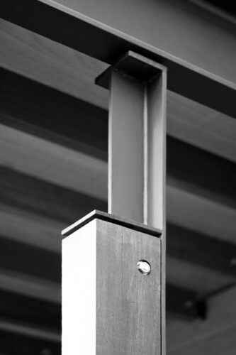
guenter pfeifer
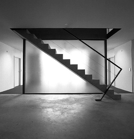
beautiful project by jonek + dressler architekten. view lots of sexy minimal details photos in this news post.
mmmmmm...
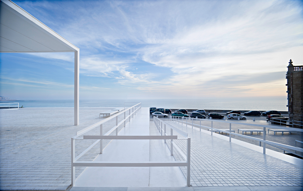
also... not so minimal, but i love it as well...

I realize I'm a year late, but regarding the Pawson home's roof spans, Aldo is correct. No structural ridge, the rafters are simply tied by steel plates. It's not typical, but not uncommon, either. It's funny because I've done residential the past 7 years and it didn't even raise a red flag when I saw that cathedral ceiling. If you go into enough older homes, you will occasionally come across sagging 2x4 rafters that aren't tied at all, supporting snow loads... Scary...
[04]http://www.image.com/image.jpg[/04]
ah. so sorry to be a numpty. but it would be great help if someone could advise on how to upload an image. clearly i have just tried and failed :(
replace your 04 with img.

but then the image must be on-line somewhere and the stuff between the [...] a link to it.
Aren't more or less most of these from 'Space Invading'?
its the other way around... the space invading images are from this thread
ll, respect.
okay...

thanks
take 2
hema, interesting project.

here is a close up of that detail.
minimal details made space invading?!? awesome... we should publish an archinect book. paul?
holz..
thanks for putting it upt..
(more importantly..how did you do that..?)
Pesquera Ulargui Arquitectos
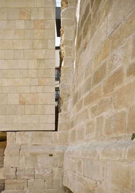
nice find... that is pretty sexy.
I just saw this one today and really enjoyed it. Im guessing several of you also did...
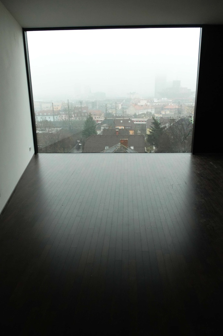
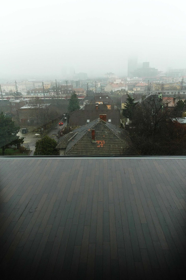
lletdownl is that Shigeru Ban's new Pompidou Metz?
its actually from this project called Pomaranc Residence by an office called AOCR
not aware of any of their other work...this one is a bit schizophrenic... though i do love that orange...
Corde Architetti
bump
I thoroughly recommend the Small Projects book referred to earlier in the thread.
sure a lot of you saw this one today as well, but i particularly loved this railing...

lletdown, where/who is/did the above staircase?
p2, it's artist Ann Hamilton, from here. It works really well next to the rough concrete, the way it bends to connect to the stair seems to allude to a more refined rebar.
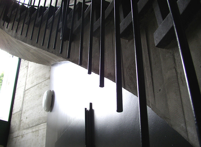
Though it's a completely different connection detail;it reminded me of the stair in H&deM's Schwitter building:
so much more refined than schwitters. holy f*ck - nice post
i really really like the roughness of the wood planking... mmmmmmm....
NADAAA (nader tehrani), back bay residence
That takes us back to the Pawson roof. Some -- laymen, typically -- will not question what simply works. Only a woodworker would really appreciate, perhaps, what's involved in the railing support just above ? By the same token, only an architect might look at the Pawson detail and start to wonder.
As to the aligned screw slot, isn't it a matter, as well, of technique and technology ? That is, a properly tightened screw or bolt tells the mechanic when to stop turning. Aligning screw-head slots, in the absence of a nut hidden behind the scenes, isn't dependent on the aesthetics of the operator, but on the position of the threads on the shank. Fine threads make it possible to align heads without compromising tightness . . .
If both slots are "misaligned" we think less of the outcome than if (as in the photo) one is aligned and one not. A good solution: the Philips or hex head ?
. . . that is, hex drive socket head, I guess. And I should have said, "Fine threads make it MORE possible to align heads without compromising tightness . . ."
yeah, with the square drives, i don't seem to notice directionality as much...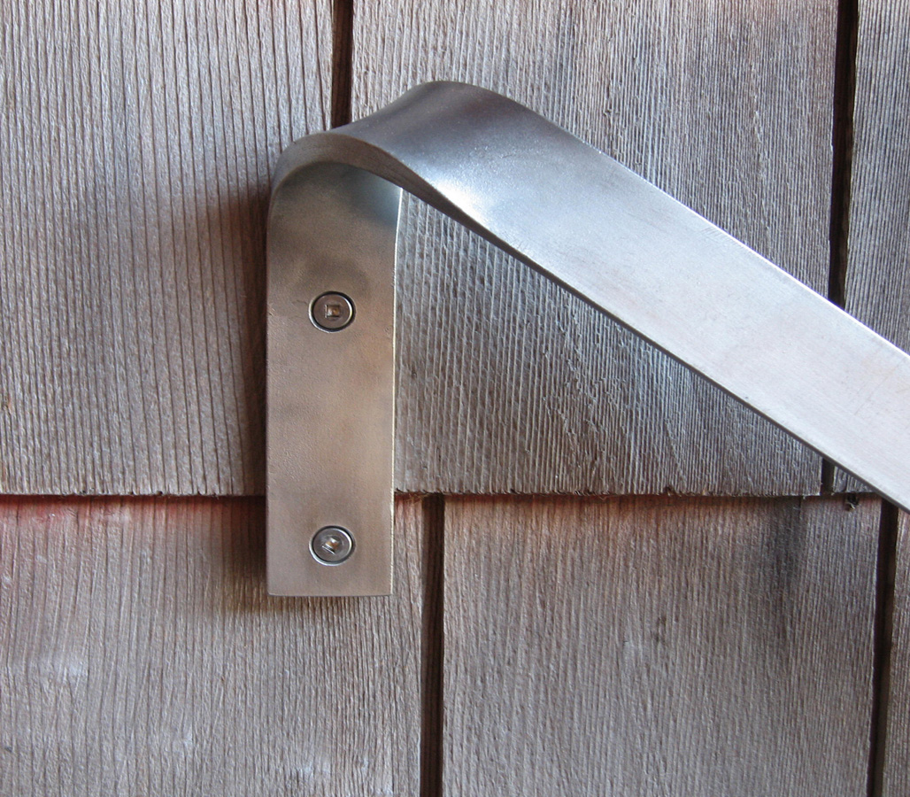
here is a recent favorite of mine... its a different sort of detail then yours holz, but i still think its a great moment...
hooray for this thread still kicking!
Uno Tomoaki from various houses
Back to the screws issue... Is it just me, or is the bent flat plate just rather badly done? I find a bend that has begun to kink distinctly off putting. Perhaps the misaligned screws were on purpose to throw us off the scent?
ospedale giovanni xxiii chapel
These Dean -- if you mean the concavity of the outer surface at the bend, one could point out that the metal is doing what it "wants" to do, barring a restraint that would have prevented that curl from occurring. I agree that a kink -- a sudden change in shape, indicating either sloppy workmanship and/or an incipient material failure, would be unforgivable . . .
These matters are vital in the discussion of craft, and its effect on the work of the architect and his deputies. Carry on !
That plate is machined, not bent. Or rather, it's been bent through use or accident.
Anyway, what bothers me just as much is the seam. Why is there a seam?!?
Sorry -- guess i don't know what photo we're talking about. I was onto the most recent handrail image . . .
Regarding the John Pawson townhouse, I admire the consistent carrying out of an aesthetic vision, but... Is anyone else worried about a floating kitchen counter, with no rim or splash, right next to a descending stair? The first time someone accidently floods the counter with water, or turns around and knocks over a glass of red wine, or sets an egg on the counter, and doesn't mind it as it rolls away, and all that stuff is pouring down and staining the plaster wall below, or dropping a full level to the stair treads.
I realize that practical accommodation of human activity is very low on Pawson's hierarchy of values, but a small, beautifully detailed metal flange at the edge of the counter would avert disaster.
That's not minimal, minimal would be trimless.
Not a place for toddlers to play, though. Reminds me of those stairs you see in some modern houses with no railing on the wall side and nothing at all on the room side. And your grandmother who is recovering from hip-replacement surgery is visiting for a few weeks. .
Yes. Sadly, minimalist architectural detailing, which appeals to our aesthetic sensibilities, doesn't always support life's realities: gravity, human behavior, weathering, to name just three categories. There has to be a lesson there for the designer.
At the top of the page, Derek Kaplan wrote "an image of simplicity always entails torturous solutions." eduardo souto de moura
While "always" might be a bit strong, the essence of the statement holds, I think.
One can admire the lengths that Pawson and others will go to, to achieve a desired result. Someone has to carry on this work -- it just cries out for accomplishment and demonstration, as the realization of an ideal that appears, appealingly, on the drawn page.
But in the real world, entropy continually asserts itself. Accidents happen. I love the look of a simple and bare flight of stairs, yet I believe it virtually criminal to build a stair with no handrail.
Perhaps the "infinity edge" of the floor in a photo above, is enhanced by the presence of a substantial frame around the other three edges of the glazed plane ? I marvel at the frameless glazing employed in many of Wright's later houses (and those of his most inspired followers), typically seen at the ceiling plane -- but I'm equally thrilled by, and more comfortable with, the rare case where a minimal metal receptacle for the glass is visible. Why ask the plasterer or sheetrock installer to work to an imaginary glass line, and the glazer to caulk or cement the glass into a soft channel ? It was done, repeatedly -- but is it really a sound detail ?
My favorite example of Wrightian foolishness is the detail he devised, and repeatedly had drawn, for terminating a flat-roof cover at the wood fascia -- in the days before a reliable membrane roof had been developed. The fascia is slotted on its top edge, and the roofing is bent down into the slot, with application of tar or similar sealant. Really ! How was that to resist the realities of material movement and the vagaries of the weather ? Only one Usonian that I know of has been restored with the original effect retained -- by what means I have not been able to learn. All other similar houses have long had conventional flashing of one sort or another added to the roof fascia. (Schindler achieved the desired appearance of the unflashed fascia by having it stand off the wall, hiding the actual termination of the roof.)
Indeed, a perusal of the drawings of Wright's Usonians reveals detailing that would be appropriate for a house built inside a warehouse, where it would be protected from the elements. Wrightians may wonder why the architect received so little respect from the profession, for so long; one doesn't have to look far for an answer . . .
Block this user
Are you sure you want to block this user and hide all related comments throughout the site?
Archinect
This is your first comment on Archinect. Your comment will be visible once approved.