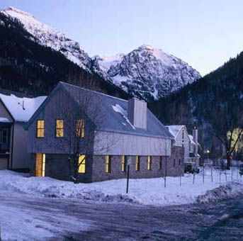
Well, the counter may be nice but as far as "minimal details" the architect may have screwed the pooch on this one.
Anybody else see any transverse (short direction) wall bracing keeping this super long and narrow residence from falling over?
Being a cathedral ceiling with no ceiling joists or rafter ties, requires that the ridge board become an engineered ridge beam. I dunno, what is that span there? 40 feet? 50 feet? 60 feet? Anybody know what size beam is required for such a span?
pretty sure the pawson project is a row house w/ shared party walls on either side. maybe others can confirm, but would that negate the requirement for transverse bracing?
I, for one, like that the screws are not aligned in the Holl chapel. It seems odd to want precision in screw alignment next to beautifully irregular wall texture, etc.
pawson - walsh house in colorado (the thing with the long counter)
minimal details does not necessarily mean efficient structure. as said in another thread 'minimum details/maximum work'. and i would also add 'maximum cost'.
look at kahn's vaults at kimball - architecture sometimes trumps structural efficiency.
Acually, the Pawson project could use a series of rigid bents (steel most liekly) in the short direction where the horizontal thrust of the roof form is resisted by moment connections at the angles of the bents. It seems to be a relatively short span. These could located every 3-4 meters apart, then use a short rafter spanning between the bents in the long direction. Not cheap, but who said minimalism is cheap?
Beyind that, the roof diaphragm, or cross bracing in the plane of the sloped surface, would essentially create a space frame which would resist horizontal loads perpendcular to the long dimension.
Many pre-engineered warehouse type buildings use this approach. They often have a pin connection at the peak to reduce the moment stress along the beam length.
As for shared party walls, you wouldn't be able to use adajacent properties to shore your structure. What if the neighbor wanted to tear his house down?
If you want a supersized example, the Spruce Goose Hanger Building at Playa Vista is 96' wide, 96' to the peak, hundreds of feet long, and not a tie rod in site. Just a series of rigid glu-lam bents marching along.
Apparently it's the biggest wood frame building in the world: Type V-NR!
The two items I listed about this house are just things that jumped out at me from a photo. Certainly, an engineered solution could have been accomplished and without seeing the plans, I could not be 100% positive that it does not meet required design standards.
Still, it screams "look at me" and maybe that is a good thing to make people look at it and wonder, how is that done?
uhm, not to nitpick but 45x55 does "not" a square make.
I think that may be a rectangle. Just guessing though.
But dayamm, where did they get 2x12 lumber approximatly 33 feet long for each of the roof rafters? Without intermediate support, that would be about how long they would need to be. Do you live near a rain forest? Maybe there are some columns in this house of your parents.
Some architects, like Pawson, have a vision of what they want to achieve and work hard to make that vision possible. And then there are other architects, like yourself (I think), who don't even have the vision because they start the design process thinking it is impossible to achieve anything other than what Graphic Standards and a bit of uninspired professional experience have dictated throughout their careers. Sorry to be so harsh here, but I think the apprehension in your comments speaks for itself.
Good point FP. There are many discussions here admiring the work of Gehry, Hadid, etc., that perform much more dramatic feats of space with essentally the same technology.
I remember driving by the Disney Concert Hall while it was under construction and marvelling at the incredible amount of steel structure it took to make the forms happen.
on the fence regarding the Pawson building above. I suspect that the engineering was done with a nominal ridge board, versus using something like a "collapsed" truss, or maybe out of concrete would be a far more efficient alternative. But I see that most comments on this thread has jumped at that... and you are right he's made us look up and go "how the hell...."
I think you are talking out your ass. I mean, seriously, you have deduced your observation of my design process/thinking from two comments of the Walsh residence. I'd also like to thank you for personally attacking me and my "uninspired professional experiance", of course if you could be more specific as to exactly which of my designs has led you to this conclusion I'd be most appreciative. I'm always up for a good critique of one of my buildings.
Your still top notch in my book and don't let anybody tell you differently. :)
Truthfully, I liked the open space that was created even though I am concerned with how it was built. A bit stark when it comes to filling the void though. But that is more aesthetics and I am no interior designer. But lets face it, the outside is far more interesting than the inside.
I don't know you, the projects in your portfolio, or your career path...So I might be wrong. But to look at a project like the Walsh House and be "concerned with how it was built" says a lot about your trepidation with building design and structures. What do you think about MVRDV's WOZOCO complex? Or Alsop's Sharp Center for Design...Putting aesthetics aside, do they give you a heart attack to even contemplate their structural integrity?
All I'm saying is that some architects actively, and creatively, find solutions to design problems, and others avoid them entirely because it's "safer" to do so. That's all. I'll refrain from making a judgement about you in this comment, but I'll just say that I think the latter design approach is all too common in our profession...especially considering most architects initially go to architecture school not because they want to design run-of-the-mill suburban houses, but because they want to be inspired by, design, and inevitably build well-crafted and original designs.
not to harp on the screws, but I just wanted to point out that in the photo from capluta sogn benedetg, the screws are also not aligned, and I like it better. Just personal preference, and if they were incidentally aligned, I'd be okay with it, too. I think there's just a range in the images in the collection above from the super-minimal refined container (the outlets, pawson...) and designs that show more of the components, imperfections in materials, and so forth (zumthor, lewerentz...). My preference is for the latter and I think worrying about screws in those cases is silly, but in the former (if screws were ever allowed to be visible), I think aligning them would make sense.
Perfection is achieved, not when there is nothing more to add, but when there is nothing left to take away.
Antoine de Saint-Exupery
to me, the metail rail and bracket are a foil to the imperfections of the wall finish, hence the feeling those screws should align.
and beta, a field of screws/nails (e.g. a wood facade or rainscreen) that don't align vertically and horizontally is incredibly irritating. when the screw slots are aligned in a similar fashion, it tends to look even slicker.
good point, holz, but I still disagree (and I think it's just a matter of opinion, but i'll say mine anyway): the metal of the rail picks up finger prints, presumably intentionally, so I don't think it's intended to be a foil to the imperfections of the wall, but picking up the same idea of the irregularities of the wall--human presence. The unaligned screws work well with this.
as far as aligned screws in a rainscreen, etc. I'm in agreement--if there's regularity, rhythm, etc, they should be aligned.
Even though I think we'll continue to disagree, I'm enjoying the philosophical discussion on the alignment of screws.
i somehow missed this thread when it first started... so, going back up to the top and the picture of the handrail at st. ignatius... i'm glad that i'm not the only one that is bothered by screws not aligning in an otherwise beautifully detailed building... one of my pet peeves!
i'm glad that i'm not the only one that is bothered by screws not aligning
it would have bothered me if they were aligned...
to me, the metail rail and bracket are a foil to the imperfections of the wall finish, hence the feeling those screws should align.
the rail doesn't look machined - it looks slightly hand-bent... and it's of a metal that is meant to patina - I'd argue that it also accentuates "imperfections." Holl is (was?) really into Merleau-Ponty - i.e. seeing with the hand - so I think there's more of a quality-of-material dichotomy going on - hard and soft? rough and smooth? light and dark?
mmm, not so much an argument as feeling contextually appropriate. handcrafty, non standard, rather rustic...can you imagine those screw slot aligned? yukh.
asides, i personally find many such mmm-look-what-i'm-doing-here details like someone masturbating in the corner just to turn you on. architectural whoredom.
I am also a big fan of minimal details and I was scouring the internet to look for a new coffee table for my house. There are many options here that I fancy. Maybe I will wait for my next paycheck to make a purchase. I am so bad at making these decisions. So many options!
hey i worked on a stair like that for a private residence in manhattan. we used 1/4" perforated steel. very similar, though ours wasn't a straight run, but instead wrapped a structural wall at its center, and ran 6 levels. sorry no pics or renders...very private client.
minimal details
per the the minimal/maximal thread request.
a visual homage.
outlet: bocci 22
stair: delicious steel
counter: john pawson
skin: suedwestmetall, allman sattler wappner
handrail: st ignatius chapel, steven holl (i wish the screws aligned...)
handrail: ICA, ds+r
sink: holy rosary complex, trahan architects
window: lewerentz, flowershop in malmo
window: lewerentz, st peter's church in klippan
door pulls: leather, henrybuilt
skin: KH bregenz, zumthor
handrail: kolumba museum, zumthor
door lever: capluta sogn benedetg, zumthor
door latch: bruder klaus chapel, zumthor
door pull: kolumba, zumthor
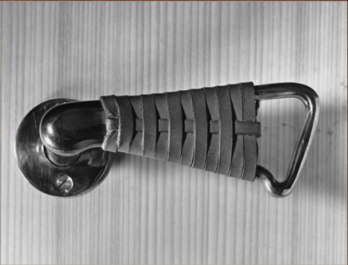
door handle: steel w/ leather grip, Ize
[imghttp://www.remodelista.com/img/sub/ize-leather-door-handle-black.jpg width=416[/img]
1 Featured Comment
I honestly miss the days when this kind of thread was what took up most of our time on Archinect.
Hi phuyake!
All 114 Comments
door handle: steel w/ leather grip, Ize

regarding the counter by john pawson
Well, the counter may be nice but as far as "minimal details" the architect may have screwed the pooch on this one.
Anybody else see any transverse (short direction) wall bracing keeping this super long and narrow residence from falling over?
Being a cathedral ceiling with no ceiling joists or rafter ties, requires that the ridge board become an engineered ridge beam. I dunno, what is that span there? 40 feet? 50 feet? 60 feet? Anybody know what size beam is required for such a span?
Minimal details? Lets hope the damage is minimal.
pretty sure the pawson project is a row house w/ shared party walls on either side. maybe others can confirm, but would that negate the requirement for transverse bracing?
I, for one, like that the screws are not aligned in the Holl chapel. It seems odd to want precision in screw alignment next to beautifully irregular wall texture, etc.
pawson - walsh house in colorado (the thing with the long counter)
minimal details does not necessarily mean efficient structure. as said in another thread 'minimum details/maximum work'. and i would also add 'maximum cost'.
look at kahn's vaults at kimball - architecture sometimes trumps structural efficiency.
The pawson house shown is the walsh residence in Colorado, not pawson’s own rowhouse
Acually, the Pawson project could use a series of rigid bents (steel most liekly) in the short direction where the horizontal thrust of the roof form is resisted by moment connections at the angles of the bents. It seems to be a relatively short span. These could located every 3-4 meters apart, then use a short rafter spanning between the bents in the long direction. Not cheap, but who said minimalism is cheap?
Beyind that, the roof diaphragm, or cross bracing in the plane of the sloped surface, would essentially create a space frame which would resist horizontal loads perpendcular to the long dimension.
Many pre-engineered warehouse type buildings use this approach. They often have a pin connection at the peak to reduce the moment stress along the beam length.
As for shared party walls, you wouldn't be able to use adajacent properties to shore your structure. What if the neighbor wanted to tear his house down?
BTW...
If you want a supersized example, the Spruce Goose Hanger Building at Playa Vista is 96' wide, 96' to the peak, hundreds of feet long, and not a tie rod in site. Just a series of rigid glu-lam bents marching along.
Apparently it's the biggest wood frame building in the world: Type V-NR!
I should have better stated my position on this.
The two items I listed about this house are just things that jumped out at me from a photo. Certainly, an engineered solution could have been accomplished and without seeing the plans, I could not be 100% positive that it does not meet required design standards.
Still, it screams "look at me" and maybe that is a good thing to make people look at it and wonder, how is that done?
Money can get most anything done.
My parents house is a 45 by 55 square with a 32' cathedral ceiling with no load bearing interior walls.
It seems to have done well for 19 years.
If this is a masonry building you just run a bond beam around the perimeter. Then all you have to solve is the windows interrupting the bond beam.
uhm, not to nitpick but 45x55 does "not" a square make.
I think that may be a rectangle. Just guessing though.
But dayamm, where did they get 2x12 lumber approximatly 33 feet long for each of the roof rafters? Without intermediate support, that would be about how long they would need to be. Do you live near a rain forest? Maybe there are some columns in this house of your parents.
On The Fence,
Some architects, like Pawson, have a vision of what they want to achieve and work hard to make that vision possible. And then there are other architects, like yourself (I think), who don't even have the vision because they start the design process thinking it is impossible to achieve anything other than what Graphic Standards and a bit of uninspired professional experience have dictated throughout their careers. Sorry to be so harsh here, but I think the apprehension in your comments speaks for itself.
Good point FP. There are many discussions here admiring the work of Gehry, Hadid, etc., that perform much more dramatic feats of space with essentally the same technology.
I remember driving by the Disney Concert Hall while it was under construction and marvelling at the incredible amount of steel structure it took to make the forms happen.
let's skip the sword fight, kids.


and just appreciate the finesse...
chair: shigeru ban
cabinet: kerf design
on the fence regarding the Pawson building above. I suspect that the engineering was done with a nominal ridge board, versus using something like a "collapsed" truss, or maybe out of concrete would be a far more efficient alternative. But I see that most comments on this thread has jumped at that... and you are right he's made us look up and go "how the hell...."

 [/img]http://img134.imageshack.us/img134/2894/batterseastairside.jpg width=400[/img]
FP,
I think you are talking out your ass. I mean, seriously, you have deduced your observation of my design process/thinking from two comments of the Walsh residence. I'd also like to thank you for personally attacking me and my "uninspired professional experiance", of course if you could be more specific as to exactly which of my designs has led you to this conclusion I'd be most appreciative. I'm always up for a good critique of one of my buildings.
Your still top notch in my book and don't let anybody tell you differently. :)
Truthfully, I liked the open space that was created even though I am concerned with how it was built. A bit stark when it comes to filling the void though. But that is more aesthetics and I am no interior designer. But lets face it, the outside is far more interesting than the inside.
holz, i too find the screws not aligning to be annoying. i find especially annoying when screws/fasteners are not aligning in a large field...
On The Fence,
I don't know you, the projects in your portfolio, or your career path...So I might be wrong. But to look at a project like the Walsh House and be "concerned with how it was built" says a lot about your trepidation with building design and structures. What do you think about MVRDV's WOZOCO complex? Or Alsop's Sharp Center for Design...Putting aesthetics aside, do they give you a heart attack to even contemplate their structural integrity?
All I'm saying is that some architects actively, and creatively, find solutions to design problems, and others avoid them entirely because it's "safer" to do so. That's all. I'll refrain from making a judgement about you in this comment, but I'll just say that I think the latter design approach is all too common in our profession...especially considering most architects initially go to architecture school not because they want to design run-of-the-mill suburban houses, but because they want to be inspired by, design, and inevitably build well-crafted and original designs.
not to harp on the screws, but I just wanted to point out that in the photo from capluta sogn benedetg, the screws are also not aligned, and I like it better. Just personal preference, and if they were incidentally aligned, I'd be okay with it, too. I think there's just a range in the images in the collection above from the super-minimal refined container (the outlets, pawson...) and designs that show more of the components, imperfections in materials, and so forth (zumthor, lewerentz...). My preference is for the latter and I think worrying about screws in those cases is silly, but in the former (if screws were ever allowed to be visible), I think aligning them would make sense.
Antoine de Saint-Exupery
to me, the metail rail and bracket are a foil to the imperfections of the wall finish, hence the feeling those screws should align.
and beta, a field of screws/nails (e.g. a wood facade or rainscreen) that don't align vertically and horizontally is incredibly irritating. when the screw slots are aligned in a similar fashion, it tends to look even slicker.
good point, holz, but I still disagree (and I think it's just a matter of opinion, but i'll say mine anyway): the metal of the rail picks up finger prints, presumably intentionally, so I don't think it's intended to be a foil to the imperfections of the wall, but picking up the same idea of the irregularities of the wall--human presence. The unaligned screws work well with this.
as far as aligned screws in a rainscreen, etc. I'm in agreement--if there's regularity, rhythm, etc, they should be aligned.
Even though I think we'll continue to disagree, I'm enjoying the philosophical discussion on the alignment of screws.
bump. this was getting fun...
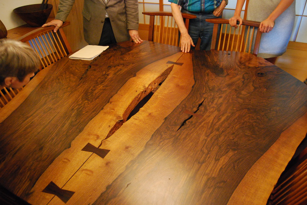
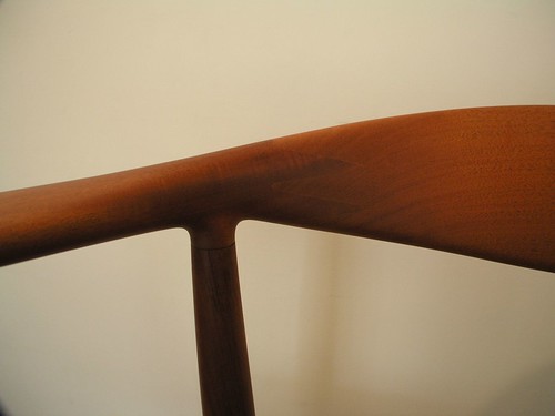
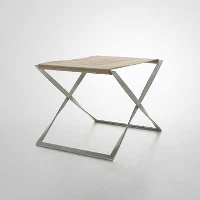
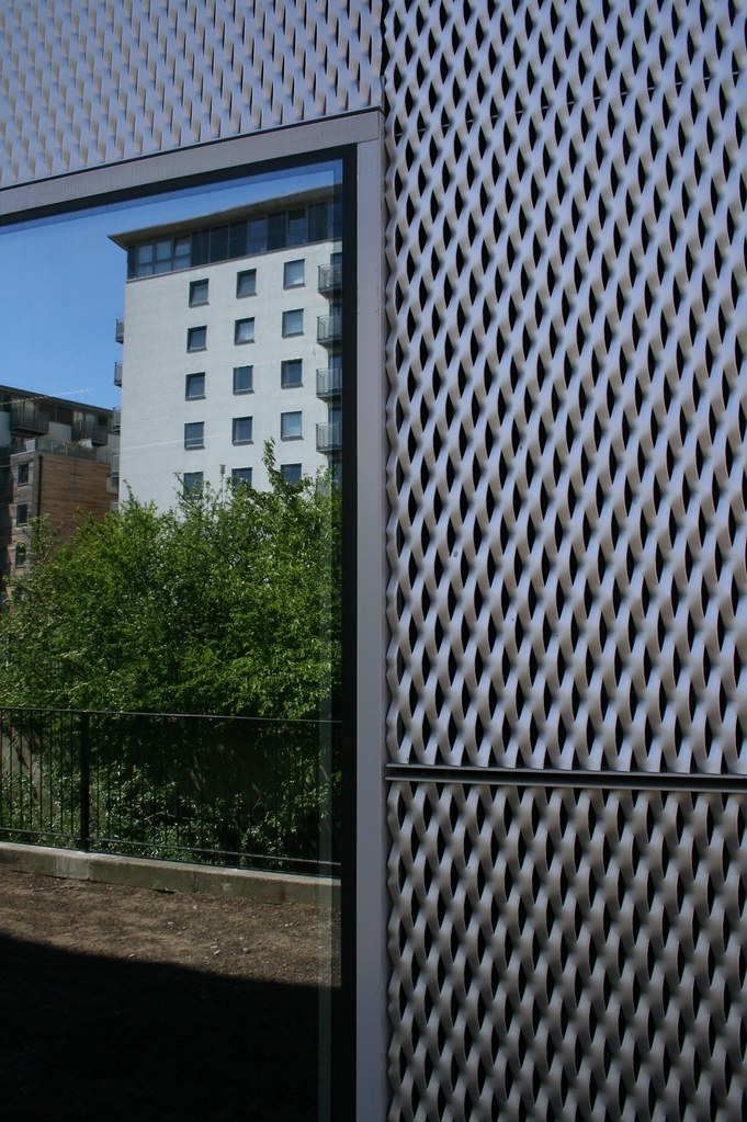
table: george nakashima
chair: wishbone, hans wegner
stool: PK91, poul kjaerholm
rainscreen: stephen lawrence center, david adjaye
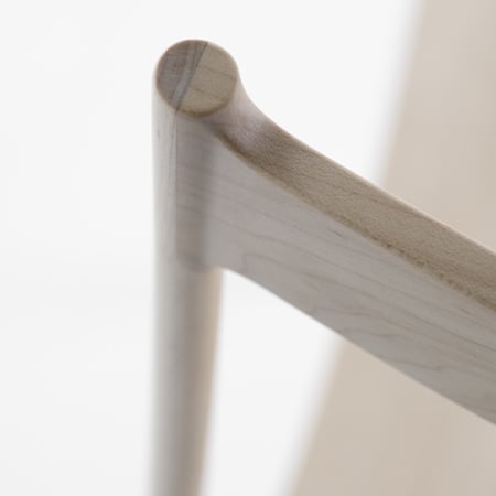
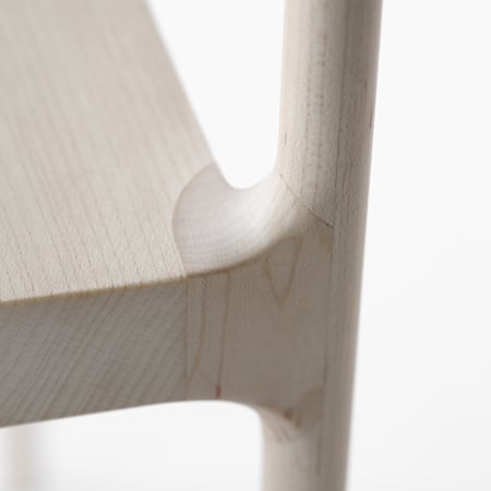
Cord Chair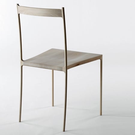

tyvek,
that cord chair is sick. although, a friend mentioned it was something on the order of $15k?!?
i somehow missed this thread when it first started... so, going back up to the top and the picture of the handrail at st. ignatius... i'm glad that i'm not the only one that is bothered by screws not aligning in an otherwise beautifully detailed building... one of my pet peeves!
i just wanted to audit this thread.
you know, for the details. and maybe a little for the pissing contest.
it would have bothered me if they were aligned...
to me, the metail rail and bracket are a foil to the imperfections of the wall finish, hence the feeling those screws should align.
the rail doesn't look machined - it looks slightly hand-bent... and it's of a metal that is meant to patina - I'd argue that it also accentuates "imperfections." Holl is (was?) really into Merleau-Ponty - i.e. seeing with the hand - so I think there's more of a quality-of-material dichotomy going on - hard and soft? rough and smooth? light and dark?
valid point.

but for some reason, the other things are less 'visible' to me, due to my OCD preoccupation with the screw slots aligning.
you could also make the argument that the top screw being skewed is a diagram of the building's 'light bottles'
good arguments for the misaligned screw slots... it still bothers me...

a drawing from the master of details...
mmm, not so much an argument as feeling contextually appropriate. handcrafty, non standard, rather rustic...can you imagine those screw slot aligned? yukh.
asides, i personally find many such mmm-look-what-i'm-doing-here details like someone masturbating in the corner just to turn you on. architectural whoredom.
because this thread kept me going for a while, and may need to again... a resurrection...



pawson, novy dvur
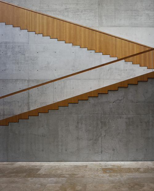
the most incredible stair. ever...
scarpa
Aalto:
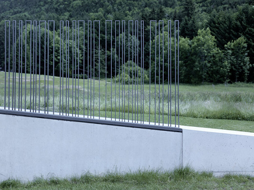
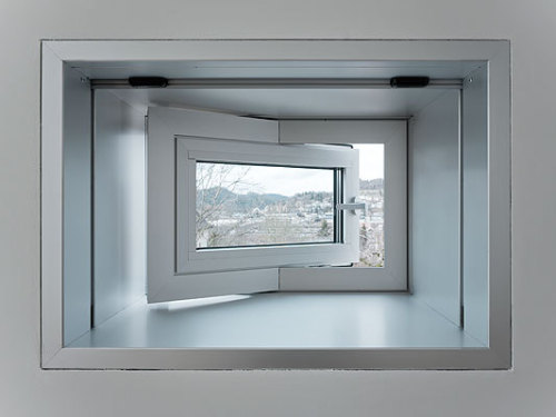
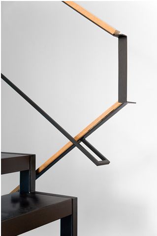
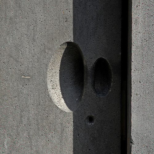
Takuro Yamamoto
marte.marte
staab
e2a
Ricardo Vieira de Melo
Gottfried Bohm
I am also a big fan of minimal details and I was scouring the internet to look for a new coffee table for my house. There are many options here that I fancy. Maybe I will wait for my next paycheck to make a purchase. I am so bad at making these decisions. So many options!
holz.box - love the stair, but would be a little disconcerting to use. Any other info on it? Is it also from the Paulson project?
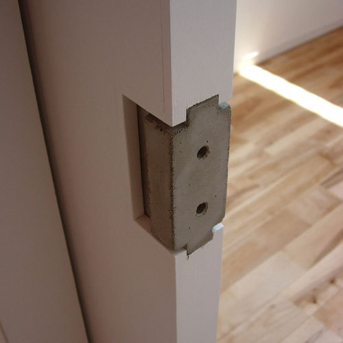
And, love the cast concrete door pull. I am going to have to steal that idea and use it somewhere.
stair is by kevin low of small projects for his aviary house. it's friggin genius.

o don't think it can get any more incredible than this...
How thick would that grating have to be to resist bending, denting and bowing? 1/4th inch?
Holz you know he recently put out a book, was interested in picking it up, especially if he's got some good detail drawings in there.
hey i worked on a stair like that for a private residence in manhattan. we used 1/4" perforated steel. very similar, though ours wasn't a straight run, but instead wrapped a structural wall at its center, and ran 6 levels. sorry no pics or renders...very private client.
Sweet, nice to know AP. I'm thinking 3/8" might be too cumbersome and the thickness would create unwanted optical illusions.
I'm just trying to think how something like that would age (or heavy forbid moving furniture up and down it).
phu, i didn't know about the book. maybe for my birthday...
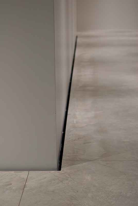
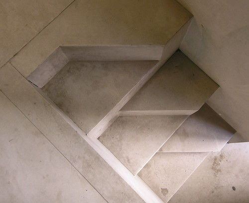

SANAA @ kanazawa
holl @ kiasma
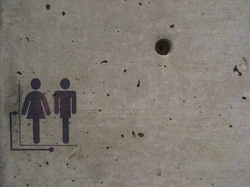
graffiti signage @ ando
more scarpa
holz galore @ mariakloster tautra
a 30 second video of Scarpa's musical stairs at Brion (Fall 2004)...
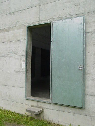
Märkli
one of my recent favorites...
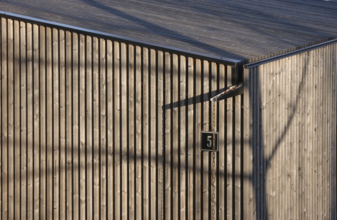
Huttunen-Lipasti-Pakkanen Architects in Finland
we're FAMOUS
ok well i guess its not so coincidental...
another good one... eastern design office...
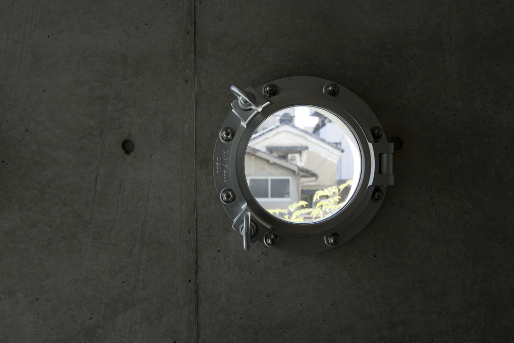
ha, awesome. good catch, lletdownl
Block this user
Are you sure you want to block this user and hide all related comments throughout the site?
Archinect
This is your first comment on Archinect. Your comment will be visible once approved.