When our client, Laramar Group, acquired a vintage apartment building bordering Loyola University, just steps from Lake Michigan, updates had not been done in many years. They wanted to freshen up the look of the common spaces, and create additional amenity space out of underutilized back of house areas. Remodeling work occurred on both the ground floor and top level of the building, with a strong desire to maintain the building’s ornamental and vintage details along the way.
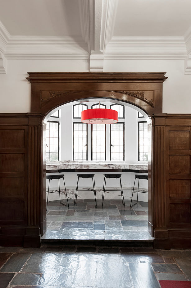
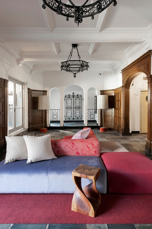
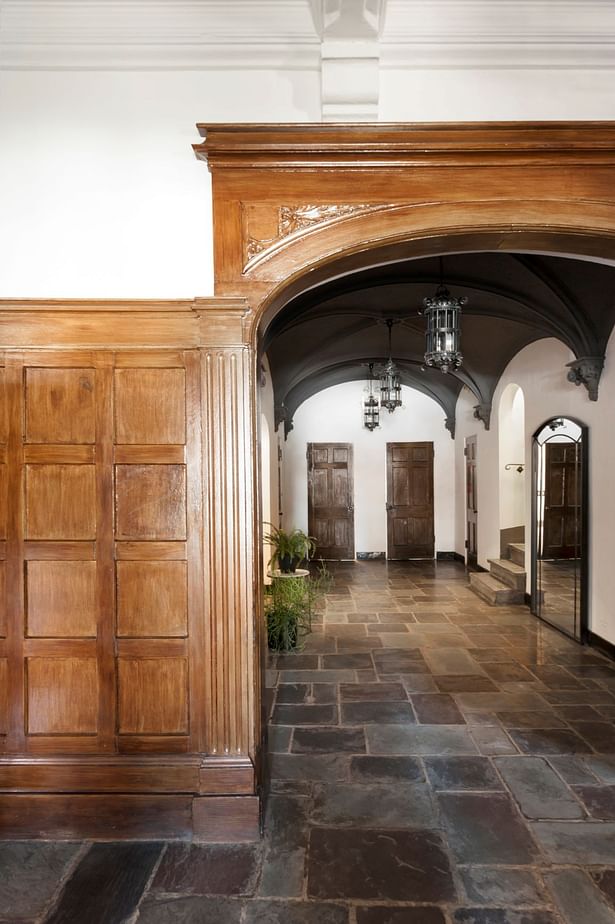
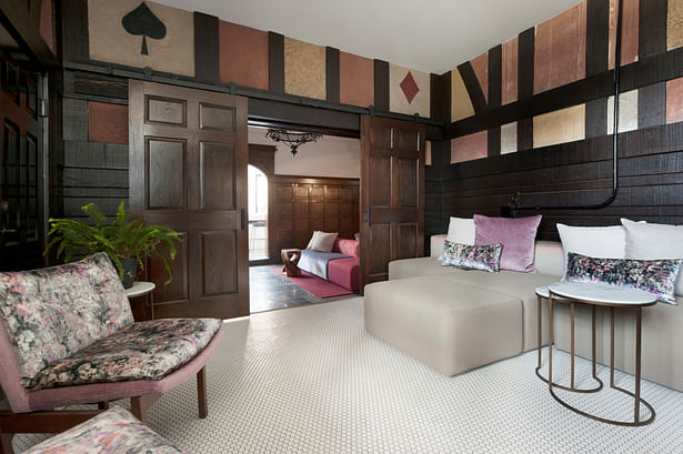
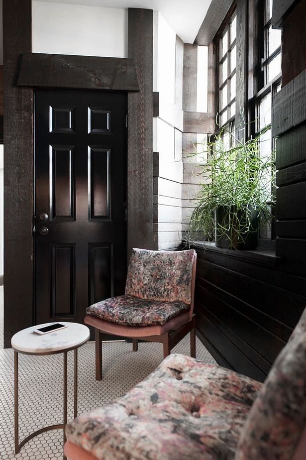
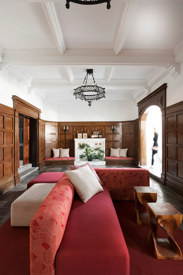
Work on the ground level was comprised of an entry vestibule, the main lobby, an elevator lobby with an adjacent mail room, a small window nook with bench seating, and annexed two storage rooms for more communal space. Original wood paneling, plaster details of cards and half-timbering were restored, balanced by new white hex ceramic mosaic flooring. Unique French doors were repurposed as sliding doors, and vintage iron gates were salvaged from another part of the building. Wrought iron lighting fixtures were reused, sometimes remaining in place and sometimes relocated. The fireplace was enhanced by a new marble hearth, creating a bright focal point at the end of the room and playing off the new white ceilings. In contrast, the groin vaulted ceiling in the elevator lobby received a dramatic slate grey paint, accentuating the arches further. A violet veined marble bar was created in the entry nook, while a pop of color in the new drum fixture draws interest in from the outside at night.
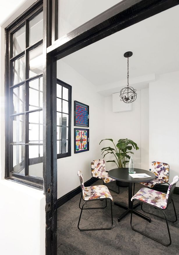
The concept for the palette of materials was envisioned as if a band of Bohemians had taken over an abandoned Victorian hotel in Manhattan. Subtle purples and reds of the existing slate floor inspired the new palette of colors, becoming more intense to give the space a modern feel. Tones of violet and magenta were dialed up in the upholstery, while details like wall mounted game boards, massive sectional sofas and recovered vintage library chairs rounded out the modern Bohemian feel.
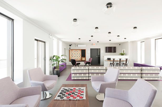
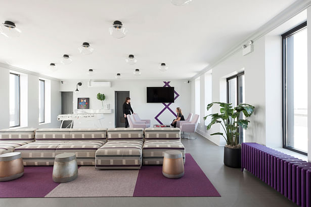
A separate space on the building’s top floor was reopened as a multi-functional common space for residents. The lavenders of the ground floor color palette take over as bold purples and the intense reds fade to lighter pinks. Existing radiators, one functioning and one disconnected, where both painted bright purple calling attention to the new casement windows added to maximize natural light and provide uncluttered views of Lake Michigan to the east and the sunsets to the west. The shocking colors are tempered by bright white walls, new grey LVT flooring and black accents. New moldings and vintage inspired ceiling fixtures in a geometric pattern mimic the board games from below.
A large sectional anchors the center of the room, while lounge chairs in another area form a casual meeting space around a large coffee table. At the opposite end, a gaming area is formed around an over-sized Scrabble board. A semi-enclosed work space created of Buzzi space “picnic” tables at offset heights provides two layers of function paired with seating in an iron black. The half-wall is capped with the same violet veined marble from the ground floor.
The completed renovations present a fresh, curated atmosphere more compatible to newer properties, but for residents seeking a vintage building experience. By annexing underutilized storage space, the overall common area square footage was almost doubled, providing residents with more functional amenity space in a variety of settings.
Status: Built
Location: Chicago, IL, US
Firm Role: Architect
Additional Credits: Photography by Petra Ford
