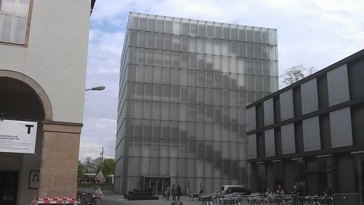

It's sort of 2 and a half buildings in one. A functional envelope that might remind one of the Eames' house, if the Eame's house were 4 stories and all glazed. Outside of that are the overlapped panels of glass that come all the way down to the sidewalk.

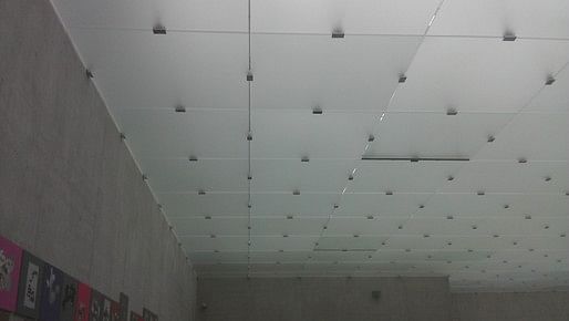
Inside is concrete - interior walls and stairs of the same finish. The brightest finish of concrete is reserved for the floor. The ceilings are also glass, clipped together - the clips showing, of course.

The ceiling brings in a filtered light from fixtures far enough away that the light becomes diffused. This is probably the most decadent aspect of the project - it's what enables us to read the stairs and floors through the envelope. It's the sort of ultimate 'reveal' - a gap between floors that functionally provides an amazing lighting effect.
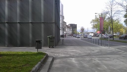
Urbanistically, the building basically participates in the dominant pattern of the city blocks near the lake. That means facing away from the lake. (There's rail and a major vehicular street between the lake and the streetwall.) This creates odd problems, such as this position for trash pick up. Below is what one walks past on the sidewalk between the lake and the building, attempting to get a view of the Kunsthaus and Lake Constance at the same time.

This may seem tangential to the question of the architecture, but I think it's actually another iteration of the logic of the reveal. At some scale it closes in on itself.
Posts are sporadic. Topics span architecture, urban design, planning, and tangents from these. I sometimes include excerpts of academic articles.
1 Comment
I love pictures like that one with the recycle bin at the base of the building! So good to remind us that buildings are not just discreet objects. Thank you!
Block this user
Are you sure you want to block this user and hide all related comments throughout the site?
Archinect
This is your first comment on Archinect. Your comment will be visible once approved.