
Sep '08 - Sep '11
I thought it would be good for me to resurrect (not too strong a word at this point!) my archinect schoolblog in order to chronicle my final year in UCLA’s M.Arch I program. The beginning of the school year, fall quarter 2010, was our second topic studio - the studios we get to choose by lottery. Three of the four studios were offered at UCLA, and the fourth was a traveling studio under Peter Ebner (and Friends), based in Munich, Germany the entire quarter and partly sponsored by 3M. I of course chose the studio that would let me go back to Germany (though Munich is most definitely not Berlin). Munich is actually a great city, if a bit too rich and comfortable to be truly exciting.
Some shots of Munich:
Marienplatz, Munich's central square
some awesome trompe l'oeil rustication on one of Munich's oldest buildings
the hanging garden in Herzog & deMeuron's Fünf Höfe shopping mall
the pretty River Isar, which has a permanent tube wave in one spot, giving rise to the odd concept of German urban surfers
we met with the head city planner of Munich
the remarkable Frei Otto Olympiastadion - apparently you can take guided tours of the upper roof surface membrane, but it got too cold before any of us figured out how to do it
Coop Himmelb(l)au's BMW Welt:
Herzog & deMeuron's Allianz Arena:
detail of the ETFE panel joins
we actually went to a soccer game to get into the interior. Great pretzels, and terrifying after-game drunken german sports bros filling the maze-like urinal bathrooms
We also toured the grounds of the Schloßpark Nymphenburg, the former Bavarian royal palace and grounds. The main palace is surrounded by a massive park with odd little Romantic mini-palaces dotting the grounds - I'd highly recommend checking these out if you're visiting Munich:
Apparently this mini-palace was built for a princess who would stand on the platform on the roof and shoot deer released by servants below
apparently one of the first indoor swimming pools in Europe; only the king was allowed to use it
this intentionally ruinous building housed a charming grotto fashioned out of shells and coral:
there was also an exhaustive exhibit of royal sleds and carriages; some crazy, almost contemporary parametric-looking stuff along with the expected gilded naked ladies.
Peter took us out to Oktoberfest and paid for everything, making an already delightful experience even more DRUNK. I just wish I had gone more than the one day.
Ladies, may I introduce you to Elan and Tim?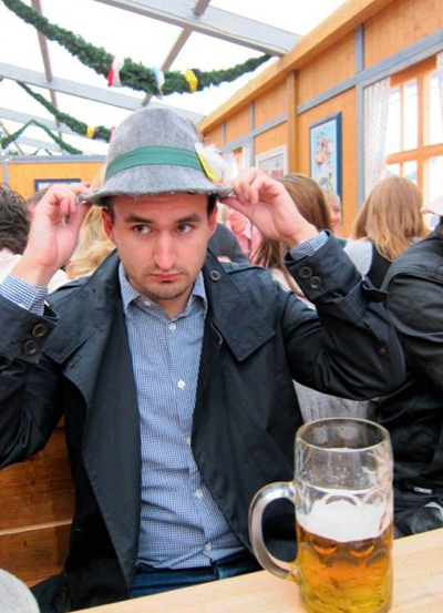
apparently ugly hats are a big part of the Oktoberfest ritual. I quite liked this one on me though, I should have bought it but wasn't drunk enough at the time
Jonny got his gun: they probably shouldn't hand air rifles to Oktoberfest drunkards, but Jon didn't end up shooting anyone
The studio as Peter defined it was meant to tackle future concepts of residential tower living, which was partly appealing to me because I hadn’t yet done a tower design at UCLA. The studio was held at the Haus der Gegenwart on the outskirts of Munich, which is a funny ‘house of the future’ concept house built after an ideas competition held by one of the largest newspapers in Germany, the Süddeutsche Zeitung. The house is organized with three bedrooms on the ground floor surrounded by a hedge maze, with an elevated living area spanning between them. We used the open living area for lectures and meetings, and the bedrooms for our workspaces. The house was meant to be run by an advanced computer system, with shutters closing when an incoming storm was sensed, and lights and heat controllable remotely by cellphone. The system was designed by Microsoft (Bill Gates was at the opening of the house), so of course nothing worked the entire time we were there. When we complained that the house was getting cold with the encroaching winter, were told that we could have either heat or hot water, not both. We voted for hot water since we could get space heaters, but the managers of the house had other ideas and turned the hot water off, though we never noticed much heat to replace it. We were pretty sure this was because we weren’t supposed to be in the house overnight, which we tended to ignore around deadlines. So despite the house’s interesting qualities, it wasn’t always a great place to work!
the Haus
oddly one of the few pics I have of the living area
dawn one morning while we were still living in the house
Integral to the studio were an intensive series of lectures as well as trips around Europe. The lectures were mostly held in the living area of the Haus der Gegenwart, sometimes as many as three a day. One of Peter Ebner’s great strengths is in networking, so the many lectures were given by a wide range of guests, from a London product designer, Munich architectural publishers, a wind engineer, many of Munich’s architects (one of whom used a hilarious and shockingly expletive-laced quotation of Reservoir Dogs to explain a project) as well as other architects from around Europe and even as far as Dubai, and the head of Transsolar, climate engineers for some of the biggest projects in Europe, and an excellent installation at the Venice Biennale. One of the bigger events of the quarter was a symposium Peter organized at a large modern art and design museum in Munich called the Pinakothek der Moderne, featuring Kazuyo Sejima (SANAA, duh), Hitoshi Abe and Kivi Sotamaa from UCLA, Farshid Moussavi (FOA), the guys from Urban Think Tank, Hani Rashid (Asymptote), zany Frenchman Edouard Francois, and several others. With such heavy hitters the symposium was of course fun and interesting, but a critique afterwards was that it didn’t really function as a symposium in that barely any generative public discussion or feedback was fomented; instead acting like a regular lecture series with even less time for audience questions. But it was still great to see so many speakers from various continents in two days.
As for the trips around Germany and Europe, they were also an interesting mix, with visits to fabrication companies (the Seele glass and ETFE factories were very cool) and advanced materials labs (a carbon fiber lab was especially interesting), to some famous architectural works in Stuttgart, to art fairs in Berlin, and finally to the Venice Biennale.
Stuttgart:
UN Studio's great and highly disorienting Mercedes Benz Museum
I was surprised that the atrium at the center of the building was a straight extrusion when the program-filled floorplates are so complex and confusing. But the weird sci-fi elevators project movies on the core walls as they move, so 'it's all good'
the interstitial 'leftover' volumes were the most spatially interesting
The Popemobile!
Delugan Meissl Architects' Porsche Museum - less complex and formally interesting than Mercedes, but still worth a visit. It basically looked like an early grad school project that was rendered so well it became real.
UCLA prof Neil Denari was in Germany and came with us to Stuttgart
We were told that the unnecessarily-cantilevered museum used more steel than the Eiffel Tower; not sure if that's literally true
one of the more interesting exhibits was a porsche that had been sectioned like a Damian Hirst shark
Berlin trip:
we of course went to the usual architectural suspects
I was glad to go to OMA's Dutch Embassy because I somehow skipped it when I was in Berlin for a whole summer in 2006
Chipperfield's Neues Museum
A little too elegant and tidy for me, but very well done
If Chipperfield isn't into crafting atmosphere, I'm pretty sure the stairs were designed to this sun angle to keep people from wanting to enter near the museum's closing time, ha ha.
We met with a guy who had developed this interesting wrapped gallery row on Berlin's River Spree, as well as an art fair we went to later in a hangar at the now-closed Nazi-built airport Tempelhof
an amazing Bruce Nauman retrospective at one of my favorite museums, the Hamburger Bahnhof
Gotta love Koon's Michael Jackson and Bubbles
as newly minted country bumpkins from Munich, it was disorienting to find a mini Bavarian-theme village set up on the former central plaza of East Germany, Alexanderplatz
a lot of the work at the art fairs was terrible, but some of it was pretty fun
The former airfield of Tempelhof airport has been turned over to the people as a park, with basically zero interventions; it's created a very interesting public space, which seemed to me a lot like the High Line but as a field condition rather than a linear strip
Venice trip:
we stopped in Innsbruck Austria on the way down to Italy, and checked out some Zaha projects (they're quite enamored with her there)
the view from our apartment in Venice
we went to a very impressive show on Piranesi
spectacular views from a church campanile
the Transsolar installation at the Biennale; the precise control over atmosphere (literally!) was quite impressive
Francois Roche's installation (which he told us in a recent lecture at UCLA had some kind of radioactive material in it)
Our Munich studio prof in a video installation of Biennale participants
Peter met us at his piece on the Biennale grounds, but of course he couldn't just walk in like a normal person, instead arriving on a motorboat
Peter's piece was a little bridge/bench made of translucent concrete - it was designed to be walked on, except apparently a Biennale curator stepped out a little too far on a drizzly day and fell into the canal!
we boarded Peter's boat and snuck into the other part of the Biennale, where the Austrian pavilion was for some reason full of work by LA architects.
The US pavilion had a room devoted to UCLA's CityLab; my buddy Elan was surprised to see a bunch of his work for them on the walls
the Dutch pavilion was perhaps predictably filled with blue foam
look at those adorable little blue foam windmills!
I was into these surveiled Villa Savoye and McDonalds
Rem's installation on preservation and landmarking
a delightful Philip Beesley installation filled the Canadian pavilion (I reported previously on his lecture and installation at UCLA)
in my previous trips to Venice I had never seen the famous flooding of the city, but on our last morning there the waterfront was almost totally under
remind me not to wear nice shoes
stopped in Vicenza on the way back to catch some Palladio
Zaha's ski jump was unfortunately locked down tight
The actual work of the studio, on residential towers, was of course impacted by all the events and traveling, but we had understood before applying to the studio that the experience would be worth most likely having less developed work than our peers back at UCLA at the end. The studio was run as an interesting hybrid of European and American models; we had much more contact with the professors than a usual European studio would, but the project prompt was way more wide open to interpretation than a normal brief, at least here at UCLA. We were asked to design a 200 meter residential tower, and the rest was up to us - site, secondary program, etc. It was odd to work in Munich on this prompt since by city law nothing can be built higher than the 100m Frauenkirche in the historic city center. The studio worked with Peter quite closely, but we saw the assistant professor, Munich architect Alexander Müller even more often. Alex was an interesting guy; a classic ‘sophisticated European’, obsessed with Renaissance architecture and 60s French films, but also almost secretly very contemporary. Most of us really loved working with him, but were often pulled in different directions when talking with him and Peter separately. At any rate, due to the paucity of time to work on our projects in Munich, we ended up extending the studio through December, with a ‘soft final’ in Munich in early December, and the ‘final final’ at UCLA in early January. Unfortunately, with the shop at UCLA closed and most of us traveling through December, we didn’t get much of a chance to work on a model or on polishing our designs (which most of us sorely needed!). I ended up using the lasercutter at TechShop in San Francisco while I was visiting my parents in the Bay. Despite the high initial costs ($75 for one month student membership and $50 to take a mandatory laser cutting course), it seems totally worth it since the actual cutting time is free (unlike at UCLA, where it’s .40 cents a minute). So I did end up having a model at the final crit. My project began with an interest in bundled tower organization, and in secondary programs that would activate the residential components. I used an arts slant, incorporating an elevated museum and artist live/work spaces along with more normative high-end apartments and sited in Berlin, in the outskirts of the Mitte arts district. The project was pulled in some odd directions over the course of the quarter, at least partially explaining its weird appearance. Some images of the model and my final boards: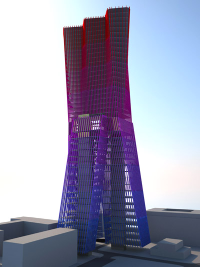
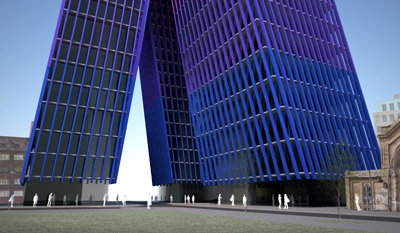
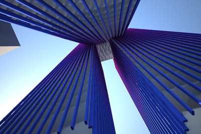
Our studio was also published in the Süddeutsche Zeitung: 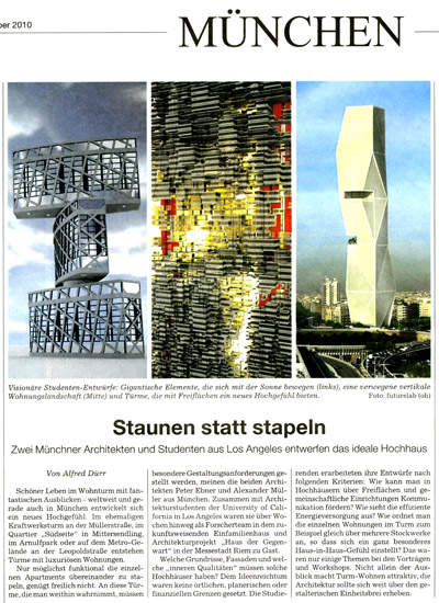
from left to right, images from my good buddies Tim, Jon, and Diane’s projects.
A detail of Jon’s project, which had some great material/organizational and class mixing concepts which really befuddled the Germans
Images from the day of our 'soft final' in Munich:
Haus der Gegenwart in snow
peering through the bare branches of the hedgemaze into a work space
my desk at dawn on the day of the crit
Peter gave us branded chocolate for all our hard work
we warmed up on Glühwein in central Munich after the crit
After the ‘soft final’ in Munich, most of us traveled as much as our meager bank accounts would allow. I went to Amsterdam, where shockingly I had never been before. I of course loved it, though despite its quaintness rather than because of it. The most interesting quality of the city to me was not its bikes and canals (though I loved the bike parking structure at the central train station); instead the most interesting urban condition is the near total lack of concern for domestic privacy - street level living room windows of posh townhouses on major streets offer easy public views into intimate domestic spaces, where inhabitants lived without seeming to notice surreptitious glances from passersby.
bike parking garage, fabulously overused
a delightful urban amenity: the public pissoir
cute little floating construction site - I wonder how CalTrans would function if their building sites were under water?
a Dwell-ready canal boat
I was not prepared for the blizzard that hit my second day there
MVRDV's Silodam on a blustry evening
warmed up at a lovely windmill powered brewery
After Amsterdam, I met up with some friends from studio in Barcelona. It was also my first time there, and it was really fantastic to finally visit a city so soaked in amazing architecture. I think I was too overwhelmed by the city to look for any kind of deeper analysis, but I’ll definitely say that the design culture in the city goes way beyond just Gaudí, though his work did live up to the hype for me.
The awesome Mercato Santa Caterina (Enric Miralles):
Gaudí, Casa Battló:
there was a popup store for the trashy fashion label Custo Barcelona on the ground floor, but at least it let us inside to check out the interior
Casa Mila (aka la Pedrera):
the brick vaulted attic level might be my favorite part
The Sagrada Familia really bowled me over; I had not been expecting it to be as successfully affecting as it was (regardless of apparent debates over whether it's faithful to the original design):
ongoing construction
jealous of these guys on a hard hat tour
wait is that the T-mobile logo??
Parc Guell:
the steep climb to Parc Guell has been mitigated by the installation of outdoor escalators. Thank goodness.
the view of the city from the Parc
the Boho peak of Parc Guell
Sangria in the Parc. Does it sound alcoholic of me to say I wish I could do this every day?
guell
Other Barcelona architecture:
the Forum, Herzog & deMeuron. I actually liked the project, which gets a lot less attention than it’s also H&deM-designed cousin in Madrid. It successfully produces atmosphere from materials that look like tinfoil and moldy purple cottage cheese.
Mies’ reconstructed Barcelona Pavilion (on the original site)
oh Tim. Tim and Jiwon later sat in THE Barcelona chairs, til the guard yelled at them, ha ha
Gehry’s fish was a bit disappointing
Flea market in the shadow of Nouvel’s Torre Agbar
I always wondered how Nouvel negotiated the end condition of the Torre, but it turns out he kind of didn’t; the facade slips past the ground plane to an abrupt ending in a dry moat of sorts.
the weird Torre Agbar lobby houses an interactive exhibit on water conservation
The Munich studio was all-in-all a fantastic experience, perhaps in spite of the actual work produced. I’d highly recommend the studio to you UCLA second years thinking of which topic studio to take in fall. Hopefully some of the logistical hangups will be ironed out in future years, like HOUSING - we kind of got screwed on housing in Munich, as well as communication between Peter and the students before they get to Munich.
No Comments
Block this user
Are you sure you want to block this user and hide all related comments throughout the site?
Archinect
This is your first comment on Archinect. Your comment will be visible once approved.