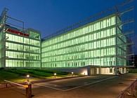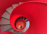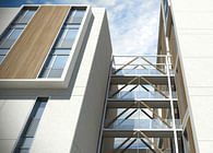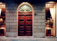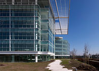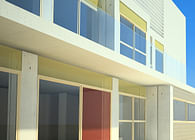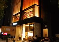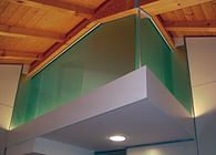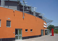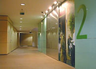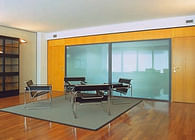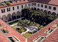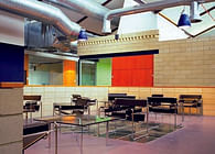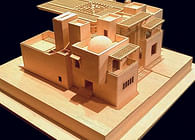
The exterior of the project in dialogue with the interior.
The architectural context has influenced the design of interior spaces in two ways: positively and negatively; the building it is not exactly an office building, quite the opposite, because there are no requirements such as flexibility and efficiency. So, we found in the site unusual features in 99% of the offices. I mean double-height spaces, or plan without large rectangular areas and depth, that could suggest us some different lay out.
The main goal: Green Interior Design
GaS Architects building on with Autodesk brief: to run a LEED Gold project. The sustainability has been part of our general approach. LEED green building program. gives points for a variety of different aspects. The energy efficiency, the type of material, but also the source of the materials, their recyclability, their insulation ... and also the quality of the working spaces, the quality of light, the conscious use of water.
How to design a creative office for a creative brand.
One of mandatories of the Autodesk brief has been to mix global spirit and local flair. The challenge of the concept was to communicate a successful meeting beetween an international style and Italian way of life. Our project has focused on some Italian excellences. Italy is well known for industrial design. So we were inspired by the best of Italian production: furniture, lighting, etc..
Another important factor regarding the project materials:: Italy is not a country rich in raw materials, it is not famous for its steel or wood industries. But it is very well known the concept of Italian masonry , italian experience in the dough, italian fine craftsmanship. So we decided to design a straight line, a great wall that links between two floors. This wall was total covered with handmade Venetian plaster.
A third element was the decoration of the rooms: it is performed with projects aimed with Autodesk software, but they show projects and drawings by the most famous Italian designers.
No color and colored shapes.
Basically, the dominant color is white. It is in this background that we have show our white colored objects. Another important element in the color are the maintaining of original floors, which cover a large surface area of the project. A third idea was idea was to create a contrast with the environment through the green color chosen for the wall.
Original Details.
Some workbenches were made in cement. This suggested to us the idea of including the ancient tools for technical drawing, as valuable evidence of the design history. We brought these ancient tools to the technological elements such as the choice of plants to view or sliding glass doors. This match between industrial materials and handmade materials has created a visual richness very charming, a real new language which then marked all the elements of the project, such as the phone boot, necessary to talk on the phone with privacy and avoiding interference with colleagues.
Status: Built
Location: Milano, IT
My Role: architect
Additional Credits: Photo: Luc Boegly
General Contractor: Tétris Design & Build
